Super Animation Catalogue 2.0

Discussion specifically regarding the "Dragon Ball Super" TV series premiering July 2015 in Japan, including individual threads for each episode.

Moderators: General Help, Kanzenshuu Staff

User avatar
emperior
I Live Here
Posts: 4322
Joined: Fri Apr 24, 2015 1:52 pm
Location: Dragon World
Contact:

Re: Super Animation Catalogue 2.0

Post by emperior » Fri Mar 16, 2018 3:32 am

GTx10 wrote:While I can admit that Yamamuro's work has aged (much like Toriyama's work) I like the "action figure and shiny" look to the characters. Take the S.H. Figuarts Super Sentai and Kamen Riders for example, those figures are immaculate in scuplt and that doesn't seem like a bad translation for Dragon Ball. Ajay can you give me a example of Yamamuro's character sheets/design/style not translating well onto the screen? If I am not mistaken, he recently drew UI Goku's grand appearance in episode 129 and it looks good.
So while New animators can indeed give new breath to our beloved series it is not Yamamuro who is giving us bad work as of right now.
Do you want a Toy Story show with Dragon Ball characters? You can actually go watch these videos: https://www.youtube.com/results?search_ ... gure+fight

By the way if you want examples of Yamamuro character sheets not translating well just watch Super and the last two movies, they are filled with plastic looking characters due to the model sheets looking like toys.
悟 “Vincit qui se vincit”

What I consider canonical

User avatar
JazzMazz
I Live Here
Posts: 2217
Joined: Thu Nov 03, 2016 7:28 am
Location: Mordor, the Borg cube and Voldemort's lair all at the same time in the year 199X

Re: Super Animation Catalogue 2.0

Post by JazzMazz » Fri Mar 16, 2018 6:43 am

cuartas wrote:
JazzMazz wrote:I guess the big thing I have to ask you, is what's the problem with Dragon ball updating itself visually to exist in a new modern age?
Technically Dragon Ball updated itself in a new modern age, because current Yamamuro designs are nothing like his 90's.
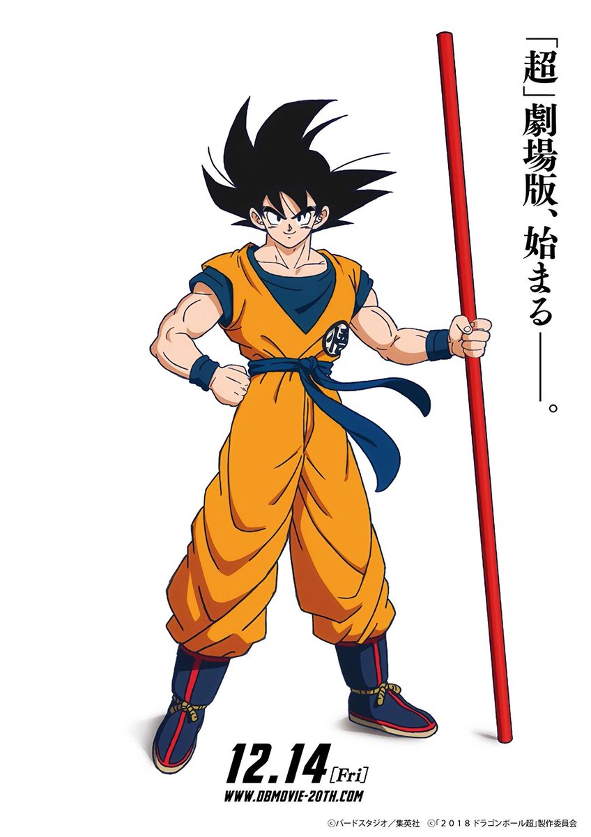
Now, I've never said his modern designs were the best, and that opinion was confirmed when I saw ajay post long time ago, the point here is that I always preferred his designs over tate's all the way, that was the discussion, but after watching Takahashi, those perfect characters reminiscent of early Yamamuro I can't change my mind, I haven't seen anything more fitting for Dragon Ball than what he has achieved.

Idk if you see Takahashi as dragon ball updating itself or simply coming back to better times (which apparently is not what you want), if it's the latter, in that sense, yes, I'd have a problem with dragon ball updating itself, it would be a missed chance to not exploit his talent, just like Yamamuro was chosen taking Maeda's place long time ago.

I know a lot of you want dragon ball to make a drastic transition like pokemon sun & moon to fullfill your wet animation dreams, I don't, I wan't a perfect balance between those two aspects, sorry for not thinking like you
Personally I preferred they went more the Nippon path(which is what they seem to be doing). As for Yamamuro's designs, they've been pretty much the face of the franchise has been around for the better part of 20 years and they weren't ever particularly liked to be begin with, so its kind of been a wonder the look has lasted this long.

While Takahashi's art style is fantastic, I think the new art style currently being promoted is definitely the best step Toei could have artistically made with the franchise. It provides a freshness to the visuals of the series that really has never been seen before. Takahashi's style is a fantastic reminder of what Dragonball was back in its prime and I can easily see why would think there is no more fitting style for Dragonball, because Takahashi's style is the old design for Dragonball. But I don't think letting the past define the current visuals of the series would really facilitate much in the way of actual growth and interest, I think it says a little to much about the franchise being stuck in the past as a product of a bygone era. That's why a lot of people and big name animators in the industry have taken a big notice to the new promo art, because its something the series has never done before, and while the final results haven't been presented to us, I think the movie has a real chance of outshining anything the series had ever produced visually.

On a more technical level, I'm not particularly sure how inclined Takahashi is to create character designs for Dragonball and act as chief animation supervisor when he probably has other projects going on.

Change isn't necessarily always a good thing, some changes can be regressive, which is exactly what Yamamuro's time as character designer for the series can be described as. However, I think its important to be optimistic about the character designs and the talent handling them. We're not dealing with a has been, or a big fish in a small pond, we are dealing with fresh talent who are getting their hands on the franchise in order to try something creative. Though we haven't seen the final film, I think it certainly sounds more promising and is shaping up to be more promising than last 2 movies were, at the very least, in the visual sense.

User avatar
Baggie_Saiyan
Namekian Warrior
Posts: 10283
Joined: Sat Mar 30, 2013 5:22 pm
Location: Atlantis.

Re: Super Animation Catalogue 2.0

Post by Baggie_Saiyan » Fri Mar 16, 2018 7:33 am

Yamamuro's worst offence was the damned highlights especially on base Goku made him too ugly then he added an extra back spike for no reason.

If his designs never had highlights I think they would have been a lot more serviceable.

User avatar
Torturephile
Regular
Posts: 576
Joined: Thu Apr 07, 2016 10:13 pm

Re: Super Animation Catalogue 2.0

Post by Torturephile » Fri Mar 16, 2018 8:17 am

Baggie_Saiyan wrote:Yamamuro's worst offence was the damned highlights especially on base Goku made him too ugly then he added an extra back spike for no reason.

If his designs never had highlights I think they would have been a lot more serviceable.
Perhaps. I always thought Goku Black looked better in the anime than Goku since he rarely had highlights.
From Super episode 113 thread:
MaskedRider wrote:
Torturephile wrote:
hunduel wrote:I liked this episode. I seriously don't know why people hate it.
namekiansaiyan wrote:I seriously don't see why some of you like this episode when nothing happened and was basically filler.
The fandom in a nutshell.
The duality of man.

User avatar
cuartas
Beyond Newbie
Posts: 285
Joined: Tue Jun 14, 2016 1:16 am

Re: Super Animation Catalogue 2.0

Post by cuartas » Fri Mar 16, 2018 8:31 am

Torturephile wrote:
Baggie_Saiyan wrote:Yamamuro's worst offence was the damned highlights especially on base Goku made him too ugly then he added an extra back spike for no reason.

If his designs never had highlights I think they would have been a lot more serviceable.
Perhaps. I always thought Goku Black looked better in the anime than Goku since he rarely had highlights.
And only 3 back spikes

User avatar
JulieYBM
Patreon Supporter
Posts: 16539
Joined: Mon Jan 16, 2006 10:25 pm

Re: Super Animation Catalogue 2.0

Post by JulieYBM » Fri Mar 16, 2018 10:12 am

The May 2018 V-JUMP cover features new promotional art of Super Saiyan Gokuu that might be from Shintani Naohiro. If there's anything I have to say it is that I hope Shintani's final work for the movie isn't so early 1990s-ish. I would likely actually good and modern designs.

[spoiler]Image[/spoiler]
She/Her
progesterone princess, estradiol empress
bisexual milf

User avatar
Doctor.
Banned
Posts: 10558
Joined: Sat Jul 26, 2014 10:02 am
Location: Portugal

Re: Super Animation Catalogue 2.0

Post by Doctor. » Fri Mar 16, 2018 10:17 am

Absolutely love it. Actually seems like prime Toriyama; he nailed the facial features and the hair down, at least.

Vegeta_Sama
Regular
Posts: 713
Joined: Wed Feb 07, 2018 2:59 pm
Location: Your mom's anus

Re: Super Animation Catalogue 2.0

Post by Vegeta_Sama » Fri Mar 16, 2018 11:09 am

Interesting how Goku's .. Belt thing is back to how it used to be back in the Saiyan/Namek arc. I wonder why
Get Fucked, C_unt

User avatar
emperior
I Live Here
Posts: 4322
Joined: Fri Apr 24, 2015 1:52 pm
Location: Dragon World
Contact:

Re: Super Animation Catalogue 2.0

Post by emperior » Fri Mar 16, 2018 11:22 am

I am incredibly happy about how that Goku Super Saiyan hair looks, and the color is very nice too. It's so good to see Dragon Ball being back to a similar art-style to the Saiyan-Namek era, that is exactly how I always wanted Dragon Ball to look and I even lost the hope we would ever see such designs again. I never made a secret that my favorite look of the series is from the Saiyan/Namek arcs: for me it is the most iconic look and that Goku is exactly how I always envisioned SSJ Goku to look like.

Coloring and style apart, I dislike the fact that art has highlights. Sure, they aren't as bad as in Yamamuro's work but I would rather have no highlights at all. About the artist, I'm not sure it is Shintani - it may be a promo artist following his designs.
悟 “Vincit qui se vincit”

What I consider canonical

User avatar
cuartas
Beyond Newbie
Posts: 285
Joined: Tue Jun 14, 2016 1:16 am

Re: Super Animation Catalogue 2.0

Post by cuartas » Fri Mar 16, 2018 11:26 am

Thats better, not that round design, but I don't like the pointy noise that resembles uchiyama

User avatar
Baggie_Saiyan
Namekian Warrior
Posts: 10283
Joined: Sat Mar 30, 2013 5:22 pm
Location: Atlantis.

Re: Super Animation Catalogue 2.0

Post by Baggie_Saiyan » Fri Mar 16, 2018 11:35 am

Vegeta_Sama wrote:Interesting how Goku's .. Belt thing is back to how it used to be back in the Saiyan/Namek arc. I wonder why
Also the pole in the movie KV so it's probably just to further signify the "hey guys we're going back to old school designs".

I dislike the SS colour in that pic, only gripe.

User avatar
paulo89988
Newbie
Posts: 22
Joined: Sun Feb 25, 2018 12:32 pm

Re: Super Animation Catalogue 2.0

Post by paulo89988 » Fri Mar 16, 2018 12:12 pm

Wow, this looks pretty cool, is this Naohiro Shintani too? It's a lot more angular, the body is more defined and there are highlights on the skin, and the ear looks very different, so maybe it's not him? Or maybe he just changed his style to fit the ssj form better.
[spoiler]Image
Image[/spoiler]

User avatar
Firebolt
Beyond Newbie
Posts: 117
Joined: Sun Feb 11, 2018 8:40 am

Re: Super Animation Catalogue 2.0

Post by Firebolt » Fri Mar 16, 2018 12:37 pm

That Goku is sooooo good. Everything from the hair to the wrinkles in the clothes is simple and charming. I absolutely adore the muscles and the colours.

The preview image for 131.....looks so lifeless and on model, but I guess that's to be expected when Yammy's supervising. Really hope some Takahashi art slips by uncorrected!

User avatar
Chuquita
Namekian Warrior
Posts: 15155
Joined: Sat Nov 20, 2004 2:16 am
Location: New Jersey
Contact:

Re: Super Animation Catalogue 2.0

Post by Chuquita » Fri Mar 16, 2018 12:47 pm

I think the VJump is also Shintani because of the lines on the neck (especially that small line off to the side near the head) because that seems like a small thing but I could be wrong.
My deviantart * My tumblr * My twitter
---
フレフレ みんあ! フレフレ 私!

Vegeta_Sama
Regular
Posts: 713
Joined: Wed Feb 07, 2018 2:59 pm
Location: Your mom's anus

Re: Super Animation Catalogue 2.0

Post by Vegeta_Sama » Fri Mar 16, 2018 1:53 pm

Baggie_Saiyan wrote:
Vegeta_Sama wrote:Interesting how Goku's .. Belt thing is back to how it used to be back in the Saiyan/Namek arc. I wonder why
Also the pole in the movie KV so it's probably just to further signify the "hey guys we're going back to old school designs".

I dislike the SS colour in that pic, only gripe.
Well, at last it's not Yammamuro's bright piss yellow
Get Fucked, C_unt

User avatar
FortuneSSJ
Born 'n Bred Here
Posts: 5812
Joined: Sat Mar 30, 2013 9:07 pm

Re: Super Animation Catalogue 2.0

Post by FortuneSSJ » Fri Mar 16, 2018 2:19 pm

I also love that SSJ Goku. Especially the hair. It's gorgeous!!
The color scheme keeps being what I've been wishing for years. The only thing I don't like are the highlights on his arms, but no big deal.
A world without Dragon Ball is just meh.

User avatar
AnimeNation101
I Live Here
Posts: 2191
Joined: Wed Apr 05, 2017 8:01 pm
Location: Planet ShoJump

Re: Super Animation Catalogue 2.0

Post by AnimeNation101 » Fri Mar 16, 2018 2:37 pm

Looks too old school. What i want is a modern but simple and animation friendly design like the Shintani key visual. This Goku looks kinda different and i dislike the hair color
I called it that Gogeta, Bardock, and something Broly related would be in the movie before it was even announced that it was a Broly movie. 8)

"I don't think I'm a hero of justice or anythin'. But those who'd hurt my friends... I won't forgive!"

User avatar
GTx10
Regular
Posts: 581
Joined: Tue Apr 02, 2013 10:06 pm
Location: Beerus's Palace

Re: Super Animation Catalogue 2.0

Post by GTx10 » Fri Mar 16, 2018 3:41 pm

emperior wrote:
GTx10 wrote:While I can admit that Yamamuro's work has aged (much like Toriyama's work) I like the "action figure and shiny" look to the characters. Take the S.H. Figuarts Super Sentai and Kamen Riders for example, those figures are immaculate in scuplt and that doesn't seem like a bad translation for Dragon Ball. Ajay can you give me a example of Yamamuro's character sheets/design/style not translating well onto the screen? If I am not mistaken, he recently drew UI Goku's grand appearance in episode 129 and it looks good.
So while New animators can indeed give new breath to our beloved series it is not Yamamuro who is giving us bad work as of right now.
Do you want a Toy Story show with Dragon Ball characters? You can actually go watch these videos: https://www.youtube.com/results?search_ ... gure+fight

By the way if you want examples of Yamamuro character sheets not translating well just watch Super and the last two movies, they are filled with plastic looking characters due to the model sheets looking like toys.
I disagree. BoG and F (Movie versions) looked amazing. The characters were on model and SSG Goku and Lord Beerus were flying and zipping around flawlessly. SSB Goku and Golden Freeza's entire fight were organic and lose. So I think your example is poor because BoG and F (Movie versions) were sexy looking movies.
"Good luck, Kakarrot... You are the Champion!!" Vegeta DBZ ShonenJump Manga Volume 26 p.113

I'm reviewing Dragon Ball! Both the Jap ver. and Uncut Funi Dub! Check out the thread: http://www.kanzenshuu.com/forum/viewtop ... =6&t=31208

kn83
Banned
Posts: 320
Joined: Mon Jul 14, 2014 8:27 pm

Re: Super Animation Catalogue 2.0

Post by kn83 » Fri Mar 16, 2018 5:41 pm

JulieYBM wrote:The May 2018 V-JUMP cover features new promotional art of Super Saiyan Gokuu that might be from Shintani Naohiro. If there's anything I have to say it is that I hope Shintani's final work for the movie isn't so early 1990s-ish. I would likely actually good and modern designs.

[spoiler]Image[/spoiler]
That design of Goku looks great. If that's how he's gonna look in the movie then I'm satisfied.

User avatar
DainIronfoot
OMG CRAZY REGEN
Posts: 754
Joined: Sun Apr 05, 2015 12:13 am

Re: Super Animation Catalogue 2.0

Post by DainIronfoot » Fri Mar 16, 2018 5:58 pm

kn83 wrote:
JulieYBM wrote:The May 2018 V-JUMP cover features new promotional art of Super Saiyan Gokuu that might be from Shintani Naohiro. If there's anything I have to say it is that I hope Shintani's final work for the movie isn't so early 1990s-ish. I would likely actually good and modern designs.

[spoiler]Image[/spoiler]
That design of Goku looks great. If that's how he's gonna look in the movie then I'm satisfied.

That design looks fine to me as well. Although the hair color is a little off for my taste. Not sure if it's Shintani since there are many different characteristics from that first image. If it is, then that's good. Doesn't have the same weird face as that first one.

Post Reply