
What do you mean by this?PsionicWarrior wrote:The thing is Super would look awesome if all or at least most frames were at top level, it was particularly obvious in latest ep #53 with the fight, it was like they hired students for it, totally different style, less colors, less details, just ugly, for the only fight scene and the short time it length, a real pity.FortuneSSJ wrote:It's a different era and a different approach, Super will never look like Z. For better or for worse, things changed.
If Super Looked More like Z...
Moderators: General Help, Kanzenshuu Staff
Re: If Super Looked More like Z...

Re: If Super Looked More like Z...
This thread made me think back to those drawings made by Masaki Satou awhile back. That guy is amazing at giving the characters detail and really nails it down with the art. Seeing him do the Super manga or at least his own work, would really make my day.
-
PsionicWarrior
- I'm, pretty, cozy, here...
- Posts: 1569
- Joined: Mon May 09, 2016 2:33 pm
Re: If Super Looked More like Z...
I mean the best looking frames of Super look real nice thus too bad not most of it are like it. Contrast between good and bad frames in Super is painful, much more than in Z, imo.nite_jay wrote: What do you mean by this?
-
TheGreatness25
- I Live Here
- Posts: 4928
- Joined: Fri Oct 19, 2007 9:36 am

Re: If Super Looked More like Z...
VegettoEX wrote:People still seem to think that "digital" somehow means the show couldn't look exactly as DBZ did in the 90s. It absolutely could. You could replicate every single last detail digitally: everything from the variable width of strokes to the gradients of the shadows. You could even do the film grain and cel shaking if you wanted to go insane.
Of course it could. It just doesn't.

Re: If Super Looked More like Z...
Meh, all I see are a bunch of blatant, oftentimes stiff, traces of old Dragon Ball Z art with their current clothes and coloring tacked on. And the season set color palette isn't doing it any favors. It's nothing particularly impressive or inspiring.
Yamcha: Do you remember the spell to release him - do you know all the words?
Bulma: Of course! I'm not gonna pull a Frieza and screw it up!
Master Roshi: Bulma, I think Frieza failed because he wore too many clothes!
Cold World (Fanfic)
"It ain't never too late to stop bein' a bitch." - Chad Lamont Butler
Bulma: Of course! I'm not gonna pull a Frieza and screw it up!
Master Roshi: Bulma, I think Frieza failed because he wore too many clothes!
Cold World (Fanfic)
"It ain't never too late to stop bein' a bitch." - Chad Lamont Butler
Re: If Super Looked More like Z...
This.jjgp1112 wrote:Meh, all I see are a bunch of blatant, oftentimes stiff, traces of old Dragon Ball Z art with their current clothes and coloring tacked on. And the season set color palette isn't doing it any favors. It's nothing particularly impressive or inspiring.
An artist who traces isn't really an impressive artist at all. Though I do respect he got the old school anime cell look down pretty well.
And I admit some of these do look pretty good, but I've never seen him do any interesting pose of his own. Basically all poses are traced. I've seen him pop up on deviantart for a while now.
-
LSSJGODSSJ4Gogeta

- Advanced Regular
- Posts: 1269
- Joined: Wed Jul 29, 2015 1:24 pm
- Location: Kami's Lookout.
Re: If Super Looked More like Z...
I'm shocked these could get any disdain. They look perfect. They don't even look like the remastered sets, nor do they have the weird tint from the dragonboxes, this looks like an unaltered version from the TV airings (what you'd get with the DVD singles)
Also the remastered version isn't the toonami version, it was released after toonami ended dragonball's run. it's a bad recoloring and even a redubbing. (good at times but weird changes as well like no filter for candy vegito)
This is how super should look. No kawaii looking goku or bulma, they both look too round to boot. Balanced dark and light. GT was too dark but it worked and super is WAAAAAAAY to bright and everyone looks oiled up.
And digital animation CAN replicate this look so you can't blame digital, just the digital style toei has be cause since they went digital they got really bad.
Any post before 8/7/2016 isn't mine. This account was a gift from someone who thought the account was already banned. Saved me the trouble of making a new one haha XD
I love DB/DBZ/DBGT/DBZK/DBS (If I didn't why would I be here? XD)
I love DB/DBZ/DBGT/DBZK/DBS (If I didn't why would I be here? XD)
Re: If Super Looked More like Z...
The colors in the Trunks and Black Goku shots are pretty much identical to the remastered History of Trunks special, and the Resurrection F stuff has the same color scheme as the season 7-ish episodes they were traced from.
Yamcha: Do you remember the spell to release him - do you know all the words?
Bulma: Of course! I'm not gonna pull a Frieza and screw it up!
Master Roshi: Bulma, I think Frieza failed because he wore too many clothes!
Cold World (Fanfic)
"It ain't never too late to stop bein' a bitch." - Chad Lamont Butler
Bulma: Of course! I'm not gonna pull a Frieza and screw it up!
Master Roshi: Bulma, I think Frieza failed because he wore too many clothes!
Cold World (Fanfic)
"It ain't never too late to stop bein' a bitch." - Chad Lamont Butler
-
LSSJGODSSJ4Gogeta
- Advanced Regular
- Posts: 1269
- Joined: Wed Jul 29, 2015 1:24 pm
- Location: Kami's Lookout.
Re: If Super Looked More like Z...
I don't see it being closer to remastered then the toonami version. This looks like DBZ before anyone changed things. No kai or dragonbox or orange brick changes, just the unaltered classic footage you first got on tv. Remastered is nowhere near as clear or coolerful. Its too blurry.jjgp1112 wrote:The colors in the Trunks and Black Goku shots are pretty much identical to the remastered History of Trunks special, and the Resurrection F stuff has the same color scheme as the season 7-ish episodes they were traced from.
Any post before 8/7/2016 isn't mine. This account was a gift from someone who thought the account was already banned. Saved me the trouble of making a new one haha XD
I love DB/DBZ/DBGT/DBZK/DBS (If I didn't why would I be here? XD)
I love DB/DBZ/DBGT/DBZK/DBS (If I didn't why would I be here? XD)

Re: If Super Looked More like Z...
As someone who owns numerous cels and has copies of the original broadcast, both from the UK and Japan, I can tell you with absolute certainty that these look nothing like the show was ever intended to look. That's pretty much all there is to it.
Follow me on Twitter for countless shitposts.
Deadtuber.
Deadtuber.
-
LSSJGODSSJ4Gogeta
- Advanced Regular
- Posts: 1269
- Joined: Wed Jul 29, 2015 1:24 pm
- Location: Kami's Lookout.
Re: If Super Looked More like Z...
Can you post a cel next to the DVD single version of it? And that next to one of the pictures? I don't see a difference. it seams to match perfectly.Ajay wrote:As someone who owns numerous cels and has copies of the original broadcast, both from the UK and Japan, I can tell you with absolute certainty that these look nothing like the show was ever intended to look. That's pretty much all there is to it.
Any post before 8/7/2016 isn't mine. This account was a gift from someone who thought the account was already banned. Saved me the trouble of making a new one haha XD
I love DB/DBZ/DBGT/DBZK/DBS (If I didn't why would I be here? XD)
I love DB/DBZ/DBGT/DBZK/DBS (If I didn't why would I be here? XD)
Re: If Super Looked More like Z...
These edits don't look anything like the DVD singles, otherwise I doubt I'd have any where near as many issues since, dark detail and bad encoding aside, their colours aren't too bad.LSSJGODSSJ4Gogeta wrote:Can you post a cel next to the DVD single version of it? And that next to one of the pictures? I don't see a difference. it seams to match perfectly.
The first batch of edits are very clearly based on the Orange Bricks. They're horrendously over-contrasted, which you can see plainly in Black's clothes -- there's no dark detail there at all and his face is totally blown out. You'd have no idea that Black's undershirt is in fact grey. The skin tones are blown out and the skies are all horribly oversaturated, too. These are all Orange Brick traits. The second set of edits look a little more like the Dragon Boxes, but of course those have their own set of issues, and aren't an accurate representation of the show. The skies are that nasty teal colour from the aged film, and the skin tones are all kinds of wrong. The issues from the previous edits are still there, too: Piccolo and Whis' purple outfits are totally crushed, and Gohan and Kuririn's skin tones are entirely blown out. That's not how the show looks, that's how FUNimation's 'remaster' looks.
If the title was: "If Super looked like iffy Z home releases", then yeah okay, but these are being touted as edits that are supposed to make Super actually look like Z, and they just don't do that. They don't address any of the character design issues, the colours are all wrong, and the redraws are from an era that is long gone. They're nothing more than edits clearly aimed at the Orange Brick generation. They're done by someone who doesn't appear to understand what made Z look like Z. It's by someone who seems to think that throwing filmic filters over the top of everything is somehow a viable solution. I appreciate it's all done in good fun, but these aren't any good, and they're certainly shouldn't ever be taken as a legitimate suggestion to alter Super's aesthetic.
Grain removal aside, Kai's colour correction is genuinely the closest home release I've seen that matches my cels. It's not quite as contrasty as it should be, but it's damn close.
Follow me on Twitter for countless shitposts.
Deadtuber.
Deadtuber.
-
fadeddreams5

- Born 'n Bred Here
- Posts: 5156
- Joined: Fri Aug 08, 2014 10:53 pm
- Location: New York
Re: If Super Looked More like Z...
Serious question, is that Orange Brick art supposed to have something wrong with it? I have very little animation knowledge and small attention to detail when it comes to art, but I think it looks really good. =PAjay wrote:These edits don't look anything like the DVD singles, otherwise I doubt I'd have any where near as many issues since, dark detail and bad encoding aside, their colours aren't too bad.LSSJGODSSJ4Gogeta wrote:Can you post a cel next to the DVD single version of it? And that next to one of the pictures? I don't see a difference. it seams to match perfectly.
The first batch of edits are very clearly based on the Orange Bricks. They're horrendously over-contrasted, which you can see plainly in Black's clothes -- there's no dark detail there at all and his face is totally blown out. You'd have no idea that Black's undershirt is in fact grey. The skin tones are blown out and the skies are all horribly oversaturated, too. These are all Orange Brick traits. .
"Dragon Ball once became a thing of the past to me, but after that, I got angry about the live action movie, re-wrote an entire movie script, and now I'm complaining about the quality of the new TV anime. It seems Dragon Ball has grown on me so much that I can't leave it alone." - Akira Toriyama on Dragon Ball Super

Re: If Super Looked More like Z...
It's not the art it's the colors. The details in Goku's normally blue undershirt and wristbands can't be seen, because it's too dark.fadeddreams5 wrote:Serious question, is that Orange Brick art supposed to have something wrong with it? I have very little animation knowledge and small attention to detail when it comes to art, but I think it looks really good. =PAjay wrote:These edits don't look anything like the DVD singles, otherwise I doubt I'd have any where near as many issues since, dark detail and bad encoding aside, their colours aren't too bad.LSSJGODSSJ4Gogeta wrote:Can you post a cel next to the DVD single version of it? And that next to one of the pictures? I don't see a difference. it seams to match perfectly.
The first batch of edits are very clearly based on the Orange Bricks. They're horrendously over-contrasted, which you can see plainly in Black's clothes -- there's no dark detail there at all and his face is totally blown out. You'd have no idea that Black's undershirt is in fact grey. The skin tones are blown out and the skies are all horribly oversaturated, too. These are all Orange Brick traits. .
Of course it's better to have a comparison instead of just the image on its own.

Re: If Super Looked More like Z...
Honestly, flawed and misguided as the oversaturated Orange Brick coloring style is, I think it's infinitely more pleasing to the eye than Super's bulbous-plastic art style.
-
LSSJGODSSJ4Gogeta
- Advanced Regular
- Posts: 1269
- Joined: Wed Jul 29, 2015 1:24 pm
- Location: Kami's Lookout.
Re: If Super Looked More like Z...
Agreed. I just want better colors and nobody looking oiled up though. Those are the two biggest problems I hear and agree with. I can deal with the drawings if I didn't have to see goku looking oiled up. They do this just as much as highschool of the dead! Both do it way too often and it's just distracting.Zephyr wrote:Honestly, flawed and misguided as the oversaturated Orange Brick coloring style is, I think it's infinitely more pleasing to the eye than Super's bulbous-plastic art style.
Any post before 8/7/2016 isn't mine. This account was a gift from someone who thought the account was already banned. Saved me the trouble of making a new one haha XD
I love DB/DBZ/DBGT/DBZK/DBS (If I didn't why would I be here? XD)
I love DB/DBZ/DBGT/DBZK/DBS (If I didn't why would I be here? XD)

Re: If Super Looked More like Z...
Those takes on another art style for Super are interesting.
But I must say that for every single one of them, I do prefer the current art style. Which fits with the fact that I do prefer Super graphics over the Z graphics in general.
But I must say that for every single one of them, I do prefer the current art style. Which fits with the fact that I do prefer Super graphics over the Z graphics in general.
-
DragonBallFoodie
- Advanced Regular
- Posts: 1371
- Joined: Tue Jun 28, 2016 5:12 pm
- Location: Zambia, Southern Africa
Re: If Super Looked More like Z...
SalvaMakoto has done it again!
[spoiler]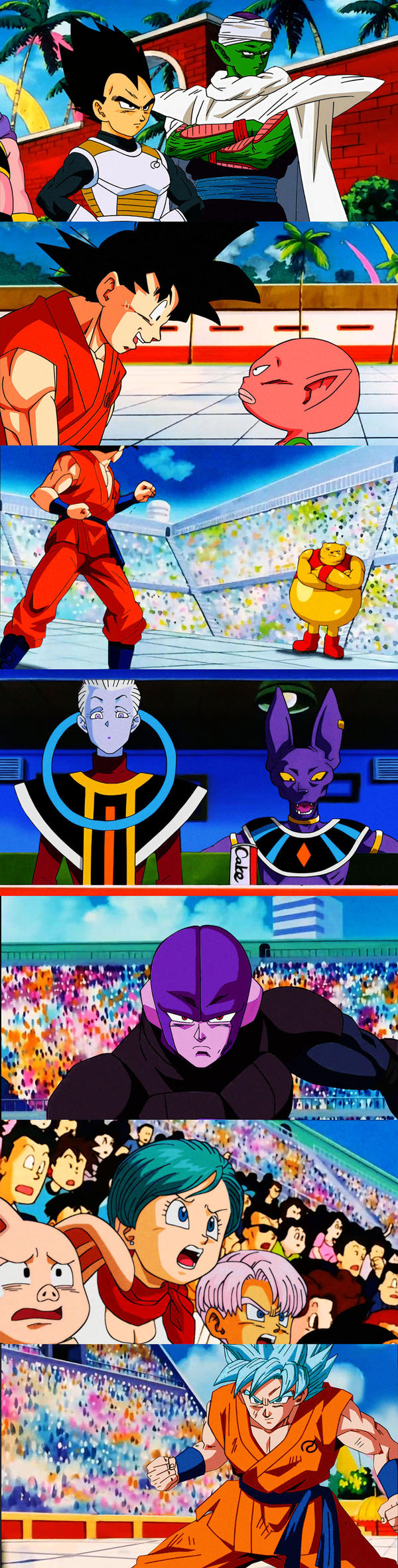 [/spoiler]
[spoiler]
[/spoiler]"Don't take pleasure in destruction!" / "I will not let you destroy my world!"
A true hero goes beyond not the limits of power, but the limits that divide countries and people.
A true hero goes beyond not the limits of power, but the limits that divide countries and people.
-
VegettoEX
- Kanzenshuu Co-Owner & Administrator
- Posts: 17547
- Joined: Sat Jan 10, 2004 3:10 pm
- Location: New Jersey
- Contact:
Re: If Super Looked More like Z...
These look absolutely nothing like Dragon Ball Z. Just as before, all I see are grossly over-saturated colors.
Did people only own the orange bricks and only own broken TV sets? I don't understand this at all.
Did people only own the orange bricks and only own broken TV sets? I don't understand this at all.
:: [| Mike "VegettoEX" LaBrie |] ::
:: [| Kanzenshuu - Co-Founder/Administrator, Podcast Host, News Manager (note: our "job" titles are arbitrary and meaningless) |] ::
:: [| Website: January 1998 |] :: [| Podcast: November 2005 |] :: [| Fusion: April 2012 |] :: [| Wiki: 20XX |] ::
:: [| Kanzenshuu - Co-Founder/Administrator, Podcast Host, News Manager (note: our "job" titles are arbitrary and meaningless) |] ::
:: [| Website: January 1998 |] :: [| Podcast: November 2005 |] :: [| Fusion: April 2012 |] :: [| Wiki: 20XX |] ::
-
Luso Saiyan

- Advanced Regular
- Posts: 1479
- Joined: Wed Sep 25, 2013 10:33 am
- Location: Portugal
Re: If Super Looked More like Z...
This joke (probably originated from false perceptions, misinformation, etc) has gone way too far to the point where it's influencing current official content.