The way I see it...
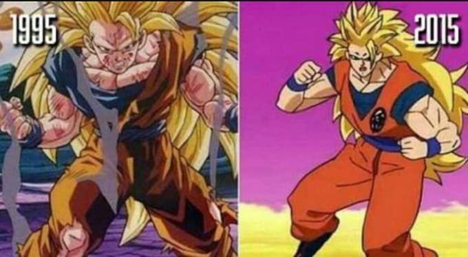
Old artstyle - great detail, but somewhat static (pan shots, not too much movement)
New artstyle - lots of motion and intensity, but at times awful artwork.
Old artstyle vs New Artstyle 2.0
Moderators: General Help, Kanzenshuu Staff
-
DragonBallFoodie
- Advanced Regular
- Posts: 1371
- Joined: Tue Jun 28, 2016 5:12 pm
- Location: Zambia, Southern Africa
Re: Old artstyle vs New Artstyle 2.0
"Don't take pleasure in destruction!" / "I will not let you destroy my world!"
A true hero goes beyond not the limits of power, but the limits that divide countries and people.
A true hero goes beyond not the limits of power, but the limits that divide countries and people.
-
JazzMazz
- I Live Here
- Posts: 2217
- Joined: Thu Nov 03, 2016 7:28 am
- Location: Mordor, the Borg cube and Voldemort's lair all at the same time in the year 199X

Re: Old artstyle vs New Artstyle 2.0
Why would the designs suddenly become unfitting for a specific type of technology? I don't understand this point.Kokonoe wrote:Older artstyle is better for cel art, newer artstyle is better for digital.
In what way is the artwork awful?DragonBallFoodie wrote:The way I see it...
Old artstyle - great detail, but somewhat static (pan shots, not too much movement)
New artstyle - lots of motion and intensity, but at times awful artwork.

Re: Old artstyle vs New Artstyle 2.0
Because the shading in digital art always tends to be brighter and lacks all the detail hand drawn cel art had. This plays up the strong points of digital while the older style works better for cel art because it can pull off the detail without looking plasticy or shiny.JazzMazz wrote:Why would the designs suddenly become unfitting for a specific type of technology? I don't understand this point.Kokonoe wrote:Older artstyle is better for cel art, newer artstyle is better for digital.
!! -- Donate to Planned Parenthood -- !!
-
DragonBallFoodie
- Advanced Regular
- Posts: 1371
- Joined: Tue Jun 28, 2016 5:12 pm
- Location: Zambia, Southern Africa
Re: Old artstyle vs New Artstyle 2.0
I said at times. Remember how DBS had some terrible animation?JazzMazz wrote:In what way is the artwork awful?
They've improved since then, especially with Shintani on board. But still, there's a balance between detail and motion that I think early/current DB animation has trouble maintaining.
Last edited by DragonBallFoodie on Sat Jul 21, 2018 11:15 am, edited 1 time in total.
"Don't take pleasure in destruction!" / "I will not let you destroy my world!"
A true hero goes beyond not the limits of power, but the limits that divide countries and people.
A true hero goes beyond not the limits of power, but the limits that divide countries and people.
-
BakaManiaHD
- Beyond Newbie
- Posts: 223
- Joined: Thu Jun 30, 2016 12:57 am
- Location: France
Re: Old artstyle vs New Artstyle 2.0
Looks like someone is stuck in the 2015 mentalityDragonBallFoodie wrote:I said at times. Remember how DBS had some terrible animation?JazzMazz wrote:In what way is the artwork awful?
[spoiler]
Last edited by BakaManiaHD on Sat Jul 21, 2018 11:03 am, edited 1 time in total.
kill me
-
Akuma Johnson
- Newbie
- Posts: 19
- Joined: Sun Jun 18, 2017 1:28 am
- Location: Location
- Contact:

Re: Old artstyle vs New Artstyle 2.0
I can't tell if you're joking or you're actually serious.DragonBallFoodie wrote:I said at times. Remember how DBS had some terrible animation?JazzMazz wrote:In what way is the artwork awful?
[spoiler]
Dragon Ball sucks lmao
Discord username (with tag) - Razius#2781
Discord username (with tag) - Razius#2781
-
Attitudefan

- I Live Here
- Posts: 2963
- Joined: Tue Aug 03, 2010 9:51 pm
- Location: Canada
Re: Old artstyle vs New Artstyle 2.0
Well the new design of Vegeta, released in the trailer, he looks straight out of the early Cyborg arc. The big forehead is back too which I like!! But some of the close-ups in the trailer of Vegeta remind me of some of his close-ups in the first Broly film. It was interesting to see.
Goku's base form looks much closer to the Freeza arc.
Shots in the trailer either look way more detailed than the character reference sheets or roughly the same. It reminds me more of how old Dragon Ball differed between the shots of different artists. I feel like they are really trying to capture that old style. Hell, in the poster, the shading has a slight delineation of the 2 tone colours for the shading of colour, similar to how cels look when they are painted between two tones. So it really tells me they are going for that old school aesthetic. I like the new direction a lot. It does fit better with the original series but contrasts heavily to Super.
My favourite art style (and animation) outside Toriyama who worked on Dragon Ball: Katsuyoshi Nakatsuru, Masaki Satō, Minoru Maeda, Takeo Ide, Hisashi Eguchi, Katsumi Aoshima, Tomekichi Takeuchi, Masahiro Shimanuki, Kazuya Hisada

Re: Old artstyle vs New Artstyle 2.0
Shintani's art style looks ok, but some of the faces look kind of off at times for me, like the entire clip in the trailer of Goku talking with Whis.
Now Takahashi's take with the new style is absolutely beautiful. It's exactly how I feel Dragon Ball should look nowadays. Bless that man and his art...
Now Takahashi's take with the new style is absolutely beautiful. It's exactly how I feel Dragon Ball should look nowadays. Bless that man and his art...
"I can't increase my ability through some kind of noisy transformation the way Frost and you Saiyans do. If I wanna become more lethal, I don't have the luxury of cutting corners, I just have to do it the old-fashioned way.
Combat is craft. What matters most is not raw power, but the skill by which you hone it."
Combat is craft. What matters most is not raw power, but the skill by which you hone it."
-
Attitudefan
- I Live Here
- Posts: 2963
- Joined: Tue Aug 03, 2010 9:51 pm
- Location: Canada
Re: Old artstyle vs New Artstyle 2.0
I think people are just so used to the rigidity of the old designs, that when seeing this change, people are not used to it and have a negative reaction. Turn the characters into silhouette's and you will see Shintani's designs absolutely have a better understanding of anatomy. I feel that if the Saiyan arc's style came out after the Buu arc today, people would be negative towards it too: "Oh man, they have such round eyes and thin faces! Where are the big chins and noses with lego hair?!? Why do the characters have collarbones!?! Why is Vegeta so small and chubby looking???"Logania wrote:Shintani's art style looks ok, but some of the faces look kind of off at times for me, like the entire clip in the trailer of Goku talking with Whis.
Now Takahashi's take with the new style is absolutely beautiful. It's exactly how I feel Dragon Ball should look nowadays. Bless that man and his art...
My point is that different style isn't bad, it is just contrasts to the status quo (that being Yamamuro). Shintani's designs are very friendly to drawings that are in lots of motion.
One thing I miss greatly from the pre-Cyborg arc days are exaggerated features. I love seeing characters, under duress, have their mouths and eyes become very large and cartoony. Something that was lost during Yamamuro's period because everything always had to be so stiff and "perfect". Hence, why the line art was so uniform during Super (and even the Budokai openings back in 2002).
My favourite art style (and animation) outside Toriyama who worked on Dragon Ball: Katsuyoshi Nakatsuru, Masaki Satō, Minoru Maeda, Takeo Ide, Hisashi Eguchi, Katsumi Aoshima, Tomekichi Takeuchi, Masahiro Shimanuki, Kazuya Hisada
-
JazzMazz
- I Live Here
- Posts: 2217
- Joined: Thu Nov 03, 2016 7:28 am
- Location: Mordor, the Borg cube and Voldemort's lair all at the same time in the year 199X
Re: Old artstyle vs New Artstyle 2.0
None of what you said is necessarily true at all though. You can still have incredibly detailed digital animation, just as you can have incredibly loose hand drawn animation. You can also have incredibly muted and dark colouring in digital, and incredibly light or muted colours in cell animation. The medium the animation is created on doesn't really affect the actual animation being produced is my main point. The only difference between digital animation and cell animation, is that one is drawn on tablets, the other on paper. It doesn't really impact the visuals themselves at all.Kokonoe wrote:Because the shading in digital art always tends to be brighter and lacks all the detail hand drawn cel art had. This plays up the strong points of digital while the older style works better for cel art because it can pull off the detail without looking plasticy or shiny.JazzMazz wrote:Why would the designs suddenly become unfitting for a specific type of technology? I don't understand this point.Kokonoe wrote:Older artstyle is better for cel art, newer artstyle is better for digital.
-
JazzMazz
- I Live Here
- Posts: 2217
- Joined: Thu Nov 03, 2016 7:28 am
- Location: Mordor, the Borg cube and Voldemort's lair all at the same time in the year 199X
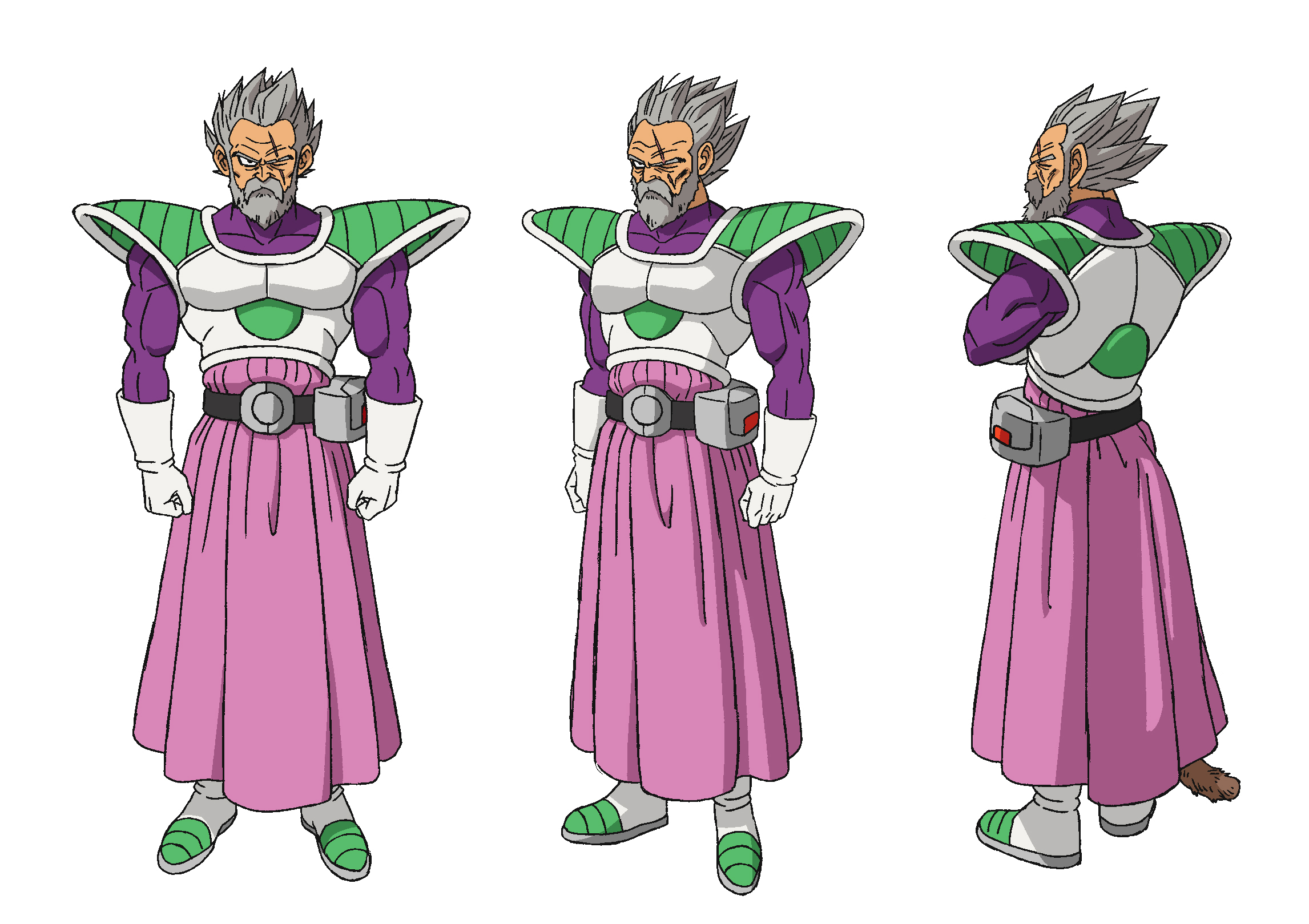
Re: Old artstyle vs New Artstyle 2.0
Here are some high quality versions of the character designs for Broly, Cheelai, Vegeta, Goku and Paragus as well as the HD version of the previously shown stickers.
[spoiler]


 [/spoiler]
Have to say, like the SSG designs for both characters, I like how Shintani has intentionally gone for a softer approach when drawing their faces, and I think it shows in that shot of SSG Goku in the trailer.
What do people feel about these new designs?
[spoiler]
[/spoiler]Have to say, like the SSG designs for both characters, I like how Shintani has intentionally gone for a softer approach when drawing their faces, and I think it shows in that shot of SSG Goku in the trailer.
What do people feel about these new designs?
Re: Old artstyle vs New Artstyle 2.0
I disagree with this because I have yet to find a single anime or cartoon that gets anywhere near the level of shading and detail that cel art.JazzMazz wrote:None of what you said is necessarily true at all though. You can still have incredibly detailed digital animation, just as you can have incredibly loose hand drawn animation. You can also have incredibly muted and dark colouring in digital, and incredibly light or muted colours in cell animation. The medium the animation is created on doesn't really affect the actual animation being produced is my main point. The only difference between digital animation and cell animation, is that one is drawn on tablets, the other on paper. It doesn't really impact the visuals themselves at all.Kokonoe wrote:Because the shading in digital art always tends to be brighter and lacks all the detail hand drawn cel art had. This plays up the strong points of digital while the older style works better for cel art because it can pull off the detail without looking plasticy or shiny.JazzMazz wrote: Why would the designs suddenly become unfitting for a specific type of technology? I don't understand this point.
In my experience when looking at Super they are trying to do all these things to emulate the old cel art look and it...always looks off, it's too shiny on their muscles and hair, or just too bright.
Stuff like this you just won't see in digital art.

In comparison this is much more brighter and lacks the shading that cel art would bring.

!! -- Donate to Planned Parenthood -- !!
-
JazzMazz
- I Live Here
- Posts: 2217
- Joined: Thu Nov 03, 2016 7:28 am
- Location: Mordor, the Borg cube and Voldemort's lair all at the same time in the year 199X
Re: Old artstyle vs New Artstyle 2.0
For reference, you know Super was still a Cel drawn production right?Kokonoe wrote:I disagree with this because I have yet to find a single anime or cartoon that gets anywhere near the level of shading and detail that cel art.JazzMazz wrote:None of what you said is necessarily true at all though. You can still have incredibly detailed digital animation, just as you can have incredibly loose hand drawn animation. You can also have incredibly muted and dark colouring in digital, and incredibly light or muted colours in cell animation. The medium the animation is created on doesn't really affect the actual animation being produced is my main point. The only difference between digital animation and cell animation, is that one is drawn on tablets, the other on paper. It doesn't really impact the visuals themselves at all.Kokonoe wrote: Because the shading in digital art always tends to be brighter and lacks all the detail hand drawn cel art had. This plays up the strong points of digital while the older style works better for cel art because it can pull off the detail without looking plasticy or shiny.
In my experience when looking at Super they are trying to do all these things to emulate the old cel art look and it...always looks off, it's too shiny on their muscles and hair, or just too bright.
Stuff like this you just won't see in digital art.
In comparison this is much more brighter and lacks the shading that cel art would bring.
-
Captain-Sora

- Regular
- Posts: 538
- Joined: Fri Sep 19, 2008 10:22 am
- Location: Earth
Re: Old artstyle vs New Artstyle 2.0
That doesn't mean it can't be done, it just means most studios are opting to go for those brighter color palettes because it's more appealing to younger audiences. You can easily have a muted color scheme and darker shadows in digitally colored art if you so desired. There's nothing stopping you from doing so. As for the level of detail, that obviously has little to do with the medium utilized, since it's up to the artist to draw in those details in the first place. What affects that has more to do with both skill and time.Kokonoe wrote:I disagree with this because I have yet to find a single anime or cartoon that gets anywhere near the level of shading and detail that cel art.
-
Baggie_Saiyan

- Namekian Warrior
- Posts: 10283
- Joined: Sat Mar 30, 2013 5:22 pm
- Location: Atlantis.
Re: Old artstyle vs New Artstyle 2.0
There is no way SSG Vegeta would have worked in the old style, that fan art ages back of SSG Vegeta Yamamuro style was horrendous, doubt the proper thing would have been better.
-
KBABZ

- Born 'n Bred Here
- Posts: 5180
- Joined: Sun Feb 26, 2017 9:38 pm
- Location: The tallest tower in West City
Re: Old artstyle vs New Artstyle 2.0
Interesting, Broly can go stock Super Saiyan! I also noticed something in Broly's normal-form sheets; he initially has an older style of boot that matches what we see Vegeta wearing in the Saiyan/Namek arcs, then he switches to a style that looks like the "Neo" Frieza Force that we started seeing with RoF. Combined with the beat-up look, that to me suggests that Broly was lost somehow but has since recovered, or returned of his own accord. And while I can just tell that she'll be a minor Sorbet-type character, I quite like the look of the green girl.
This is also the first time I've seen Vegeta as a Super Saiyan God. Was that seen in Super?
Also does anyone know what the SAB on Goku and Vegeta's jackets stands for?
This is also the first time I've seen Vegeta as a Super Saiyan God. Was that seen in Super?
Also does anyone know what the SAB on Goku and Vegeta's jackets stands for?

Re: Old artstyle vs New Artstyle 2.0
It's hand drawn, but it most definitely does not use cels.JazzMazz wrote: For reference, you know Super was still a Cel drawn production right?
Follow me on Twitter for countless shitposts.
Deadtuber.
Deadtuber.
-
JazzMazz
- I Live Here
- Posts: 2217
- Joined: Thu Nov 03, 2016 7:28 am
- Location: Mordor, the Borg cube and Voldemort's lair all at the same time in the year 199X
Re: Old artstyle vs New Artstyle 2.0
Sorry for the misinformation.Ajay wrote:It's hand drawn, but it most definitely does not use cels.JazzMazz wrote: For reference, you know Super was still a Cel drawn production right?
Its still mostly on genga/douga sheets though.
-
MonkeyKing16
- Not-So-Newbie
- Posts: 72
- Joined: Sun May 08, 2016 6:47 pm
Re: Old artstyle vs New Artstyle 2.0
This is the first time we see Super Saiyan God Vegeta in animated form. It was first seen in Toyotaro's manga adaptation of the Goku Black arc.KBABZ wrote:Interesting, Broly can go stock Super Saiyan! I also noticed something in Broly's normal-form sheets; he initially has an older style of boot that matches what we see Vegeta wearing in the Saiyan/Namek arcs, then he switches to a style that looks like the "Neo" Frieza Force that we started seeing with RoF. Combined with the beat-up look, that to me suggests that Broly was lost somehow but has since recovered, or returned of his own accord. And while I can just tell that she'll be a minor Sorbet-type character, I quite like the look of the green girl.
This is also the first time I've seen Vegeta as a Super Saiyan God. Was that seen in Super?
Also does anyone know what the SAB on Goku and Vegeta's jackets stands for?

Re: Old artstyle vs New Artstyle 2.0
Have the Goku and Vegeta ones been released anywhere else or are they just cleaned up versions of the Comic Con photos? I'm trying to find bigger HQ versions lolJazzMazz wrote:Here are some high quality versions of the character designs for Broly, Cheelai, Vegeta, Goku and Paragus as well as the HD version of the previously shown stickers.
[spoiler]
Have to say, like the SSG designs for both characters, I like how Shintani has intentionally gone for a softer approach when drawing their faces, and I think it shows in that shot of SSG Goku in the trailer.
What do people feel about these new designs?
Yamcha: Do you remember the spell to release him - do you know all the words?
Bulma: Of course! I'm not gonna pull a Frieza and screw it up!
Master Roshi: Bulma, I think Frieza failed because he wore too many clothes!
Cold World (Fanfic)
"It ain't never too late to stop bein' a bitch." - Chad Lamont Butler
Bulma: Of course! I'm not gonna pull a Frieza and screw it up!
Master Roshi: Bulma, I think Frieza failed because he wore too many clothes!
Cold World (Fanfic)
"It ain't never too late to stop bein' a bitch." - Chad Lamont Butler