You haven't been sold before?Lord Beerus wrote:The new movie poster has absolutely sold me new artstyle Shintani has provided.
Old artstyle vs New Artstyle 2.0
Moderators: General Help, Kanzenshuu Staff
-
majinwarman

- I'm, pretty, cozy, here...
- Posts: 1698
- Joined: Mon Dec 12, 2016 11:50 pm
- Location: Freeza Planet 1
Re: Old artstyle vs New Artstyle 2.0
Majinwarman
So I'm 'evil', huh? Interesting."
A world without Dragon Ball is just meh.
So I'm 'evil', huh? Interesting."
A world without Dragon Ball is just meh.
-
KBABZ

- Born 'n Bred Here
- Posts: 5180
- Joined: Sun Feb 26, 2017 9:38 pm
- Location: The tallest tower in West City
Re: Old artstyle vs New Artstyle 2.0
There's "sold" and then there's "absolutely sold"!majinwarman wrote:You haven't been sold before?Lord Beerus wrote:The new movie poster has absolutely sold me new artstyle Shintani has provided.
-
Lupin Vegeta

- Newbie
- Posts: 28
- Joined: Sat Nov 25, 2017 12:52 am
- Location: Canada
Re: Old artstyle vs New Artstyle 2.0
Still don't think Shintani has Goku's face 100% down but the new poster is promising.
-
majinwarman
- I'm, pretty, cozy, here...
- Posts: 1698
- Joined: Mon Dec 12, 2016 11:50 pm
- Location: Freeza Planet 1
Re: Old artstyle vs New Artstyle 2.0
I understand now. Thank you.KBABZ wrote:There's "sold" and then there's "absolutely sold"!majinwarman wrote:You haven't been sold before?Lord Beerus wrote:The new movie poster has absolutely sold me new artstyle Shintani has provided.
Majinwarman
So I'm 'evil', huh? Interesting."
A world without Dragon Ball is just meh.
So I'm 'evil', huh? Interesting."
A world without Dragon Ball is just meh.
-
JazzMazz
- I Live Here
- Posts: 2217
- Joined: Thu Nov 03, 2016 7:28 am
- Location: Mordor, the Borg cube and Voldemort's lair all at the same time in the year 199X

Re: Old artstyle vs New Artstyle 2.0
New Broly design dropper, or at least, the 3/4 perspective.
[spoiler]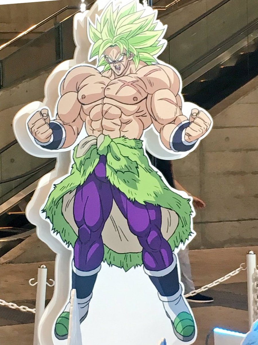 [/spoiler]
[spoiler]Sticker reveal
 [/spoiler]
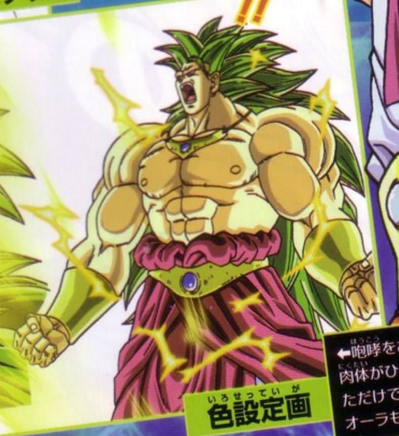
Despite not being a big fan of the double green, I think the green they used here is far better than the green found in the awfully pixelated stickers we saw earlier. Feels far more muted, and more in line with Broly's original hair colour.
His not quite as buff as his original character design, but I think that benefits the design here.
[spoiler] [/spoiler]
Will say that this Broly design is still miles better than Yamamuro's attempts at Broly, or Broly like characters in the modern era.
[spoiler]
 [/spoiler]
What do people think?
[spoiler]
[/spoiler][spoiler]Sticker reveal
[/spoiler]Despite not being a big fan of the double green, I think the green they used here is far better than the green found in the awfully pixelated stickers we saw earlier. Feels far more muted, and more in line with Broly's original hair colour.
His not quite as buff as his original character design, but I think that benefits the design here.
[spoiler]
[/spoiler]Will say that this Broly design is still miles better than Yamamuro's attempts at Broly, or Broly like characters in the modern era.
[spoiler]
[/spoiler]What do people think?
Last edited by JazzMazz on Mon Jul 16, 2018 3:05 am, edited 1 time in total.
-
KBABZ
- Born 'n Bred Here
- Posts: 5180
- Joined: Sun Feb 26, 2017 9:38 pm
- Location: The tallest tower in West City
Re: Old artstyle vs New Artstyle 2.0
I like how he's wearing a skinned Star Wars rabbit for a skirt now.
-
Baggie_Saiyan

- Namekian Warrior
- Posts: 10283
- Joined: Sat Mar 30, 2013 5:22 pm
- Location: Atlantis.
Re: Old artstyle vs New Artstyle 2.0
I don't think Kale was too bad a design the bottom though... yeah doesn't look too great.JazzMazz wrote:New Broly design dropper, or at least, the 3/4 perspective.
[spoiler]
[spoiler]Sticker reveal
Despite not being a big fan of the double green, I think the green they used here is far better than the green found in the awfully pixelated stickers we saw earlier. Feels far more muted, and more in line with Broly's original hair colour.
His not quite as buff as his original character design, but I think that benefits the design here.
[spoiler]
Will say that this Broly design is still miles better than Yamamuro's attempts at Broly, or Broly like characters in the modern era.
[spoiler]
What do people think?
I still would have preferred less buff on the new design it still comes across as sort of silly looking not as silly as that SS3 Broly though lol But other than that I like it. Do love the green on the hair too.
-
KBABZ
- Born 'n Bred Here
- Posts: 5180
- Joined: Sun Feb 26, 2017 9:38 pm
- Location: The tallest tower in West City
Re: Old artstyle vs New Artstyle 2.0
It goes against what typically defines a powerful Dragon Ball character, which is someone who doesn't LOOK that strong until they bash your face in. Vegeta, Frieza, Cell and Buu all have this and it's directly pointed out by the characters (Piccolo has this too to some extent). Broly has this to a certain extent with his meeker form, but that practically disappears completely after he transforms in the first film.Baggie_Saiyan wrote:I still would have preferred less buff on the new design it still comes across as sort of silly looking not as silly as that SS3 Broly though lol But other than that I like it. Do love the green on the hair too.

Re: Old artstyle vs New Artstyle 2.0
It was never pointed out that Cell didn’t look strong. Broly looks strong but so looked Tenshinan, Hit and Jiren, and those were main rivals of Goku in their respective arcs. Sure, those were tournaments but it’s not like DB villains must always look weak.KBABZ wrote:It goes against what typically defines a powerful Dragon Ball character, which is someone who doesn't LOOK that strong until they bash your face in. Vegeta, Frieza, Cell and Buu all have this and it's directly pointed out by the characters (Piccolo has this too to some extent). Broly has this to a certain extent with his meeker form, but that practically disappears completely after he transforms in the first film.Baggie_Saiyan wrote:I still would have preferred less buff on the new design it still comes across as sort of silly looking not as silly as that SS3 Broly though lol But other than that I like it. Do love the green on the hair too.
悟 “Vincit qui se vincit”
What I consider canonical
What I consider canonical
Spoiler:
-
BlueBasilisk

- I Live Here
- Posts: 3062
- Joined: Sun Feb 05, 2017 11:58 am
Re: Old artstyle vs New Artstyle 2.0
I think the other designs are fine, the issue is Yamamuro's questionable art and anatomy. If you got Shintani or someone else to draw them in the new style they'd probably look really good too.JazzMazz wrote:New Broly design dropper, or at least, the 3/4 perspective.
[spoiler]
[spoiler]Sticker reveal
Despite not being a big fan of the double green, I think the green they used here is far better than the green found in the awfully pixelated stickers we saw earlier. Feels far more muted, and more in line with Broly's original hair colour.
His not quite as buff as his original character design, but I think that benefits the design here.
[spoiler]
Will say that this Broly design is still miles better than Yamamuro's attempts at Broly, or Broly like characters in the modern era.
[spoiler]
What do people think?
Re: Old artstyle vs New Artstyle 2.0
Does anyone think Shintani will work on the series once it returns or does he just work on movies ?
July 9th 2018 will be remembered as the day Broly became canon.
-
Baggie_Saiyan
- Namekian Warrior
- Posts: 10283
- Joined: Sat Mar 30, 2013 5:22 pm
- Location: Atlantis.
Re: Old artstyle vs New Artstyle 2.0
Jiren seemed a break from his normal conventions and now Broly. I kinda liked BoG when we had a scrawny cat and a SSG transformation that made you skinny! So Toriyama and so Dragon Ball!KBABZ wrote:It goes against what typically defines a powerful Dragon Ball character, which is someone who doesn't LOOK that strong until they bash your face in. Vegeta, Frieza, Cell and Buu all have this and it's directly pointed out by the characters (Piccolo has this too to some extent). Broly has this to a certain extent with his meeker form, but that practically disappears completely after he transforms in the first film.Baggie_Saiyan wrote:I still would have preferred less buff on the new design it still comes across as sort of silly looking not as silly as that SS3 Broly though lol But other than that I like it. Do love the green on the hair too.
Worse comes to worse they can re-use his designs while appointing someone similar in case new designs need to be done. I dunno if stuff like that is common in the industry but don't see why they can't do that.sintzu wrote:Does anyone think Shintani will work on the series once it returns or does he just work on movies ?

Re: Old artstyle vs New Artstyle 2.0
You should do what i do. I just pretend that they look as young as they do because of their energy levels. Because of these high levels of energy, they keep their body from aging as quickly as normal people. I wish Akira Toriyama would just come out and say this, that way we would never need to worry about the characters aging againLordCrumb wrote:For me personally it is. I like character/story/arc progression. I want to see characters age rather than making them look younger just for the sake of being able to continue with countless series/movies/spinoffs.JazzMazz wrote: However, I still fail to see how them looking younger is necessarily a bad thing.
-
TheZFighter

- Regular
- Posts: 538
- Joined: Thu Sep 18, 2014 9:40 am
Re: Old artstyle vs New Artstyle 2.0
I much prefer new-Broly. He looks really good, particularly in his base form.
Z-Fighters fan.
Goku, Yamcha, Krillin, Tien, Chiaotzu, Yajirobe, Gohan, Piccolo, Vegeta, Future Trunks, Android 18, Goten, Trunks and Majin Buu.
Goku, Yamcha, Krillin, Tien, Chiaotzu, Yajirobe, Gohan, Piccolo, Vegeta, Future Trunks, Android 18, Goten, Trunks and Majin Buu.

Re: Old artstyle vs New Artstyle 2.0
Well, that new trailer sold me on the new artstyle. It's definitely improved from that brief teaser we got earlier this year
Looking for these rare items/information:
Any information or recordings pertaining to Dragon Ball Z's syndicated run on WAWB
Any information regarding the stations that carried the origin Dragon Ball in the USA
Dragon Box (any deals would be nice)
Shonen Jumps with Dragon Ball in them
Any information or recordings pertaining to Dragon Ball Z's syndicated run on WAWB
Any information regarding the stations that carried the origin Dragon Ball in the USA
Dragon Box (any deals would be nice)
Shonen Jumps with Dragon Ball in them
-
TheGreatness25
- I Live Here
- Posts: 4928
- Joined: Fri Oct 19, 2007 9:36 am

Re: Old artstyle vs New Artstyle 2.0
Is the new animation just less angular than before? Is that what's making all the difference?

Re: Old artstyle vs New Artstyle 2.0
Older artstyle is better for cel art, newer artstyle is better for digital.
!! -- Donate to Planned Parenthood -- !!
Re: Old artstyle vs New Artstyle 2.0
The angular approach is pretty much gone in the default designs, yes. It's all rounder and softer. That's not to say you can't also draw it more angular, Yuya Takashi draws the stare downs Goku & Vegeta give Broly along with the part where Broly punches Vegeta through an ice cap and it still looks very good.TheGreatness25 wrote:Is the new animation just less angular than before? Is that what's making all the difference?
When someone tells you, "Don't present your opinion as fact," what they're actually saying is, "Don't present your opinion with any conviction. Because I don't like your opinion, and I want to be able to dismiss it as easily as possible." Don't fall for it.
How the Black Arc Should End (by Lightbing!):
How the Black Arc Should End (by Lightbing!):
Spoiler:
-
KBABZ
- Born 'n Bred Here
- Posts: 5180
- Joined: Sun Feb 26, 2017 9:38 pm
- Location: The tallest tower in West City
Re: Old artstyle vs New Artstyle 2.0
There are four things that I feel make this excel over most Super animations:gokaiblue wrote:Well, that new trailer sold me on the new artstyle. It's definitely improved from that brief teaser we got earlier this year
1) The lineart. There's a much more convincing "scratchy" look to the lines that is very reminiscent of the 80s and 90s content of the franchise.
2) The art style itself is a lot more stylized and fluid, compared to the rigid and geometric style I felt in what I saw of Super. For example, Broly and Vegeta's faces get stretched in their rage-out moments to accentuate their triangular eyes and the pitch of their eyebrows.
2) There are a lot more animation frames, although to be fair this is a higher-budget movie production.
3) In tandem with 2), there's a lot of secondary animation on things like hair and clothes that really sell a lot of the shots.
On the angular, I'm guessing this is referring to the hard corners seen in Super anims?
Re: Old artstyle vs New Artstyle 2.0
In addition to that, the lines are rounder and rougher, there are fewer lines (compare Gokuu's pants as drawn by Yamamuro to those drawn by Shintani) and the feature placement is closer to the comic. Since Shintani's models have less 'rules' to them it's less apparent when key animators intentionally draw off-model for the expressions and movements. This means that a key animator can either draw more lines than the character model (Takahashi Yuuya) or less (Tate Naoki) and the overall effect won't be as apparent.TheGreatness25 wrote:Is the new animation just less angular than before? Is that what's making all the difference?
The number of lines is really important in deciding how something moves and the amount of time it takes to create a cut. It's always best to start with simple character designs that the key animators can do with as they please, either adding or subtracting detail depending of what time they have to create or ideas they have for a shot. If the drawings are simple then a good key animator who wants to make something top-notch will have more time to draw extra frames to improve the movement. Even then, it's not like detail is being 'lost' by using simple drawings. Instead of spending their time and energy on a single drawing they spread it across more drawings so that the movement itself is detailed. Pocket Monster: Sun & Moon has seen this a lot because the animators are able to give facial expressions more detail in their movement as well as other character movement that wouldn't be possible otherwise.
She/Her
progesterone princess, estradiol empress
bisexual milf
progesterone princess, estradiol empress
bisexual milf