Good job spinning my words using perfectly sculpted warrior into a friggin statue which according to you stays still, cant move & literally do nothin! Wow!emperior wrote:I'm not speaking on Toriyama's behalf, I'm just quoting his own words. http://www.kanzenshuu.com/translations/ ... t-edition/Vijay wrote: Bro, I can see the difference real fine & it was the very reason behind you replyin me
C'mon. You speak on Toriyama's behalf as his mouthpiece claiming he wants his character to looks simple....
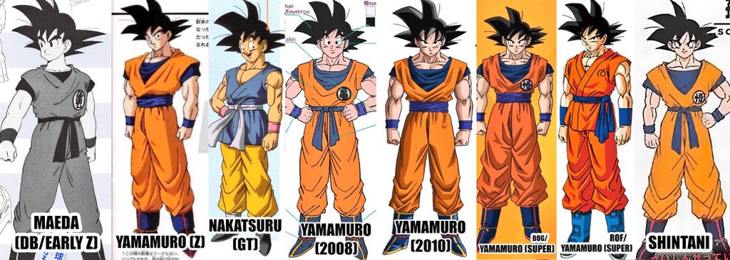
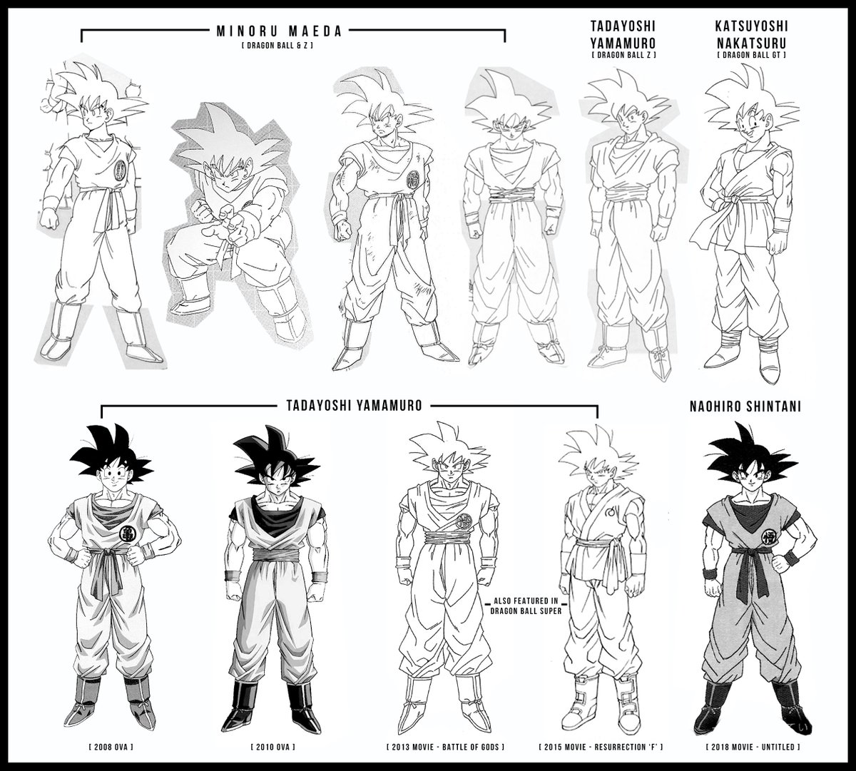
Which isnt true. Toriyama's artsyle changed drastically over the course of time with his abandoning rounded, overarching style of early DB-era into sharper, bold & defined artstyle as of Frieza Saga onwards, becoming strikingly evident in Cell & Boo Arc
As I said, 90's era is 90's era. Not post Boo/GT/BOG/Super/ROF era.
Something even Toriyama realized back in 90's hence opted to adapt himself with much sharper & angular designs that emphasizes on facial expressions, hair bangs/strands, biceps/triceps & even chi blasts that becamed significantly detailed. Take a look at 21st TB Goku's Kamehameha to 20X Kaioken Kamehameha in Frieza Arc. Holy crap...talk about the artistic progression
Even 90's era have much sophisticated & intricate character designs whenever Masaki Sato, Shinamuki & Hizada Kazuya were providing key-animations.
Just look at 2 Goku designs you've posted & you tell me which one looks like a fighter. I could ask you one better. Which one is the Goku you've watched past 20 years, grown to love & wish to see in action?
A perfectly sculpted, charming & confident right one?
Or timid, lanky dude who looks right off the bat doomed to fly several meters away when even sneezed by Yamoshi/foe on the left?
As I said, this is not bout preferences. Its about the level dedication & emphasize on arts as well as animation instead of sacrificing former for the sake of latter
In fact, I'd understand if its lack of budget on TOEI behalf as they're bout to recover frm financial crisis pre-Kai era
Its revival of sorts for DragonBall franchise & TOEI after gigantic box office smash of BOG & ROF
Hence, there should be no compromises whatsoever when it boils down to art department
Read it for yourself.
Toriyama's art got more and more angular to emphasize speed, true, but I never claimed otherwise so go back and re-read my post too.
It's also not like these designs are incredibly round, and even if they were animators could always draw the characters more angular if that gives a better sense of speed in a battle.
As for your question, I will tell you that to me the one who looks like a fighter is the one with the correct posture, correct body proportions and relaxed look. The one wearing the orange gi, you know. That's what a martial artist looks like, unlike the incredibly stiff guy wearing a counterfeit red gi and a glued-in hair wig that resembles Goku's hair if it weren't for those highlights and the fourth bang on the left-side. Also the one who looks like he would take a few seconds to move his rigid body around, the one who actually looks lanky. You said it right: perfectly sculpted. Like a damn statue. And what do statues do? Nothing. They stay still, they can't move.
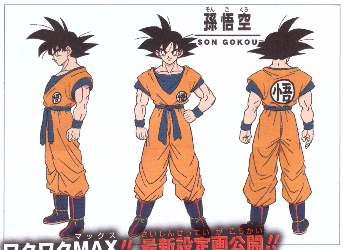
Shintani's Goku gives out the exact idea of Goku without even speaking or moving. He looks confident yet naive. He looks mobile, flexible and relaxed, as Goku typically is, but he still gives out the idea of the dude who can move at lighting fast speeds in a instant and fuck you up with a flurry of punches and kicks you wouldn't see.
And please, stop writing such uninformed bullshit such as the designs being this way because of low budget. There's no compromise in art. We got these kind of designs because the frigging creator of the serie wanted them to be like this, and he personally chose Shintani to deliver them.
There's a difference between an illustration & animation
You use a poster to gauge its fluidity.
Dats like using Tom Cruise's First Look Poster of MI: Fallout to predict its final act
I commented Shintani's lack of attention to Goku's facial texture, shadings, muscle tone, body weight proportion & overall aesthetic appeal
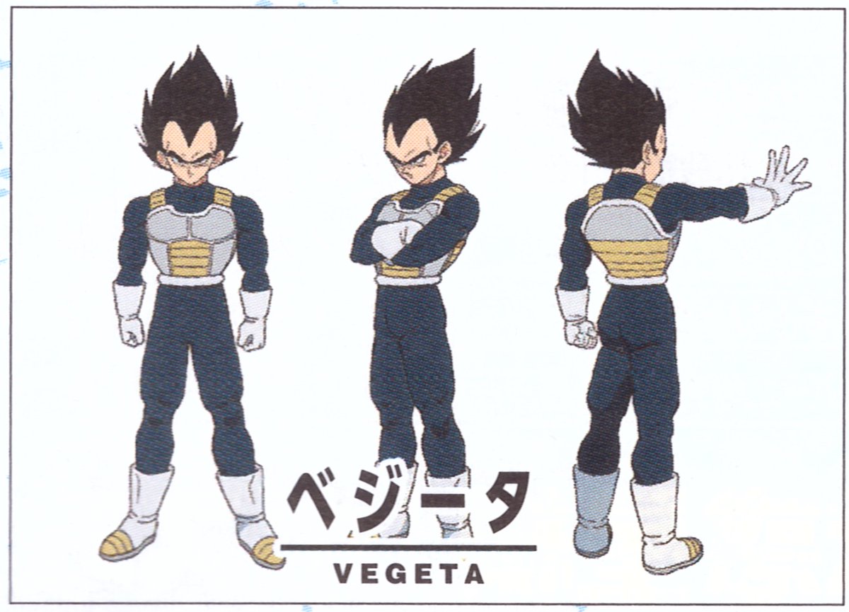
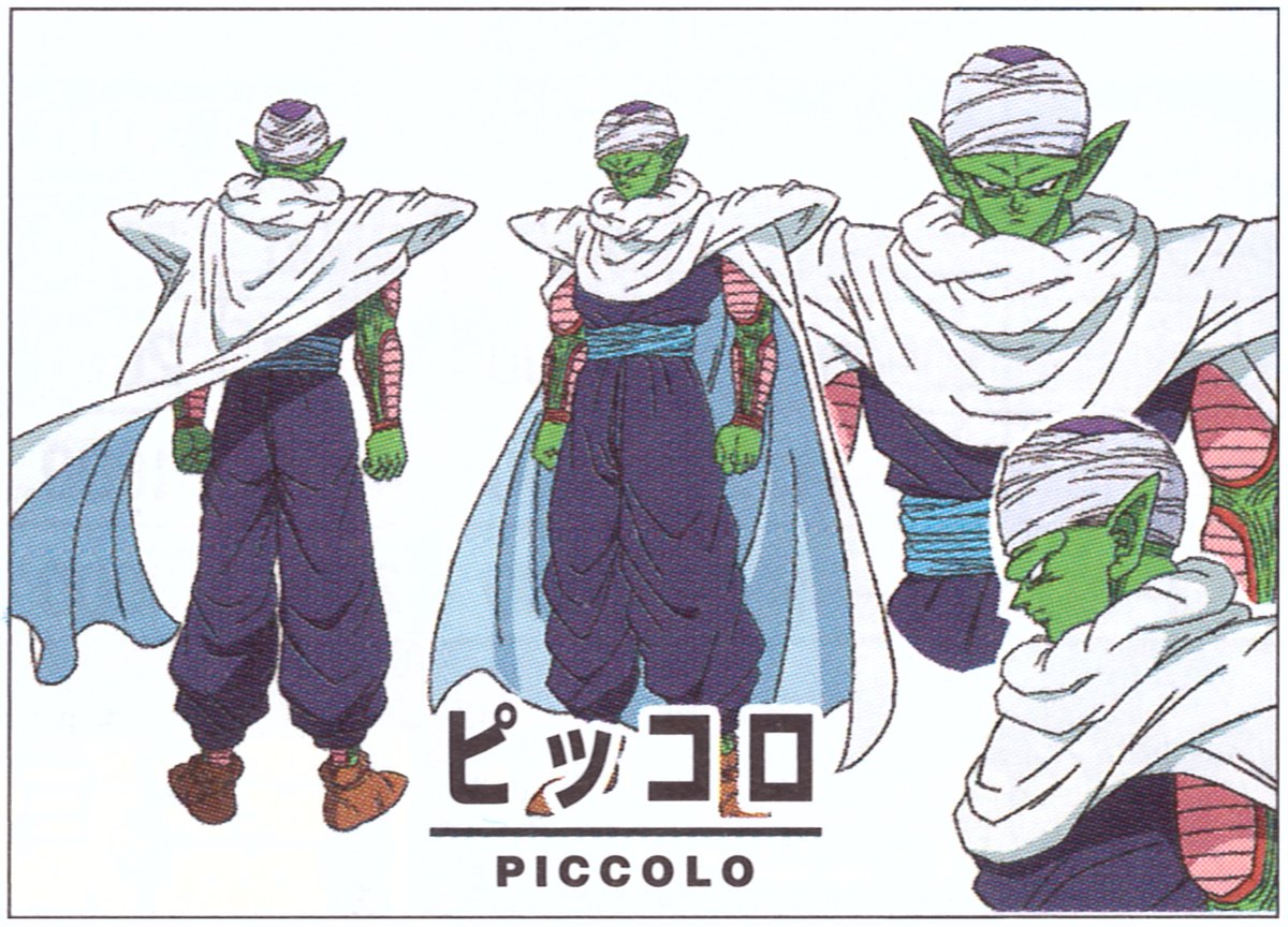
While Yamamuro's Z & ROF work were visually attractive & gives an edgy, badass impression everything right from the facial expression, muscle mass, shades, weight & posture.
Peace


 [/spoiler]


 [/spoiler]


 [/spoiler]
 [/spoiler]

 [/spoiler]