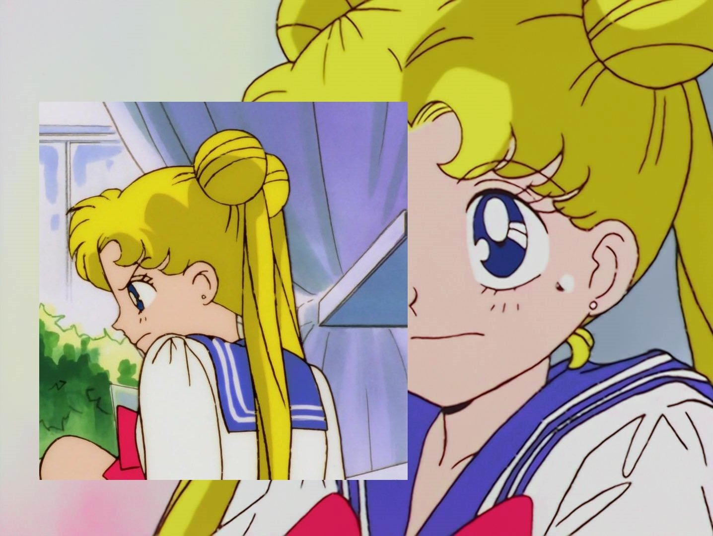
Educate yourself on what is a color cast as if your white have a tint (like there is and unlike you i gave evidence of that) THEN you have a color cast (as the tint don't affect only the white) so no it's not a "superior" job
Please educate yourself on what average delta E is, I'm getting of tire of your ignorance. And by the way, there is no color cast in my sailor moon match, every color was matched except the white patch being a little off.
it's not cause you match your references that it make the result worth or better if the references is tinted all i point is that dbox aren't screenshot, and if you were truly doing that superior things we already have seen something worth but....NOT
because it's YOUR OPINION (as long as you don't give the evidence on the supposed superiority, it's an opinion, words you said worth absolutely zero, when i said something i gave example unlike you) you are litterraly shit on others way but you don't even show where they are inferior.How is it disrespectful when saying one is better than the other? Old software will get outclass by newer software, it's the same thing for the color correction world. 3 way color corrector was superseded by gamma-gain-offset color corrector; the white balancing method using curve or levels was superseded by temperature and tint adjustment; selective color was superseded by AB grid; what is the problem? Stop being ignorant and stupid.
This sailor moon screenshot have tint so have a color cast (a color cast don't affect only the white color, i invite you to learn more about it)
(here a remind of how look your white colors) so affect more or less all colors

you have a delta value that mean you match your references and? it suck and won't work for every frame, no lut can adjust all colors value, saturation etc for all frame, they used one frame reference and apply them to the whole, so like i said you'll get something like that as a result if you used season set or bright cels
instead of keeping the details from the source
the last time i talked about this serious issue that will affect bright and dark scene, you used retarded explaination as energy should be bright bla bla bla, yes but not to the point destroying lines etc, try it and adjusting contrast etc after the lut will never revert the process
if you want this kind of result OK it's your taste but calling it superior when you show a tinted result and thinking that this kind of overbrightness is logical is just stupid
after you said "using the level set ones" okay but then it will be too darker as they are crushed in black , there is no reliable full sources (not as much cels as needed) that can used this method
you talked about xerox code but there's no clue that the xerox code for the anime should be allways okay, animators made some errors etc, you can't say 100% a thing is superior when you didn't even have made your things supposed superior working perfectly lossless.
if you are able to show a result that won't take forever to settle , don't have a color cast and neither destroy this kind of bright or dark area and automatically did everything scene by scene then i'll reconsider it being superior way to do but as long as you don't do anything in that way, it's just another way, neither superior, neither inferior, it just look like "how to color match a reference when you litterally know nothing into color correction", as you can't say something will work perfectly before being done, you open your mouth loudly, take people from really high but litterally only use no act, only words, big mouth, small dick like i said , this kind of provocation is to see if it's really words only like i now know it is.
that's why i wanted the challenge, show me where it's superior or just shut up . Someone that can't even gave solid evidence about what they said should close their mouth
and the result you show is totally not showing anything superior than what can be reach with another software, yours also have his own limit that i let you figured quickly cause a whole episode is not a simple screenshot and if you really did it with a brain (not the kind of stupid argument like "what is blown is supposed to be blown" -_-"
about the white balance there's others way to do like by rgb adjustment too , all method have his own advantage and their weakness
You talk a lot but you litterraly show nothing that's what bother me, a simple screenshot don't show nothing really superior , if your goal is not to have a white balance properly done then forget to color match, your result will need a white balance that will affect others colors anyway
why i never did a color correction is first cause of time lacking but i know that even a color matching couldn't be lossless either ,the way it work can perfectly fit some sources with the right references (but at least you can get the same result with others software as long as you know how to use them) but it's the dragon box topic, and dragon box is seriously irregular in all way about colors, brightness, etc
so once again show evidence or clue, stop talking uselessly SHOW IT!!!!!! OR FUCK YOU!!!!!!!!!!!!!! show that you have guts and take the challenge, all people here show how pathetical and stupid you are
SERIOUSLY!!!!!!!!!!!!? who show litterally no clue and no evidence? you show a pathetic screenshot with issue and you dare to called your shit "superior" they don't make sense cause you are too retarded to understand that's all, small dick with no gutsStop making things up when you are clueless about color matching program, none of that even make sense.
color grading by color matching consist into making your sources all colors turning into the same colors as the reference shot, all defined by a .lut created by matching programs that's why you need a reference shot AND a source shot, BUT in the dragon ball color correction thread (why i don't totally care about sailor moon it's out of topic as we talked about "color correcting the dragon box" and anyway yours don't even have a good white meaning that or your references or your way sucks (added to the judgement) )
The only "release" that you called "reliable" have overbrightness and crushed black, meaning that if you use it as reference , it will be also crushed black and overbright in the result if your references isn't properly white balanced like the season set, it won't be properly white balance in the result, it's pretty logical, and even by matching one image YOU SIMPLY CAN'T (at least until you show serious clues about i being wrong) said that the scene by scene matching won't blow out details in bright or dark area and have accurate white balanced in the result
You also have no clues that the xerox code applied to film footage and that all frames was having exactly the same colors, (animators made mistake etc)