What are the colors supposed to look like?
Moderators: General Help, Kanzenshuu Staff
What are the colors supposed to look like?
I'm kind of confused as to what the colors are actually supposed to look like. Why do the Dragon Boxes and Funimation releases look so different from each other? Of the many releases of the series which is the most accurate-looking colorwise?
"Like that bald punk? Killyin... You're talking about Killyin?!!" - Anime Labs
「他们並不是我孫兒... 是我弟弟。」 - 龜仙人
「他们並不是我孫兒... 是我弟弟。」 - 龜仙人

Re: What are the colors supposed to look like?
I would think that those who own the animation cells would be able to say for sure?
I've been watching the 'Ultimate Uncut Special Editions' the past few nights, and have to say I think those look damn good.
I've been watching the 'Ultimate Uncut Special Editions' the past few nights, and have to say I think those look damn good.
-
SaiyaJedi

- Kanzenshuu Co-Owner & Administrator
- Posts: 2387
- Joined: Sat Jan 10, 2004 11:24 pm
- Location: Osaka
- Contact:
Re: What are the colors supposed to look like?
Short [and jerk-ish] answer: the way they're supposed to.
Long answer: It's hard to say for certain. The Dragon Boxes were restored from the original film masters, but they made no effort to correct the natural color change that affects celluloid as it ages, so everything has a slightly yellowish/greenish tint. FUNimation's in-house releases instead attempt to clean up the masters they were given (often several generations removed from the original masters), and pump up the saturation and brightness (along with a significant blue shift) in order to mask film damage and age. And that's to say nothing of the anime vs. the original manga, which tended to be wildly inconsistent with itself.
Long answer: It's hard to say for certain. The Dragon Boxes were restored from the original film masters, but they made no effort to correct the natural color change that affects celluloid as it ages, so everything has a slightly yellowish/greenish tint. FUNimation's in-house releases instead attempt to clean up the masters they were given (often several generations removed from the original masters), and pump up the saturation and brightness (along with a significant blue shift) in order to mask film damage and age. And that's to say nothing of the anime vs. the original manga, which tended to be wildly inconsistent with itself.
Co-translator, Man-in-Japan, and Julian #1 at Kanzenshuu
最近、あんまし投稿してないねんけど、見てんで。いっつも見てる。
最近、あんまし投稿してないねんけど、見てんで。いっつも見てる。

Re: What are the colors supposed to look like?
^ The Blu-Rays look pretty close to what was aired on TV.
Visit DragonBallFigures for all your Dragon Ball figure info and needs!
MY HOLY GRAIL (110% Serious. Please sell me one)Mayuri Kurotsuchi wrote:"In this world, nothing perfect exists. It may be a cliche after all but it's the way things are. That's precisely why ordinary men pursue the concept of perfection, it's infatuation. But ultimately I have to ask myself "What is the true meaning of being perfect?" and the answer I came up with was nothing. Not one thing. The truth of the matter is I despise perfection! If something is truly perfect, that's IT! The bottom line becomes there is no room for imagination! No space for intelligence or ability or improvement! Do you understand? To men of science like us, perfection is a dead end, a condition of hopelessness. Always strive to be better than anything that came before you but not perfect! Scientist's agonize over the attempt to achieve perfection! That's the kind of creatures we are! We take joy in trying to exceed our grasp, in trying to reach for something that in the end, we have to admit may in fact be unreachable!"
Re: What are the colors supposed to look like?
Back in Japan? That would be hard to prove.Gonstead wrote:^ The Blu-Rays look pretty close to what was aired on TV.
-
theawesomepossum777

- Beyond Newbie
- Posts: 270
- Joined: Sat May 12, 2012 9:45 pm
Re: What are the colors supposed to look like?
Doesn't kei17 have some tapes of the original broadcast? If so, then it wouldn't be very hard to prove if we had some screens from it.Fulicer wrote:Back in Japan? That would be hard to prove.Gonstead wrote:^ The Blu-Rays look pretty close to what was aired on TV.

Re: What are the colors supposed to look like?
I actually read a review that talks about this.
I'm not necessarily saying that that makes it more or less accurate than the Dragon Boxes, but I think it is interesting to note.What's less factual and more a matter of opinion are the accuracy of the colors. FUNimation hasn't exactly been shy in calling the "Level" Blu-ray release the original director-approved color scheme, but how did they come to that conclusion without Daisuke Nishio's involvement? The answer Franko gives us is the existance of Telecine Analysis Film, essentially celluloid test patterns that give a colorist the Kodak-approved "official" range of color that should be available on the appropriate film stock. It's not a be-all end-all point of reference like, say, a director approved Answer Print or actually having the film makers themselves on hand to look the process over since all sorts of things can go wrong between shooting and the final product, but it's a substantially better starting point than letting Franko just eyeball it and make shit up on the fly, which, by the way, is exactly what they did five years ago.
Re: What are the colors supposed to look like?
Visit DragonBallFigures for all your Dragon Ball figure info and needs!
MY HOLY GRAIL (110% Serious. Please sell me one)Mayuri Kurotsuchi wrote:"In this world, nothing perfect exists. It may be a cliche after all but it's the way things are. That's precisely why ordinary men pursue the concept of perfection, it's infatuation. But ultimately I have to ask myself "What is the true meaning of being perfect?" and the answer I came up with was nothing. Not one thing. The truth of the matter is I despise perfection! If something is truly perfect, that's IT! The bottom line becomes there is no room for imagination! No space for intelligence or ability or improvement! Do you understand? To men of science like us, perfection is a dead end, a condition of hopelessness. Always strive to be better than anything that came before you but not perfect! Scientist's agonize over the attempt to achieve perfection! That's the kind of creatures we are! We take joy in trying to exceed our grasp, in trying to reach for something that in the end, we have to admit may in fact be unreachable!"
Re: What are the colors supposed to look like?
I still think it's a bit hand-wavy to try to compare screenshots of low-res VHS recordings from long ago to modern formats. Especially if the colors are represented in different ways on different formats. So I wonder if VHS in general does a good job of representing the colors from the original broadcasts. A lot of this probably has to do with chroma information and how accurately it is represented by that recording. There is information regarding VHS color resolution but I haven't found a page that does a comparison of VHS/digital for color information in relation to the original film stock.
You can only get so close to the "original" colors. You can probably guess based on VHS recordings or from the blog post linked by Pokewhiz (which btw, is an "adult" blog? there was a warning before I skimmed through it), but if you really pedantic about it then it will be hard figure out what the colors really were.
Not that I am opposed to color correction.
-
AnimeMaakuo
- Advanced Regular
- Posts: 1462
- Joined: Sun Aug 15, 2010 10:10 pm
.
.
Last edited by AnimeMaakuo on Fri Jul 26, 2013 3:20 am, edited 1 time in total.
My YouTube
Soppa Saiyjins from Dorgou Ballru Zetto is my favorite transformation everah, especially when Trounksoru did it in front of Seru and when Bejita did it when he faced Jingonigen-hachigo. But for real, I use the FUNi pronunciation. - Soppa Saia People
Soppa Saiyjins from Dorgou Ballru Zetto is my favorite transformation everah, especially when Trounksoru did it in front of Seru and when Bejita did it when he faced Jingonigen-hachigo. But for real, I use the FUNi pronunciation. - Soppa Saia People
Re: What are the colors supposed to look like?
The closest things are cel scans in official books I guess.AnimeMaakuo wrote:No one knows what the animators original intentions were. The closest thing we have to it are the Dragon Boxes.Thouser wrote:I'm kind of confused as to what the colors are actually supposed to look like. Why do the Dragon Boxes and Funimation releases look so different from each other? Of the many releases of the series which is the most accurate-looking colorwise?
Re: What are the colors supposed to look like?
But aren't even those too bright? I thought cels were colored knowing that they'd appear darker on film.kei17 wrote:The closest things are cel scans in official books I guess.AnimeMaakuo wrote:No one knows what the animators original intentions were. The closest thing we have to it are the Dragon Boxes.Thouser wrote:I'm kind of confused as to what the colors are actually supposed to look like. Why do the Dragon Boxes and Funimation releases look so different from each other? Of the many releases of the series which is the most accurate-looking colorwise?
DanielGClapp wrote:Every time my dad sees anything anime, he always say "When are these goddam Japs gonna learn how to draw?".
-
AnimeMaakuo
- Advanced Regular
- Posts: 1462
- Joined: Sun Aug 15, 2010 10:10 pm
.
.
Last edited by AnimeMaakuo on Fri Jul 26, 2013 3:20 am, edited 2 times in total.
My YouTube
Soppa Saiyjins from Dorgou Ballru Zetto is my favorite transformation everah, especially when Trounksoru did it in front of Seru and when Bejita did it when he faced Jingonigen-hachigo. But for real, I use the FUNi pronunciation. - Soppa Saia People
Soppa Saiyjins from Dorgou Ballru Zetto is my favorite transformation everah, especially when Trounksoru did it in front of Seru and when Bejita did it when he faced Jingonigen-hachigo. But for real, I use the FUNi pronunciation. - Soppa Saia People
-
TripleRach

- Moderator
- Posts: 2656
- Joined: Sat Jan 10, 2004 5:08 pm
- Location: Ohio, USA
- Contact:
Re: What are the colors supposed to look like?
I thought the consensus for the green sky issue in the Saiyan arc was that it was an intentional choice because the Sun was setting. Those episodes also feature a lot of pink sky below the greener portions.Toriyama-sama wrote:The green sky and the pink skin arguments are frequently brought up, but the truth is only in a few episodes of the Saiyan saga do you see the green sky and the really pink skin. For example, in the first episode of Dragon Ball, the sky is flat-out blue and there's virtually no trace of the pink skin. We may certainly wonder if something out of the ordinary happened to those Saiyan saga episodes' respective film reels, however we cannot discard the possibility of at least part of the issue being simply a matter of artistic choice (seeing as how skies with exotic colours aren't that rare in Dragon Ball and actually I for one really like the green sky).
It might also be worth noting that FUNimation's original GT DVDs (from around 2003-2004) also had a green sky in Saiyan arc flashbacks. It's certainly possible that the masters for that GT episode used Z film that was already degraded, but how would FUNimation's Z masters end up with much bluer skies than that? After all, FUNimation first worked on Z in 1996, while GT was still airing in Japan. Would FUNimation, a low budget foreign licensor, really get better masters for the Saiyan arc than the GT staff in Japan would?
I don't doubt that the original film masters could degrade over the years, but I think the issue is more complicated than that.
-Rachel
-
TheBlackPaladin

- I Live Here
- Posts: 3772
- Joined: Wed Mar 31, 2010 10:05 pm
Re: What are the colors supposed to look like?
Considering the age of the material and the various complications of the restoration processes, I would say at a certain point it's no longer a matter of "right" vs "wrong," and instead just a matter of preferences. Whatever you personally think looks better, basically. To be perfectly honest, I thought the orange bricks looked beautiful until I read about all the fuss behind the restoration process and saw a few select comparison pics. So I don't believe the orange bricks look beautiful anymore, but...thing is, I had to be told that...I didn't notice it on my own.
I've noticed a lot of people seem to change their opinions on this based on what they're told, rather than what they see. I can't find it, but I remember watching a YouTube video a week ago that was made before the FUNimation Dragon Boxes were released, comparing the orange brick footage and the Japanese Dragon Box footage. The video concluded with white text that said, "As you can see, the orange bricks are abysmal, whereas the Dragon Boxes are an absolutely perfect replication of the artist's original intent." Or rather, that's what it originally said. When this video got to the frame that had this text, an annotation (those brightly-colored boxes of text that you can add to a YouTube video after you've uploaded it) was over it. It read, "Turns out the colors are off on the Dragon Boxes, get the blu-rays."
I think for a while, fandom held the Dragon Boxes up to be better than they actually were. I'm not saying they're bad, they're good, but they're not necessarily the divine relic that some peopl were making it out to be. They probably looked like divine relics to us because we were comparing them to the orange bricks. With the Dragon Boxes, people disregarded the issue of the aging film, or put aside the fact that the audio quality on the Dragon Boxes is nowhere near the audio quality of the original broadcast. Now, it seems that the common consensus is that the Dragon Boxes are the best remaining release of DBZ, rather than the best release ever.
Because the information provided to someone can dramatically affect their opinions, that's why I find "blind tests" with regard to video and audio quality so interesting. No preconceived notions or information given out ahead of time, just providing somebody with "clip 1" and "clip 2," and asking which they like better and why.
So, we may never know what's 100% correct as far as colors are concerned...so perhaps the best thing to do is just get what looks best to you personally.
A "rather haggard" translation of a line from Future Gohan in DBZ, provided to FUNimation by Toei:
"To think of fighting that is this fun...so, it was pleasant fight, as many as, therefore is a feeling which is good the fight where."
"To think of fighting that is this fun...so, it was pleasant fight, as many as, therefore is a feeling which is good the fight where."

Re: What are the colors supposed to look like?
I always though at the very highest quality, the animation would look identical to the shots seen in the TV Animation Daizenshuu books, or maybe the animanga.
-
dbboxkaifan

- Banned
- Posts: 8906
- Joined: Wed Nov 02, 2011 11:32 pm
Re: What are the colors supposed to look like?
The FUNimation DBZ Level Blu-rays.
But to be honest, I don't really care what the colours were supposed to look like, I was fine watching the Dragon Box Z version.
But to be honest, I don't really care what the colours were supposed to look like, I was fine watching the Dragon Box Z version.
FUNimation 2015 Releases I want:
- Kai 2.0 on Blu-ray
- Kai 2.0 on Blu-ray
-
takarajima
- Beyond Newbie
- Posts: 110
- Joined: Thu Mar 17, 2011 11:25 pm

Re: What are the colors supposed to look like?
.
Last edited by takarajima on Tue Mar 05, 2013 12:30 pm, edited 1 time in total.
Re: What are the colors supposed to look like?
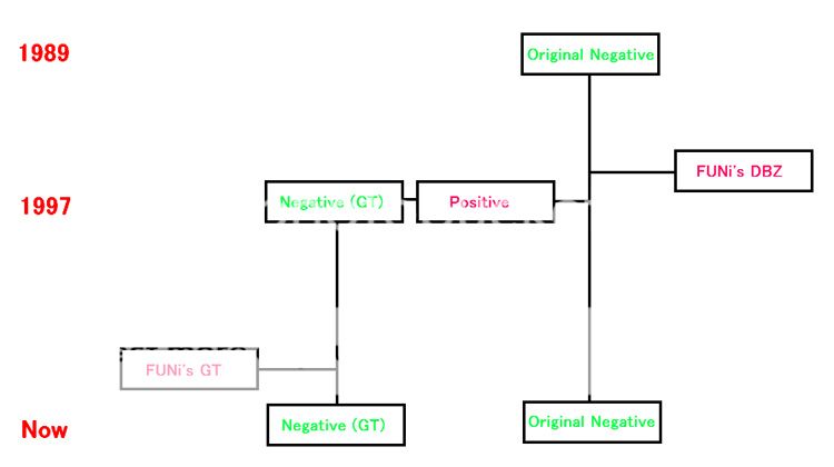
Toei Animation used to print new positive film masters every time they provided Japanese TV stations and other countries with their shows. Negative films get damaged through printing processes, so when they made GT, the original negative film masters of Saiyan arc episodes had been already damaged, which explains why FUNi's Z masters too are not that good. In addition, to reuse old footage for flashbacks, they had to copy it three times. They printed it, and copied it to negative film again. Then they once more printed it. That's what was used for the FUNi dub and the GT Dragon Box. So, in short, GT's flashbacks look worse because their footage is a copy of a copy of a copy. On the other hand, FUNi's film masters of Z were copied only once. They must have been directly printed from Toei's original masters.TripleRach wrote:It might also be worth noting that FUNimation's original GT DVDs (from around 2003-2004) also had a green sky in Saiyan arc flashbacks. It's certainly possible that the masters for that GT episode used Z film that was already degraded, but how would FUNimation's Z masters end up with much bluer skies than that? After all, FUNimation first worked on Z in 1996, while GT was still airing in Japan. Would FUNimation, a low budget foreign licensor, really get better masters for the Saiyan arc than the GT staff in Japan would?
Last edited by kei17 on Mon Aug 20, 2012 1:29 pm, edited 1 time in total.
-
TripleRach
- Moderator
- Posts: 2656
- Joined: Sat Jan 10, 2004 5:08 pm
- Location: Ohio, USA
- Contact:
Re: What are the colors supposed to look like?
I guess that would explain it. But it's still pretty bizarre.kei17 wrote:Toei Animation used to print new positive films every time they provided Japanese TV stations and other countries with their shows. Negative films get damaged through printing processes, so when they made GT, the original negative film masters of Saiyan arc episodes had been already damaged, which explains why FUNi's Z masters too are not that good. In addition, to reuse old footage for flashbacks, they had to copy it three times. They printed it, and copied it to negative film again. Then they once more printed it. That's what was used for the FUNi dub and the GT Dragon Box. So, in short, GT's flashbacks look worse because their footage is a copy of a copy of a copy. On the other hand, FUNi's film masters of Z were copied only once. They must have been directly printed from Toei's original masters.
Maybe you already realize this, since you didn't specifically say it was, but the subtitled one probably isn't a fansub. The font looks like the one used on Hawaiian TV in the early 90s. So rather than something recorded from Japanese TV, given subtitles on a new tape, and then copied out by fansub distributors, it used proper masters from Toei (pre-FUNimation) and was recorded from Hawaiian TV with the subtitles already applied before being passed around by fansub distributors.takarajima wrote:I don't have any direct recordings to prove this, but I do have a bunch of fansub stuff. Here are screenshots from a couple of them, one from a raw tape and one that has subtitles. The sky is turning green in the second screenshot, but you can still see lots of blue, particularly on the left side. The degredation is due to the fact that this tape is a multi-generational copy. And it's clear that the color degredation is going from blue to green, rather than the other way around. (see the big, dark line of green at the top)
http://i1117.photobucket.com/albums/k59 ... geta_1.png
http://i1117.photobucket.com/albums/k59 ... geta_2.png
We don't know exactly what kind of masters Toei gave them, other than the fact that they did include all the Japanese credits and the next episode previews (unlike FUNimation's masters, apparently). I guess it would still be subject to degradation of the original masters either way, but it's strange that it could be so different from the Japanese TV airings and FUNimation's masters when it came between them. Obviously VHS degrades too, both on its own and in multi-generational copies, so it's hard to know the exact cause in this case.
-Rachel