I definitely love the sheets and color pallets, but I'm not really liking how off model some scenes look in comparison to them. The characters that seem to look the most off though are Goku, Freeza and Broly occasionally. I don't really want that Studio-Trigger, sketchy look for the animation in a lot of the scenes that look like they came out of the teaser. That scene where Goku went SS and Broly clashed kind alike when Broly charged at freeza kinda looked ugly and I'm worried about the look of the Super Saiyan model for Goku & Vegeta though in the trailer don't look anything like their character models to what I saw either.Logania wrote:Shintani's art style looks ok, but some of the faces look kind of off at times for me, like the entire clip in the trailer of Goku talking with Whis.
Old artstyle vs New Artstyle 2.0
Moderators: General Help, Kanzenshuu Staff
-
SingleFringe&Sparks

- I'm, pretty, cozy, here...
- Posts: 1642
- Joined: Mon Dec 09, 2013 10:55 pm
- Location: Mt. Paozu/East District
Re: Old artstyle vs New Artstyle 2.0
Zephyr wrote:The fandom's collective fetishizing of "moments" is also ridiculous to me. No, not everyone needs a fucking "shine" moment. If that's all you want, then all you want is fanservice, rather than an actual coherent story. And of course those aren't mutually exclusive; you could have a coherent story with "shine" moments! But if a story is perfectly coherent (and I'm really not seeing any compelling arguments that this one is anything but, despite constantly recurring, really poorly reasoned, attempts to argue otherwise), and you're bemoaning the lack of "shine" moments as a reason for the story's poor quality, then you're letting your thirst for "shine" moments obfuscate your ability to detect basic storytelling when it's right in front of you.
-
JazzMazz
- I Live Here
- Posts: 2217
- Joined: Thu Nov 03, 2016 7:28 am
- Location: Mordor, the Borg cube and Voldemort's lair all at the same time in the year 199X

Re: Old artstyle vs New Artstyle 2.0
Why exactly would you be against that?SingleFringe&Sparks wrote: I don't really want that Studio-Trigger, sketchy look for the animation in a lot of the scenes that look like they came out of the teaser.

Re: Old artstyle vs New Artstyle 2.0
I really like Shintani's art style but one thing that really irks me is the fact that the shoes are incredibly rounded instead of being pointy and angular. I get that it's a homage to how current Toriyama's art looks but I definitely preferred the angular design for Goku and Vegetas boots.
-
SingleFringe&Sparks
- I'm, pretty, cozy, here...
- Posts: 1642
- Joined: Mon Dec 09, 2013 10:55 pm
- Location: Mt. Paozu/East District
Re: Old artstyle vs New Artstyle 2.0
I see it only working in close up scenes to make the anatomy looser-looking, like when Broly in the teaser was powering up and his body expanded. That looked good. In the fight scenes, no. Its when the characters get blobby and their faces start to look wonky, a lot like when Goku went SS and clashed with Broly who looked no where near as good as his lunge scene from Takahashi. Its stylistic for Studio trigger with more wacky characters, but it doesn't look good in the far shots from what I've seen. It irked me a bit seeing how off SS Goku looked because of it. Or maybe the problem is just the characters in those scenes being too loose.JazzMazz wrote:Why exactly would you be against that?SingleFringe&Sparks wrote: I don't really want that Studio-Trigger, sketchy look for the animation in a lot of the scenes that look like they came out of the teaser.
Zephyr wrote:The fandom's collective fetishizing of "moments" is also ridiculous to me. No, not everyone needs a fucking "shine" moment. If that's all you want, then all you want is fanservice, rather than an actual coherent story. And of course those aren't mutually exclusive; you could have a coherent story with "shine" moments! But if a story is perfectly coherent (and I'm really not seeing any compelling arguments that this one is anything but, despite constantly recurring, really poorly reasoned, attempts to argue otherwise), and you're bemoaning the lack of "shine" moments as a reason for the story's poor quality, then you're letting your thirst for "shine" moments obfuscate your ability to detect basic storytelling when it's right in front of you.
-
supersaiyanZero
- Beyond-the-Beyond Newbie
- Posts: 415
- Joined: Sat Nov 18, 2017 4:10 am
Re: Old artstyle vs New Artstyle 2.0
He isn't wrong.Akuma Johnson wrote:I can't tell if you're joking or you're actually serious.DragonBallFoodie wrote:I said at times. Remember how DBS had some terrible animation?JazzMazz wrote:In what way is the artwork awful?
[spoiler]
[/spoiler]

Re: Old artstyle vs New Artstyle 2.0
He's not (at least about Super's quality inconsistency), but underpinning that with zoomed in tweens doesn't really lend itself to being taken seriously. That's not how you approach animation discussion.supersaiyanZero wrote:
He isn't wrong.
Follow me on Twitter for countless shitposts.
Deadtuber.
Deadtuber.
Re: Old artstyle vs New Artstyle 2.0
According to whom, precisely? Who wrote the rules on "animation discussion"?Ajay wrote:supersaiyanZero wrote:That's not how you approach animation discussion.
Re: Old artstyle vs New Artstyle 2.0
Anyone with any sort of understanding of animation. Please don't try and be a smart ass, here.MrTennek wrote:According to whom, precisely? Who wrote the rules on "animation discussion"?Ajay wrote:supersaiyanZero wrote:That's not how you approach animation discussion.
Follow me on Twitter for countless shitposts.
Deadtuber.
Deadtuber.

Re: Old artstyle vs New Artstyle 2.0
I know what you're getting at, but I'm not sure how you can claim that the medium doesn't affect the animation when the processes and resources involved in both are fundamentally different. I'd agree that you can make digital animation resemble hand drawn animation, but the same couldn't really be said for the other way around.JazzMazz wrote: None of what you said is necessarily true at all though. You can still have incredibly detailed digital animation, just as you can have incredibly loose hand drawn animation. You can also have incredibly muted and dark colouring in digital, and incredibly light or muted colours in cell animation. The medium the animation is created on doesn't really affect the actual animation being produced is my main point. The only difference between digital animation and cell animation, is that one is drawn on tablets, the other on paper. It doesn't really impact the visuals themselves at all.
This is the episode of when Gokuh enrages himself after Freezer talk shit about Kuririn

Re: Old artstyle vs New Artstyle 2.0
...Kokonoe wrote: I disagree with this because I have yet to find a single anime or cartoon that gets anywhere near the level of shading and detail that cel art.
In my experience when looking at Super they are trying to do all these things to emulate the old cel art look and it...always looks off, it's too shiny on their muscles and hair, or just too bright.
Stuff like this you just won't see in digital art.
In comparison this is much more brighter and lacks the shading that cel art would bring.
The differences in color you keep talking about has nothing to do with the medium and everything to do with, well...the colors that they chose to use. And even then, stuff like faded, old film shapes that perception too, hence those godforsaken "SUPER WITH Z COLORS" videos that use Orange Brick and faded Dragon Box footage as a reference.
Last edited by jjgp1112 on Mon Jul 23, 2018 10:13 pm, edited 2 times in total.
Yamcha: Do you remember the spell to release him - do you know all the words?
Bulma: Of course! I'm not gonna pull a Frieza and screw it up!
Master Roshi: Bulma, I think Frieza failed because he wore too many clothes!
Cold World (Fanfic)
"It ain't never too late to stop bein' a bitch." - Chad Lamont Butler
Bulma: Of course! I'm not gonna pull a Frieza and screw it up!
Master Roshi: Bulma, I think Frieza failed because he wore too many clothes!
Cold World (Fanfic)
"It ain't never too late to stop bein' a bitch." - Chad Lamont Butler
Re: Old artstyle vs New Artstyle 2.0
Iwane Masa'aki has actually spoken about the benefits of digital animation before, which might be an interesting read while we're on the subject:
Digital compositing is definitely opening up new avenues for animators and directors to toy around with. In the interview above Iwane is referring to this long cut.Animage: The number of key animation drawings alone must have been incredibly huge.
Iwane: It absolutely was (laughs) But it helps that there's no limit to the number of drawings we can stack on top of each other now that we're in the digital age2. If I had tried to make this during the analog era I would have had to really use my head to juggle how all those cels would have been placed.
Footnote 2: During the analog days, cels were used in the production of animation. These cels were not completely transparent and so if you stacked a bunch of them on top of each other the colors of the cels on the bottom would start to look different or even be obstructed completely. For that reason limits were set up as to how many cels you could stack on each other.
Animage: You would have had to think about which cells go where3. You would have had to think about things like "If this character is on Cel A but then moves to Cel B from this point..."
Footnote 3: “Think(ing) about which cels go where” means you divide an image into parts so that, for example, a background character is on Cel A, his or her mouth movements are on Cel B, and the foreground character is on Cel C. If the shot in question is a particularly complicated one then you might have a character from Cel A need to jump up to Cel C.
Iwane: Exactly. A character simply moving from Cell A to Cell E would mess up the colors so we had to be careful not to allow them to make large jumps like that4. But now that everything's digital we can move the characters around freely without having to think about that anymore. Thanks to this, long shots like the one at the end of Act 2 become a lot easier to do.
Footnote 4: The “large jumps” he's talking about is when a character moves from one cel layer to another. The cels are stacked on each other in alphabetical order; the cel on the very bottom is Cel A, the cel on top of that is Cel B, the cel above that is Cel C, etc. And so if you have a character on Cel A who needs to move cels in the middle of a shot, having him move to Cel C is preferable to having him jump all the way to Cel E. If the characters jump around as stated in the interview then there's a chance the colors will be messed up.
She/Her
progesterone princess, estradiol empress
bisexual milf
progesterone princess, estradiol empress
bisexual milf

Re: Old artstyle vs New Artstyle 2.0
Muted colors? This is a very strange argument to me because none of what I said ever focused on the colors being muted in anyway, that is not what I'm saying at all. This isn't about merely toning down the colors, this isn't about Super being more bright and needing a certain palette, this extends far more than just colors.jjgp1112 wrote:...Kokonoe wrote: I disagree with this because I have yet to find a single anime or cartoon that gets anywhere near the level of shading and detail that cel art.
In my experience when looking at Super they are trying to do all these things to emulate the old cel art look and it...always looks off, it's too shiny on their muscles and hair, or just too bright.
Stuff like this you just won't see in digital art.
In comparison this is much more brighter and lacks the shading that cel art would bring.
So your proof that digital technology can't produce more muted colors and deep shading is...an image of a digitally produced anime gif with muted colors and deep shading?
The differences in color you keep talking about has nothing to do with the medium and everything to do with, well...the colors that they chose to use. And even then, stuff like faded, old film shapes that perception too, hence those godforsaken "SUPER WITH Z COLORS" videos that use Orange Brick and faded Dragon Box footage as a reference.
The shading and detail involved with hand drawn art is always going to have more detail than digital art and for good reason, there's far less limitations being that it's not pixel based and it's, well, actually happening in real life instead of on an LCD or OLED display with tools preconfigured for the purpose of that. Not only that, even the top of the line shows for digital such as Mob Psycho 101 still hasn't achieved the shading detail of old cel art anime, that certain tone with all the layers of shading adding a very detailed image. Digital is much easier to work with and that is certainly a pro, but I've yet to see anything digital, anime episode wise, that looks like 80s / 90s anime in terms of raw shading detail.
!! -- Donate to Planned Parenthood -- !!
-
KBABZ

- Born 'n Bred Here
- Posts: 5180
- Joined: Sun Feb 26, 2017 9:38 pm
- Location: The tallest tower in West City
Re: Old artstyle vs New Artstyle 2.0
People who know what they're talking about when it comes to animation. To get this out of the way first, I'm an animator who worked for three years at a major VFX studio.MrTennek wrote:According to whom, precisely? Who wrote the rules on "animation discussion"?Ajay wrote:supersaiyanZero wrote:That's not how you approach animation discussion.
In-between animation frames, particularly those for fast motion, are not meant to be "seen" in a literal sense. They're part of transitioning from one key pose to another, and many of them appear for only a split second before moving on to the next, usually more on-model one. As a viewer you don't see them, but you do "feel" them. Here's some examples of this stuff from western animation:

Because they're instantaneous, you don't see them in the moment, but they accentuate the movements already made by the characters and makes them more visually appealing. Here's the moment for the Aladdin shot on the left. You probably didn't even notice the frame in question, but if you step through the quick movements of that scene with the , and . keys, you'll find TONS of these sorts of supposedly "terrible" frames from the best animated films in history.
---
As a side-note, there's also a mis-understanding here on what the word animation means. I wouldn't call the DBS frames shown above terrible animation and more terrible drawings. Animation as a word specifically refers to the movement, that magic illusion of movement and life when you play a sequence of images at 24fps (give or take). You can be a great drawer but a terrible animator. Overall I find a lot of modern anime animation to feel rather stiff, using tricks like only moving a mouth plate and sliding a single frame forward in a shot above the waist to save time and money (Pokémon does this all the time for calling out attacks). That aside, anime is also more prone to having it's deforming in-between frames exposed because they're animated at 12fps, half of what most western productions use, which means that you see them on-screen for longer. But I love the animation we've seen so far from DBS Broly because the characters stretch and deform to provide appeal and to accentuate the action and the story. To go back to the Aladdin example, the title character is EXTREMELY off-model in that frame, but by drawing him like that it accentuates how fast the shopkeeper is pulling him in, making the shopkeeper feel more angry and unreasonable as a character.
-
JazzMazz
- I Live Here
- Posts: 2217
- Joined: Thu Nov 03, 2016 7:28 am
- Location: Mordor, the Borg cube and Voldemort's lair all at the same time in the year 199X
Re: Old artstyle vs New Artstyle 2.0
Could you provide examples of what you mean?SingleFringe&Sparks wrote:I see it only working in close up scenes to make the anatomy looser-looking, like when Broly in the teaser was powering up and his body expanded. That looked good. In the fight scenes, no. Its when the characters get blobby and their faces start to look wonky, a lot like when Goku went SS and clashed with Broly who looked no where near as good as his lunge scene from Takahashi. Its stylistic for Studio trigger with more wacky characters, but it doesn't look good in the far shots from what I've seen. It irked me a bit seeing how off SS Goku looked because of it. Or maybe the problem is just the characters in those scenes being too loose.JazzMazz wrote:Why exactly would you be against that?SingleFringe&Sparks wrote: I don't really want that Studio-Trigger, sketchy look for the animation in a lot of the scenes that look like they came out of the teaser.
Re: Old artstyle vs New Artstyle 2.0
Holy hell son, I know what smear frames are. The garbage-pale drawings from episode five were NOT that. There's a big difference between being intentionally off-model and not knowing what the hell you're doing animation wise (or just not caring, which is common for outsourced assembly-line animation studios). I don't need a bloody lecture on the topic, I've studied animation for well over a decade and have animated some shorts myself.KBABZ wrote:People who know what they're talking about when it comes to animation. To get this out of the way first, I'm an animator who worked for three years at a major VFX studio.MrTennek wrote:According to whom, precisely? Who wrote the rules on "animation discussion"?Ajay wrote:
In-between animation frames, particularly those for fast motion, are not meant to be "seen" in a literal sense. They're part of transitioning from one key pose to another, and many of them appear for only a split second before moving on to the next, usually more on-model one. As a viewer you don't see them, but you do "feel" them. Here's some examples of this stuff from western animation:
Because they're instantaneous, you don't see them in the moment, but they accentuate the movements already made by the characters and makes them more visually appealing. Here's the moment for the Aladdin shot on the left. You probably didn't even notice the frame in question, but if you step through the quick movements of that scene with the , and . keys, you'll find TONS of these sorts of supposedly "terrible" frames from the best animated films in history.
---
As a side-note, there's also a mis-understanding here on what the word animation means. I wouldn't call the DBS frames shown above terrible animation and more terrible drawings. Animation as a word specifically refers to the movement, that magic illusion of movement and life when you play a sequence of images at 24fps (give or take). You can be a great drawer but a terrible animator. Overall I find a lot of modern anime animation to feel rather stiff, using tricks like only moving a mouth plate and sliding a single frame forward in a shot above the waist to save time and money (Pokémon does this all the time for calling out attacks). That aside, anime is also more prone to having it's deforming in-between frames exposed because they're animated at 12fps, half of what most western productions use, which means that you see them on-screen for longer. But I love the animation we've seen so far from DBS Broly because the characters stretch and deform to provide appeal and to accentuate the action and the story. To go back to the Aladdin example, the title character is EXTREMELY off-model in that frame, but by drawing him like that it accentuates how fast the shopkeeper is pulling him in, making the shopkeeper feel more angry and unreasonable as a character.
-
KBABZ
- Born 'n Bred Here
- Posts: 5180
- Joined: Sun Feb 26, 2017 9:38 pm
- Location: The tallest tower in West City
Re: Old artstyle vs New Artstyle 2.0
Oh, I didn't know that.MrTennek wrote:Holy hell son, I know what smear frames are. The garbage-pale drawings from episode five were NOT that. There's a big difference between being intentionally off-model and not knowing what the hell you're doing animation wise (or just not caring, which is common for outsourced assembly-line animation studios). I don't need a bloody lecture on the topic, I've studied animation for well over a decade and have animated some shorts myself.
-
Neo-Makaiōshin
- I Live Here
- Posts: 2333
- Joined: Sat Jul 26, 2014 8:31 pm
- Location: Argentina
- Contact:

Re: Old artstyle vs New Artstyle 2.0
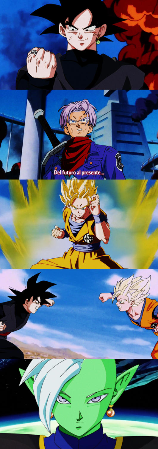
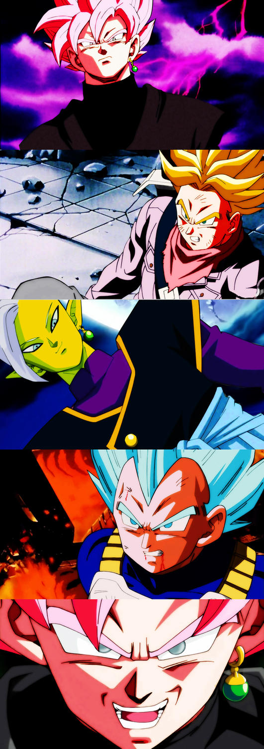
This edits prove that you can replicate the old school shading and detail art from cels using digital tools:Kokonoe wrote:I disagree with this because I have yet to find a single anime or cartoon that gets anywhere near the level of shading and detail that cel art.
In my experience when looking at Super they are trying to do all these things to emulate the old cel art look and it...always looks off, it's too shiny on their muscles and hair, or just too bright.
Stuff like this you just won't see in digital art.
[spoiler][/spoiler]
In comparison this is much more brighter and lacks the shading that cel art would bring.
[spoiler][/spoiler]
* https://www.deviantart.com/salvamakoto/ ... -620932589
* https://www.deviantart.com/salvamakoto/ ... -644891576
* https://www.deviantart.com/salvamakoto/ ... -646048255
[spoiler]
 [/spoiler]
Dragon Ball was always a kid series and fans should stop being in denial.

Re: Old artstyle vs New Artstyle 2.0
Those edits prove you can blow out the contrast on Super screenshots to make them look as terrible as the orange bricks.
-
Baggie_Saiyan

- Namekian Warrior
- Posts: 10283
- Joined: Sat Mar 30, 2013 5:22 pm
- Location: Atlantis.
Re: Old artstyle vs New Artstyle 2.0
Yup, those three shots of Zamasu, SSGSS Vegeta and Black especially look very awful.Shaddy wrote:Those edits prove you can blow out the contrast on Super screenshots to make them look as terrible as the orange bricks.
Re: Old artstyle vs New Artstyle 2.0
And that's precisely the "SUPER WITH Z COLORS" nonsense I was talking aboutNeo-Makaiōshin wrote:This edits prove that you can replicate the old school shading and detail art from cels using digital tools:Kokonoe wrote:I disagree with this because I have yet to find a single anime or cartoon that gets anywhere near the level of shading and detail that cel art.
In my experience when looking at Super they are trying to do all these things to emulate the old cel art look and it...always looks off, it's too shiny on their muscles and hair, or just too bright.
Stuff like this you just won't see in digital art.
[spoiler]
In comparison this is much more brighter and lacks the shading that cel art would bring.
[spoiler]
* https://www.deviantart.com/salvamakoto/ ... -620932589
* https://www.deviantart.com/salvamakoto/ ... -644891576
* https://www.deviantart.com/salvamakoto/ ... -646048255
[spoiler]
Yamcha: Do you remember the spell to release him - do you know all the words?
Bulma: Of course! I'm not gonna pull a Frieza and screw it up!
Master Roshi: Bulma, I think Frieza failed because he wore too many clothes!
Cold World (Fanfic)
"It ain't never too late to stop bein' a bitch." - Chad Lamont Butler
Bulma: Of course! I'm not gonna pull a Frieza and screw it up!
Master Roshi: Bulma, I think Frieza failed because he wore too many clothes!
Cold World (Fanfic)
"It ain't never too late to stop bein' a bitch." - Chad Lamont Butler