Discussion regarding the entirety of the franchise in a general (meta) sense, including such aspects as: production, trends, merchandise, fan culture, and more.
MasenkoHA wrote: ↑Fri Sep 11, 2020 3:34 pmThe marketing for those episodes between the faux Japanese and the obsession with the color red was just sooooo cringe.
I never understood Funimation's obsession with trying to make DBZ something it wasn't. It comes off as fake and trying too hard, just present the show as is, it'll be successful regardless.
Funimation in that era, largely thanks to Barry Watson, didn't think an honest presentation would gel with kids. They thought kids would just shut off if there wasn't constant dialogue and music, hardcore/edgy scoring, constant jokes, etc.
Funimation changed a lot after Barry Watson left, partially thanks to people like Chris Sabat and Sean Schemmel who really do respect and care about the Japanese version, and that's how we got the basically-faithful Kai dub that somewhat set the tone for their Dragon Ball dubbing to this day...
But, the west still has that original treatment hanging around, so you still get marketing that likes to appeal to the "hardcore"/"edgy" audience when they're trying to engage with nostalgia.
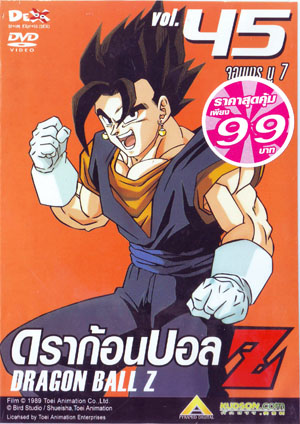
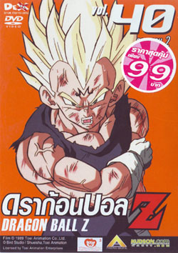
I just noticed this, but is it me or are they in the Kaiōshin Realm? I do wsh we got more info on how this set was supposed to be. It almost feels like it wasnt going to be as limited as it turned out.
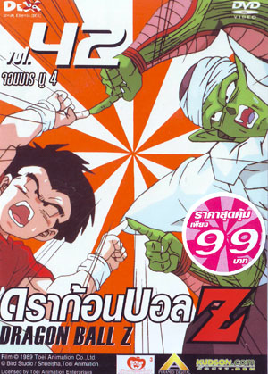
I'm not showing this because I think the front cover is great, clearly it's just a crappy screen grab. What I do like is the top image on the back with the different forms of Cell. I thought that was a really cool choice.
The biggest truths aren't original. The truth is ketchup. It's Jim Belushi. Its job isn't to blow our minds. It's to be within reach.
"You miss 100% of the shots you don't take - Wayne Gretzky" - Michael Scott
Happiness is climate, not weather.
ABED wrote: ↑Sat Sep 12, 2020 1:31 pm
I'm not showing this because I think the front cover is great, clearly it's just a crappy screen grab. What I do like is the top image on the back with the different forms of Cell. I thought that was a really cool choice.
Were all the Cell Games dvds like this or just this one?
Yes; I think every DVD from the Android saga DVDs onward has something similar
The biggest truths aren't original. The truth is ketchup. It's Jim Belushi. Its job isn't to blow our minds. It's to be within reach.
"You miss 100% of the shots you don't take - Wayne Gretzky" - Michael Scott
Happiness is climate, not weather.
The Pioneer DVDs, while somewhat inconsistent, really felt like they had money/effort behind them. Reminds me of their title cards, where they always added the nice little CG effect somewhere to give each episode a bit of extra personality.
The Pioneer DVDs, while somewhat inconsistent, really felt like they had money/effort behind them. Reminds me of their title cards, where they always added the nice little CG effect somewhere to give each episode a bit of extra personality.
Another vote for the Pioneer art. Most of it was original, or at least recycled pieces of art from manga covers and other promo art but still had more effort put into them than the screengrabs used for Funi's singles. I especially like that the logo fades from yellow to orange and that the dragon ball has a nice 3D effect, making it look like an actual orb.
And man, those CG title cards were so cheesy yet charming. Sometimes I wish Ocean at least finished the Freeza Saga just to see what else they could've come up with.
I actually like the Funimation singles covers more than the Pioneer ones. The Pioneer covers look like sloppily photoshopped bootlegs whereas the Funimation covers, while simplistic, showcase actual high quality promotional artwork from the show. It's pretty obvious that they're not just "screengrabs". I personally prefer seeing the simple highest quality cel art over cheap photoshop.
I'm quite fond scandinavian dvd release of Z movie 2. I really like how they took a shot of Goku hovering and shooting the spinning blade things and made it look like he is jumping around them barely managing to not get sawed in half. I also just really like the blue color on the back. Such a nice dark shade