Discussion regarding the entirety of the franchise in a general (meta) sense, including such aspects as: production, trends, merchandise, fan culture, and more.
Moderators: General Help, Kanzenshuu Staff
-
SingleFringe&Sparks
- I'm, pretty, cozy, here...
- Posts: 1642
- Joined: Mon Dec 09, 2013 10:55 pm
- Location: Mt. Paozu/East District
Post
by SingleFringe&Sparks » Tue Aug 02, 2016 3:37 pm
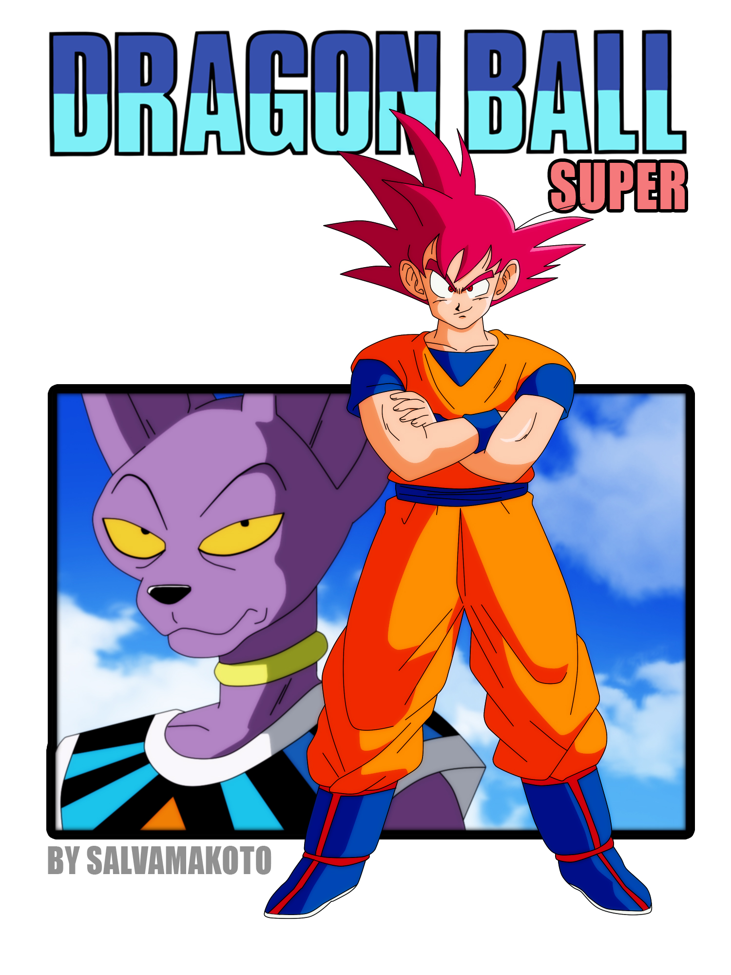
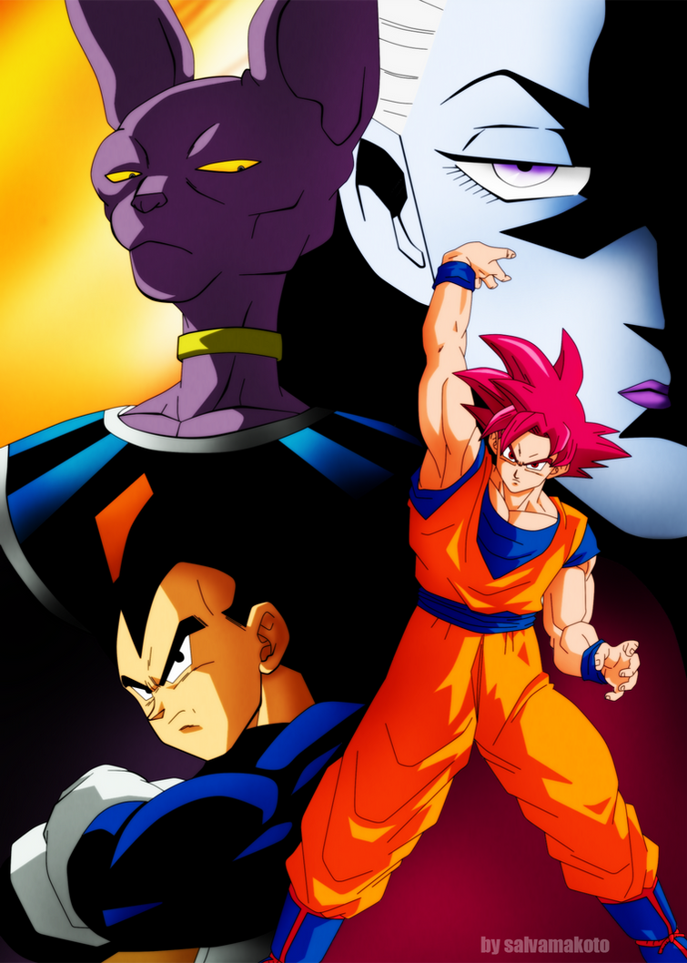
I came across a few deviant art pictures by an artist "Salvamakoto" that apparently did some work with making images of of Super fit into the older Cel-look of the older series, and by comparison I think it looks pretty good - even if just wishfully.
[spoiler]
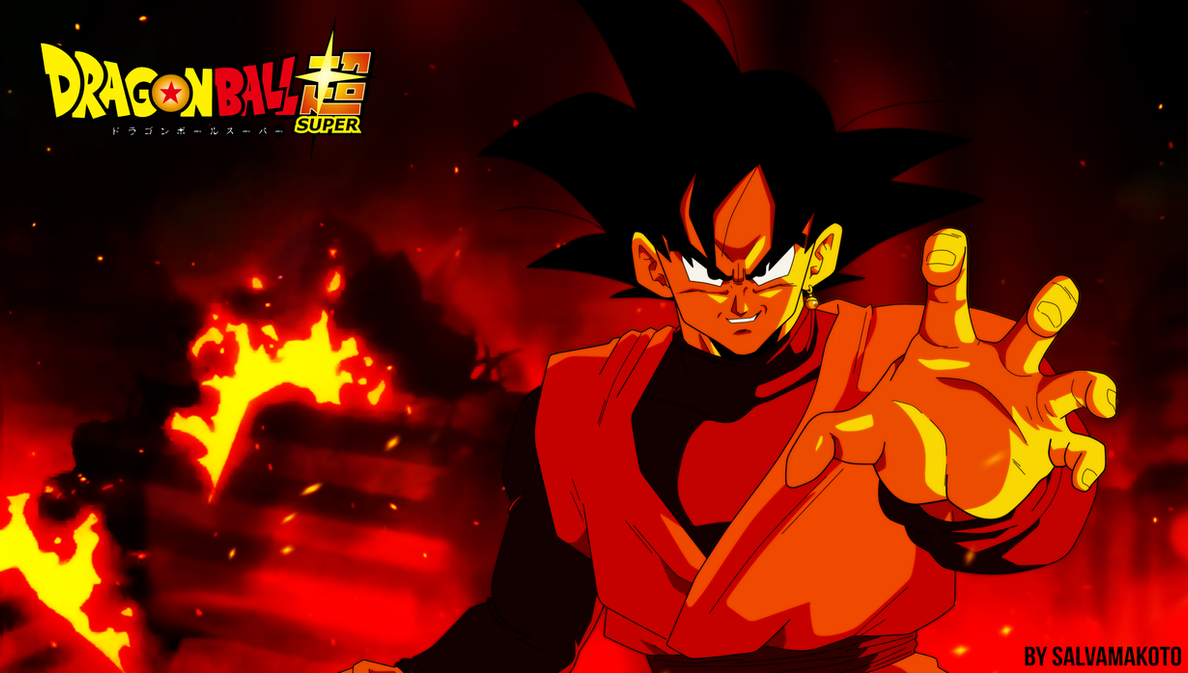
[/spoiler]
[spoiler]
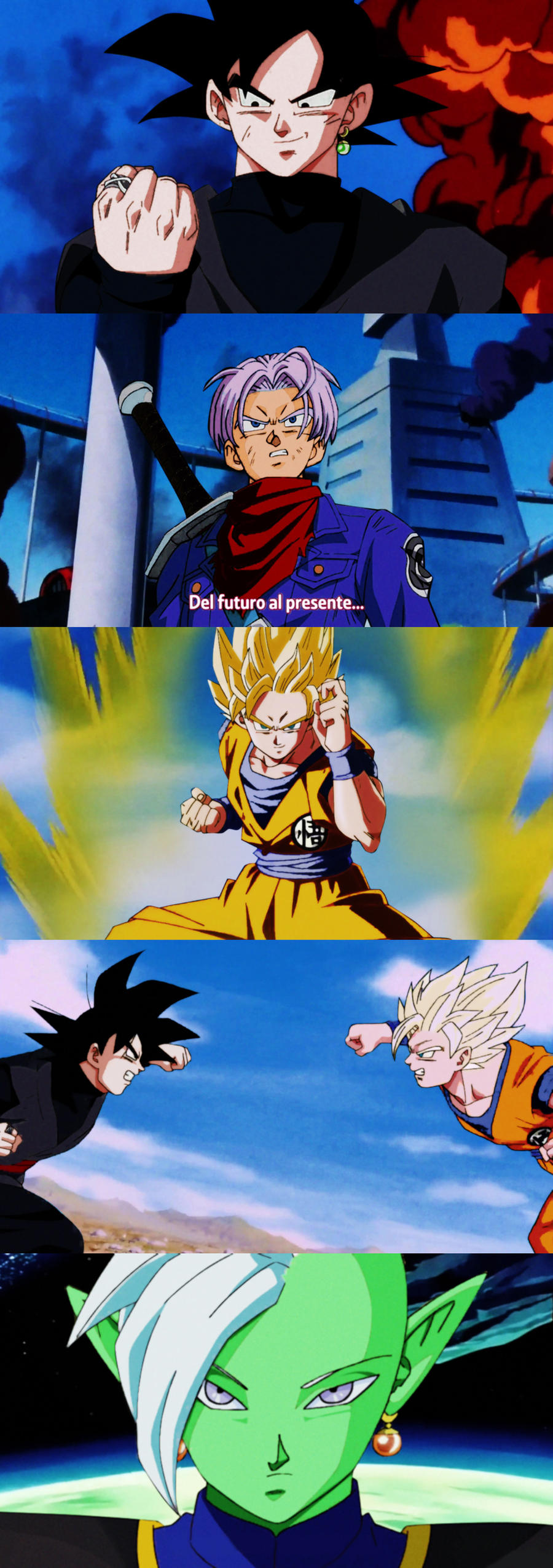
[/spoiler]
[spoiler]
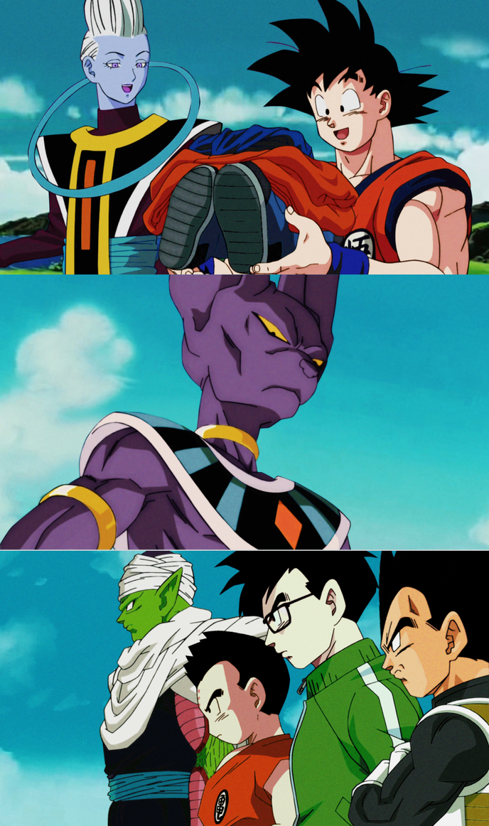
[/spoiler]
Zephyr wrote:The fandom's collective fetishizing of "moments" is also ridiculous to me. No, not everyone needs a fucking "shine" moment. If that's all you want, then all you want is fanservice, rather than an actual coherent story. And of course those aren't mutually exclusive; you could have a coherent story with "shine" moments! But if a story is perfectly coherent (and I'm really not seeing any compelling arguments that this one is anything but, despite constantly recurring, really poorly reasoned, attempts to argue otherwise), and you're bemoaning the lack of "shine" moments as a reason for the story's poor quality, then you're letting your thirst for "shine" moments obfuscate your ability to detect basic storytelling when it's right in front of you.
-
Black Hawk
- Regular
- Posts: 532
- Joined: Mon Dec 15, 2014 1:09 pm
- Location: Beacon Academy
Post
by Black Hawk » Tue Aug 02, 2016 3:40 pm
Absolutely
beautiful. If only. If only...
"Reign supreme? In your dreams; you'll never make me bow.
Kick my ass? I'm world-class and Super Saiyan now."
I BURN - Jeff Williams feat. Casey Lee Williams, RWBY Volume 1 Soundtrack
-
VegettoEX
- Kanzenshuu Co-Owner & Administrator
- Posts: 17547
- Joined: Sat Jan 10, 2004 3:10 pm
- Location: New Jersey
-
Contact:
Post
by VegettoEX » Tue Aug 02, 2016 3:45 pm
These have been discussed somewhere in
the "Dragon Ball Super" sub-forum already.
Personally, I don't understand them. To me, it just looks as if someone blew out the colors to match FUNimation's terrible remastering, and this somehow gives people nostalgia on some weird Toonami-generation level that I can't relate to. It doesn't look like
Dragon Ball to me, and it does not make me happy to look at them.
:: [| Mike "VegettoEX" LaBrie |] ::
:: [|
Kanzenshuu - Co-Founder/Administrator, Podcast Host, News Manager
(note: our "job" titles are arbitrary and meaningless) |] ::
:: [| Website: January 1998 |] :: [| Podcast: November 2005 |] :: [| Fusion: April 2012 |] :: [| Wiki: 20XX |] ::
-
sintzu
- Banned
- Posts: 13583
- Joined: Fri Sep 02, 2011 1:41 pm
Post
by sintzu » Tue Aug 02, 2016 4:43 pm
These put the current art style to complete shame.
It looks so much more natural unlike what we have now which looks fake and could be mistaken for something fan made.
July 9th 2018 will be remembered as the day Broly became canon.
-
Metalwario64
- Born 'n Bred Here
- Posts: 6175
- Joined: Thu Feb 07, 2008 1:02 am
- Location: Namek
Post
by Metalwario64 » Tue Aug 02, 2016 4:45 pm
VegettoEX wrote:These have been discussed somewhere in
the "Dragon Ball Super" sub-forum already.
Personally, I don't understand them. To me, it just looks as if someone blew out the colors to match FUNimation's terrible remastering, and this somehow gives people nostalgia on some weird Toonami-generation level that I can't relate to. It doesn't look like
Dragon Ball to me, and it does not make me happy to look at them.
Pretty much this.
Now, if the colors looked more like the Dragon Boxes, or Kai, then we'd be in business.

"Kenshi is sitting down right now drawing his mutated spaghetti monsters thinking he's the shit..."--Neptune Kai
"90% of you here don't even know what you're talking about (there are a few that do). But the things you say about these releases are nonsense and just plain dumb. Like you Metalwario64"--
final_flash
-
Bansho64
- I Live Here
- Posts: 2036
- Joined: Fri Dec 25, 2015 12:59 am
Post
by Bansho64 » Tue Aug 02, 2016 4:55 pm
The drawings are pretty good but those colors are pretty awful. The color of the characters range from too bright to too dark. Piccolo's gi in that last pic is actually black instead of purple and Beerus' skin is a bit dark as well. Not all of Salvamakoto's drawings are like that though. Some of them are actually spot on in my opinion

-
Xeztin
- I Live Here
- Posts: 2242
- Joined: Sun Jun 14, 2015 7:15 pm
- Location: Toyotarō's Place
Post
by Xeztin » Tue Aug 02, 2016 5:36 pm
Bansho64 wrote:The drawings are pretty good but those colors are pretty awful. The color of the characters range from too bright to too dark. Piccolo's gi in that last pic is actually black instead of purple and Beerus' skin is a bit dark as well. Not all of Salvamakoto's drawings are like that though. Some of them are actually spot on in my opinion
He's a really talented artist! It's neat to see what Super might look like if it was made in the late 90's but I don't think that style or way of animation (If we're talking about the first 3 series) would make it in 2016. You'd be surprised how much of that turns the younger generation off, the way Super currently is now is what's best for it in this time and age. Here's something else that looks more like early DB.
[spoiler]
[/spoiler]
-
ArchedThunder
- Born 'n Bred Here
- Posts: 5718
- Joined: Fri Dec 03, 2010 8:03 am
Post
by ArchedThunder » Tue Aug 02, 2016 6:12 pm
Bansho64 wrote:The drawings are pretty good but those colors are pretty awful. The color of the characters range from too bright to too dark. Piccolo's gi in that last pic is actually black instead of purple and Beerus' skin is a bit dark as well. Not all of Salvamakoto's drawings are like that though. Some of them are actually spot on in my opinion
All of the pictures in the OP except the very first one are just frames of Super with the colors changed and a bad filter put over them and then put on an old background. Though I'm not sure where the hair on Krillin came from.
Last edited by
ArchedThunder on Tue Aug 02, 2016 6:32 pm, edited 1 time in total.
-
Soppa Saia People
- I Live Here
- Posts: 3062
- Joined: Sun Aug 09, 2015 11:26 pm
- Location: Minnesota
Post
by Soppa Saia People » Tue Aug 02, 2016 6:15 pm
Ech, Orange Bricks colors, if these were more like the Dragon Boxes colors, it'd would look a bit better, but not better then Super.
-
Nejishiki
- I Live Here
- Posts: 2406
- Joined: Thu Mar 24, 2016 11:45 am
Post
by Nejishiki » Tue Aug 02, 2016 6:21 pm
He's a talented artist, but I disagree with the use of his colors, especially for animation. I wager if the series went into that direction, there would be justified complaints that it looks dated and that the effects are cheap. For example, the smoke in one of the photos would not appear natural if one were to commit to that reference.
-
Gonstead
- I Live Here
- Posts: 3500
- Joined: Thu Oct 13, 2011 9:33 am
- Location: New Zealand
-
Contact:
Post
by Gonstead » Tue Aug 02, 2016 6:24 pm
Admittedly I would be lying if I said I didn't like the initial look of the images. They look fine on their own.
What I can't get over are the crushed blacks and white contrast that have been boosted far too much. Goku Black and Piccolo's gi being the worst offenders with Whis not too far behind.
Visit DragonBallFigures for all your Dragon Ball figure info and needs!
Mayuri Kurotsuchi wrote:"In this world, nothing perfect exists. It may be a cliche after all but it's the way things are. That's precisely why ordinary men pursue the concept of perfection, it's infatuation. But ultimately I have to ask myself "What is the true meaning of being perfect?" and the answer I came up with was nothing. Not one thing. The truth of the matter is I despise perfection! If something is truly perfect, that's IT! The bottom line becomes there is no room for imagination! No space for intelligence or ability or improvement! Do you understand? To men of science like us, perfection is a dead end, a condition of hopelessness. Always strive to be better than anything that came before you but not perfect! Scientist's agonize over the attempt to achieve perfection! That's the kind of creatures we are! We take joy in trying to exceed our grasp, in trying to reach for something that in the end, we have to admit may in fact be unreachable!"
MY HOLY GRAIL (110% Serious. Please sell me one)
-
Dragon Ball Ireland
- I Live Here
- Posts: 3598
- Joined: Thu May 21, 2015 9:09 am
- Location: Sligo, Ireland
Post
by Dragon Ball Ireland » Tue Aug 02, 2016 6:37 pm
It's a fun curiosity, but the colours definitely need some work.
If the images looked more like Kai they'd be perfect.
Do you have any info about international non-English broadcasts about the Dragon Ball anime or manga translations/editions? Please message me. Researching for a future book with Dragon Ball scholar Derek Padula

-
Black Hawk
- Regular
- Posts: 532
- Joined: Mon Dec 15, 2014 1:09 pm
- Location: Beacon Academy
Post
by Black Hawk » Tue Aug 02, 2016 7:47 pm
VegettoEX wrote:Personally, I don't understand them. To me, it just looks as if someone blew out the colors to match FUNimation's terrible remastering, and this somehow gives people nostalgia on some weird Toonami-generation level that I can't relate to. It doesn't look like Dragon Ball to me, and it does not make me happy to look at them.
I'm not sure what it is, but there's just something about them that's visually appealing to me. I'm pretty sure it isn't nostalgia, since my first exposure to the anime was GT in the late '90s; I didn't watch the 1986-1996 anime until Kai came about in 2009. I really can't put my finger on what stands out to me so much in Salvamakoto's stuff.

"Reign supreme? In your dreams; you'll never make me bow.
Kick my ass? I'm world-class and Super Saiyan now."
I BURN - Jeff Williams feat. Casey Lee Williams, RWBY Volume 1 Soundtrack
-
Hero
- Beyond Newbie
- Posts: 178
- Joined: Fri Jul 03, 2015 7:30 pm
Post
by Hero » Tue Aug 02, 2016 8:49 pm
Black Hawk wrote:VegettoEX wrote:Personally, I don't understand them. To me, it just looks as if someone blew out the colors to match FUNimation's terrible remastering, and this somehow gives people nostalgia on some weird Toonami-generation level that I can't relate to. It doesn't look like Dragon Ball to me, and it does not make me happy to look at them.
I'm not sure what it is, but there's just something about them that's visually appealing to me. I'm pretty sure it isn't nostalgia, since my first exposure to the anime was GT in the late '90s; I didn't watch the 1986-1996 anime until Kai came about in 2009. I really can't put my finger on what stands out to me so much in Salvamakoto's stuff.
I didn't see Dragon Ball until 2013 and that was after animes like Death Note. Still, there's something about the old art style that goes with Dragon Ball very well. One Punch Man, for example, I can't imagine with the old DBZ style, but Super would be better off looking more akin to Kai.
-
sintzu
- Banned
- Posts: 13583
- Joined: Fri Sep 02, 2011 1:41 pm
Post
by sintzu » Tue Aug 02, 2016 8:59 pm
Black Hawk wrote:I really can't put my finger on what stands out to me so much in Salvamakoto's stuff.
They look amazing ?
[spoiler]
[/spoiler]
In terms of his redrawn images, the colors aren't as bright as Super so maybe that's it.
July 9th 2018 will be remembered as the day Broly became canon.
-
Metalwario64
- Born 'n Bred Here
- Posts: 6175
- Joined: Thu Feb 07, 2008 1:02 am
- Location: Namek
Post
by Metalwario64 » Wed Aug 03, 2016 3:12 am
I looked up this guy's Deviantart, and while I think a lot of his stuff is just okay, this one stood out to me:
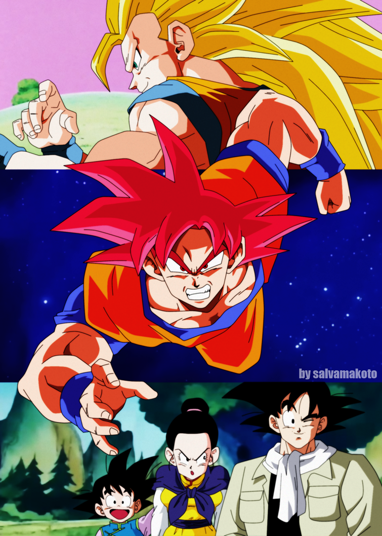
Even though I'm sure all of these images, if not outright traced were based on existing images, this is composed quite well and looks like actual 90s Dragon Ball promo art! It's better than all of the cut and past promo art the series has had the past several years (that's also usually done by that terrible artist who did the Extreme Butouden cover).
For instance, SSG Goku is obviously based on this SS3 Goku art:
[spoiler]

[/spoiler]
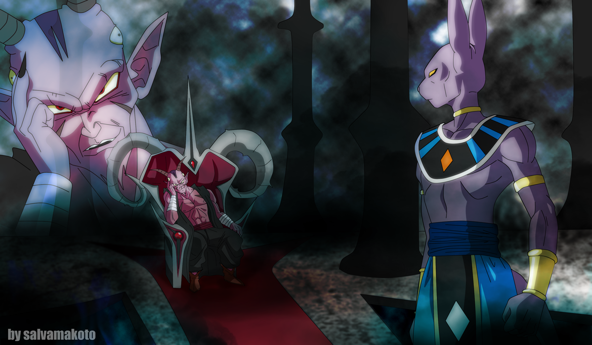
Looking through his profile further, I noticed that he completely traced the Movie 6 poster here, as well as a Cell arc screenshot of Vegeta:
[spoiler]

[/spoiler]
"Kenshi is sitting down right now drawing his mutated spaghetti monsters thinking he's the shit..."--Neptune Kai
"90% of you here don't even know what you're talking about (there are a few that do). But the things you say about these releases are nonsense and just plain dumb. Like you Metalwario64"--
final_flash
-
Rubens
- Beyond-the-Beyond Newbie
- Posts: 499
- Joined: Fri Nov 13, 2015 6:33 pm
- Location: Portugal
Post
by Rubens » Wed Aug 03, 2016 6:55 am
Personally, I think it makes Super look old-fashioned. I enjoy the current animation, apart of course from the proportinal errors and whatnot - but even DBZ had such issues ocasionally. Those pictures just look "good" because of a sense of nostalgia.
In fact, there was a flashback in the latest super pisode [spoiler]showing the same scene from the "History of Trunks movie, where Gohan speaks to young Trunks before he knocks down with a chop in the back and flies off to die against the androids; it also portrayed Trunks's first transformation[/spoiler] and I thought the animation was so much better (sometimes even wished I could see more DBZ scenes with current animation quality).
The only big problem I have with Super is the fighting scenes are not as exciting as the ones from DBZ, they seem more static and stiff, whilst the others were more fluid and gave a better sense of speed and brutality. Certainly Super's choreography is very good, but the final execution displeases me.
I'm back!
Lurking around here since 2014. Just an old fan who regained his passion for Dragon Ball since then.
-
Ajay
- Moderator
- Posts: 6197
- Joined: Sun May 26, 2013 6:15 pm
- Location: Surrey, UK
-
Contact:
Post
by Ajay » Wed Aug 03, 2016 7:12 am
VegettoEX wrote:These have been discussed somewhere in
the "Dragon Ball Super" sub-forum already.
Personally, I don't understand them. To me, it just looks as if someone blew out the colors to match FUNimation's terrible remastering, and this somehow gives people nostalgia on some weird Toonami-generation level that I can't relate to. It doesn't look like
Dragon Ball to me, and it does not make me happy to look at them.
Agreed.
They don't match the cels, they look like the Orange Bricks, and they do nothing to fix the series' troublesome character designs.
While the first image is interesting as pure fan art, it's entirely out of touch with Toriyama's current art, and even the tail end of Z.
As fun nostalgia trips for whatever audience this is supposed to appeal to, then okay, whatever. But as a genuine alternative to Super's current art? They're bad.
-
TheGreatness25
- I Live Here
- Posts: 4929
- Joined: Fri Oct 19, 2007 9:36 am
Post
by TheGreatness25 » Wed Aug 03, 2016 9:25 am
I'm sure that the point was that there's a preference for the character designs to look like they did in Z over the current character models -- colors aside. There seems to be a strong focus on them "looking like the Orange Bricks," but that does not interfere with how the characters are actually drawn.
-
Bansho64
- I Live Here
- Posts: 2036
- Joined: Fri Dec 25, 2015 12:59 am
Post
by Bansho64 » Wed Aug 03, 2016 9:38 am
Rubens wrote:
In fact, there was a flashback in the latest super pisode [spoiler]showing the same scene from the "History of Trunks movie, where Gohan speaks to young Trunks before he knocks down with a chop in the back and flies off to die against the androids; it also portrayed Trunks's first transformation[/spoiler] and I thought the animation was so much better (sometimes even wished I could see more DBZ scenes with current animation quality).
Wait, you're saying
this is better than
this? I'd have to disagree there. The latter has so much more detail and better special effects. The hair, the eyes lighting up when he transforms, everything. It ain't perfect but it's pretty good. My apologies for going off topic.


