Alee9977 wrote: means there is more time for post production
Not necessarily, it looks like a pretty simple effect that is just applied to the whole screen, so it can probably be applied very quickly.
As for the line effect I have no idea on that one.
HybridSaiyan wrote:Thank you for answering! Do you know if he's still working under Minoru Maeda? Or has any relation to modern DB?
Pretty much impossible to know for sure, but even if they did, their output wouldn't look anything like that. That art style is 100% pure Maeda, and with him being long gone, so is that style. In fact, it was gone halfway through Z!
AJay, what's your thoughts on Maeda's style? Is it something you're fond of?
Are we too old to enjoy new Dragon Ball movies/series?
Spoiler:
Nickolaidas wrote: ↑Sun Jun 14, 2015 2:10 am
Guys, I'm going to be straight with you. If you feel the show has gotten 'silly' ... it hasn't. You're just 'too old for this shit'. Seriously, 95% of the people in those boards do not fit the target demographic of the show, so don't expect the show to be 'everything you hoped for'. I'm referring to the people here who expect Super to be rich with dark moments, serious storytelling, meaningful characters etc etc. It won't. It's a show for kids. A show for kids being kids. Everyone in those boards has a manchild in him/her, clamoring to get out, and that's fine. But having unrealistic expectations (such as believing the show grew up alongside you) is naïve at best. Honestly, do you take seriously a story where the supposed God of Destruction halts his urges to blow up stuff in order to eat ice cream sundae? That's the show's silliness at full force, take it for what it is. The show hasn't matured one bit, so don't expect it too. Again, I'm not saying that's a bad thing. I'm saying *that* is DB and always will be.
HybridSaiyan wrote:Ajay, what's your thoughts on Maeda's style? Is it something you're fond of?
Maeda's designs are spectacular -- especially in the hands of folks like Masaki Sato. Those thick eyebrows were so good.
Much prefer his designs to Nakatsuru and Yamamuro's. Not that theirs were bad back then, but they're not as appealing to me as Maeda's.
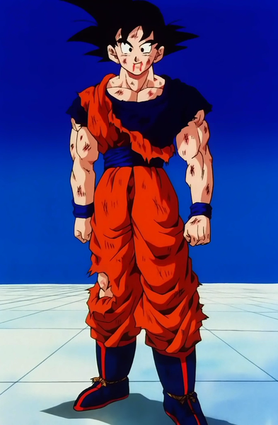
Correct me if I'm wrong but did Maeda work on Goku's design during his fight with Frieza In Z? Although, amen. The thick black eyebrows are so satisfying to look at lol.
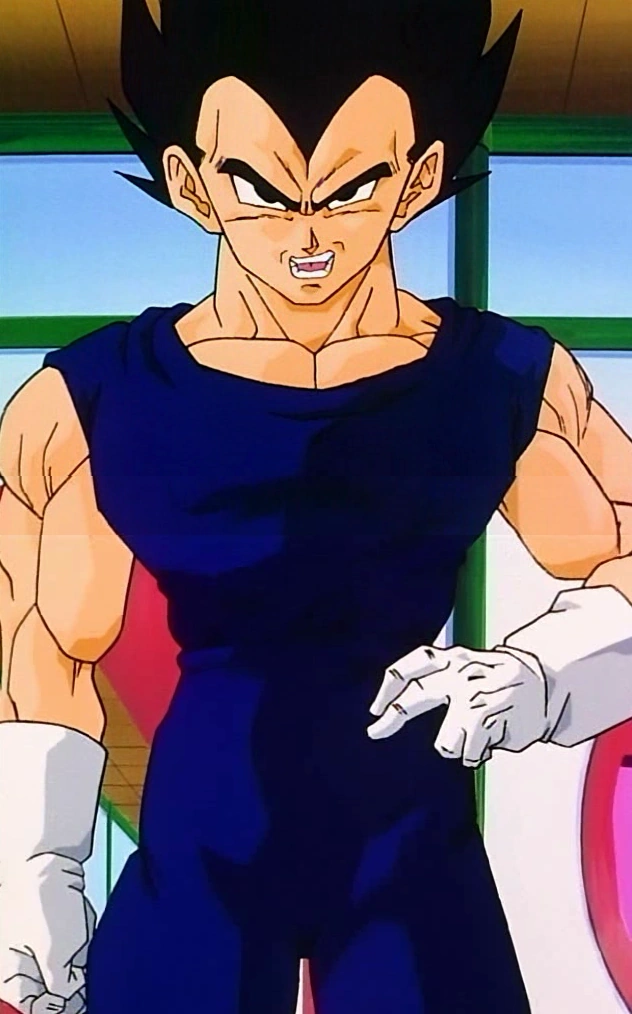
That bottom image may be done by Masaki Sato, going by his fanart drawings recently. They look similar to each other. It's not too surprising that he prefers simpler designs as opposed to Yamamuro's. If he was handed to a position of character designer, the current series would be completely different and for the better of key animators and supervisors.
HybridSaiyan wrote:
Ajay wrote:
HybridSaiyan wrote:Ajay, what's your thoughts on Maeda's style? Is it something you're fond of?
Maeda's designs are spectacular -- especially in the hands of folks like Masaki Sato. Those thick eyebrows were so good.
Much prefer his designs to Nakatsuru and Yamamuro's. Not that theirs were bad back then, but they're not as appealing to me as Maeda's.
Correct me if I'm wrong but did Maeda work on Goku's design during his fight with Frieza In Z? Although, amen. The thick black eyebrows are so satisfying to look at lol.
Indeed, he did. He was the character designer throughout the series, except Boo arc. The role of character designer is to provide designs for each character throughout a series. So, it's not only Goku Maeda had worked on, but everyone else.
DragonBalllKaiHD wrote:That bottom image may be done by Masaki Sato, going by his fanart drawings recently. They look similar to each other. It's not too surprising that he prefers simpler designs as opposed to Yamamuro's. If he was handed to a position of character designer, the current series would be completely different and for the better of key animators and supervisors.
HybridSaiyan wrote:
Ajay wrote:
Maeda's designs are spectacular -- especially in the hands of folks like Masaki Sato. Those thick eyebrows were so good.
Much prefer his designs to Nakatsuru and Yamamuro's. Not that theirs were bad back then, but they're not as appealing to me as Maeda's.
Correct me if I'm wrong but did Maeda work on Goku's design during his fight with Frieza In Z? Although, amen. The thick black eyebrows are so satisfying to look at lol.
Indeed, he did. He was the character designer throughout the series, except Boo arc. The role of character designer is to provide designs for each character throughout a series. So, it's not only Goku Maeda had worked on, but everyone else.
Ah, I see. It must be why the art looked quite consistent throughout each episode then? I don't really have a problem that Maeda wasn't the character designer in the Buu saga, reason being. It already looked visually beautiful, but saying that, it would be interesting to see the Buu saga if it was Maeda instead.
Partly. The original Dragon Ball was quite consistent, barring an animation supervisor's different take on Maeda's character designs. They worked closely to Maeda's models, so it's not too surprising that they were consistent. It was only when Dragon Ball Z took off that the series' art models became less consistent. Masahiro Shimanuki, Kazuya Hisada, Tadayoshi Yamamuro, Keisuke Masunga, Naoki Miyahara, to name a few all completely changed the look of the show once Dragon Ball Z aired. They all were key animators from the original series before being promoted to animation supervisors in Z. Naoki Tate started out as an in-betweener before becoming a key animator in Z. I suspect Maeda's may have let them do their stuff because they were good enough. We really don't know the specifics, though.
Alee9977 wrote: means there is more time for post production
Not necessarily, it looks like a pretty simple effect that is just applied to the whole screen, so it can probably be applied very quickly.
As for the line effect I have no idea on that one.
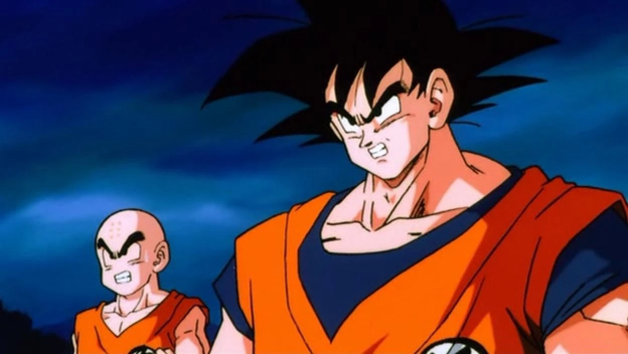
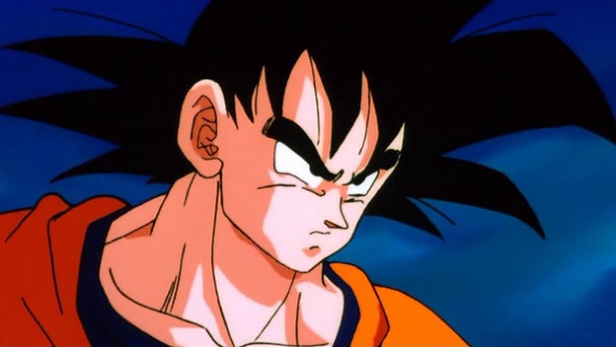
Don't think so!! If we compare these 2 images, you will see that the backround is completely different.
Check out this image. The backround on the right is much more polished, well done and more animated than the one on the left. I don't think that's the work of a single filter.
Last edited by Hit!! on Fri Feb 03, 2017 10:32 pm, edited 1 time in total.
Alee9977 wrote: means there is more time for post production
Not necessarily, it looks like a pretty simple effect that is just applied to the whole screen, so it can probably be applied very quickly.
As for the line effect I have no idea on that one.
Don't think so!! If we compare these 2 images, you will see that the backround is completely different.
Check out this image. The backround on the right is much more polished more animated than the one on the left.
\
Low Quality image vs High Quality image. Dang.
It's pretty much the same. The ground just got darker.
But, really? I think coloring Key Animation is fast. Just, look at super schedule. It's bad, but the coloring is always on-point.
And since most of us thought that the schedule is getting better. Might as well say that they got more time, giving shading and some stuff.
I agree with ArchedThunder.
Last edited by Gashif Aldi on Fri Feb 03, 2017 10:39 pm, edited 2 times in total.
I'm bad at English and still learning. If there's anything wrong, please correct me.
Alee9977 wrote: means there is more time for post production
Not necessarily, it looks like a pretty simple effect that is just applied to the whole screen, so it can probably be applied very quickly.
As for the line effect I have no idea on that one.
Don't think so!! If we compare these 2 images, you will see that the backround is completely different.
Check out this image. The backround on the right is much more polished, well done and more animated than the one on the left. I don't think that's the work of a single filter.
I think you're mistaken here. Firstly, that's not actually the same frame to begin with, so comparing the background animation isn't reliable. More to the point though, I think what you're referring to as "polish" is just blurring and thickening of the lines that the filter does to everything else, too.
Alee9977 wrote: means there is more time for post production
Not necessarily, it looks like a pretty simple effect that is just applied to the whole screen, so it can probably be applied very quickly.
As for the line effect I have no idea on that one.
Maybe, but why would they start doing this after almost 80 episodes?
Wasn't there a new color designer recently ? Maybe he decided to change things starting with the new arc.
Jinzoningen MULE wrote: Maybe I should start making it a point not to comment when I'm not sure of something. Too many people know what they're talking about around here.
Disclaimer: I might get into a disagreement with you. Sometimes I might even get feisty about it. I'll never harbor negative feelings because of it though. I hope you feel the same way!
I made a bet with Alee9977 that Vegeta won't be beaten quickly by an opponent. If I lose, I switch my avatar to Vegeta getting beat by hit. If I win, he switches it to Vegeta holding Black by his hair. This will last a month.
Alee9977 wrote: means there is more time for post production
Not necessarily, it looks like a pretty simple effect that is just applied to the whole screen, so it can probably be applied very quickly.
As for the line effect I have no idea on that one.
Don't think so!! If we compare these 2 images, you will see that the backround is completely different.
Check out this image. The backround on the right is much more polished, well done and more animated than the one on the left. I don't think that's the work of a single filter.
I don't understand how you can say it more animated when its literally just a still image.
I don't like the saturation filter, it looks overly bright and kind of ugly to be honest, I do like however, the line processing, I think it makes the characters look a little more solid.


 [/spoiler]


 [/spoiler]
 [/spoiler]