I would like some honest critique...

Any general discussion regarding fan-created works of the Dragon Ball franchise, including AMVs, fan-art, fan-fiction, etc.

Moderators: General Help, Kanzenshuu Staff

User avatar
Metalwario64
Born 'n Bred Here
Posts: 6175
Joined: Thu Feb 07, 2008 1:02 am
Location: Namek

I would like some honest critique...

Post by Metalwario64 » Fri Aug 07, 2009 5:51 am

Now, before I get started, I would like to point out that I am well aware that there is a perfectly capable thread for posting your own fan-works and the such, but I am creating this thread because I would like some serious critique on some artwork...

If this is unreasonable, then mods, please delete this thread or move this into the "fan-works explosion" thread as necessary.

Now, I have been on many internetz, and I have posted my arts on a plethora of websites, most of the time they go unnoticed, but other times, on certain sites, I request some critique or, constructive criticism if you will. Well, every time I do so, I get responses like "That is perfect, I love your art A+ thumbsuplol11!!!" or "Better than I can do, so I think it's good."

I post this here because I want some honest critique. Don't have to be super knowledgeable in art to criticize; see something you don't like? Feel free to state so! Think it outright suxxorz? You can believe that! Just state why you feel that way and how you think I could improve if possible.

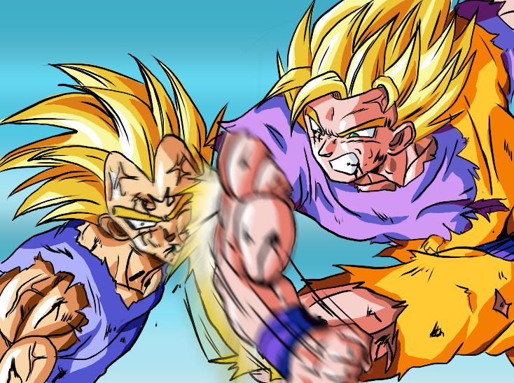
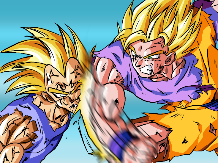
Now on to the art in question.

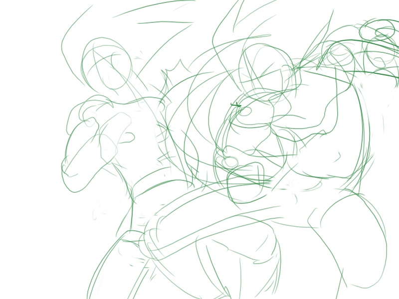
For now, I only have this one that I drew specifically for this thread, and I must say that this is one of my better works. It took about 2 or so hours, and I did try pretty hard.

All of the tutorials/books/lessons I have referred to over the years have stated that you need to be able to draw lighting fast, so that is what I attempt to do every time. I feel that if I could take as long as I wanted, then I would be able to draw anything... (not only that, but I also have little time on my hands and I want to draw as many things as possible...)

Also, I am not very good at mimicking Toriyama-sama's illustrious art style, but I cannot imaging his characters any other way, so forgive plz.

Without further ado, here is my drawing:
Image
CC plz.
"Kenshi is sitting down right now drawing his mutated spaghetti monsters thinking he's the shit..."--Neptune Kai
"90% of you here don't even know what you're talking about (there are a few that do). But the things you say about these releases are nonsense and just plain dumb. Like you Metalwario64"--final_flash

User avatar
SHINOBI-03
I Live Here
Posts: 2611
Joined: Fri Oct 10, 2008 7:47 am
Location: United Arab Emirates, Dubai
Contact:

Post by SHINOBI-03 » Fri Aug 07, 2009 6:00 am

You want the hard truth?!
-----
The blur effect is not good.

The impact effect of the punch needs more work

Lot of areas where you can see the colors outside the lines

The shading looks good however
My Dragon Ball Story (500th post)
My Anime List
My Manga List
Big Momma wrote:This is Daizex. There's gonna be complaints and groaning no matter what. ;)
Anime Insider magazine wrote:If police officers in the future dress like prostitutes, then what do prostitutes in the future wear?

SonGokuGT
I Live Here
Posts: 2440
Joined: Sun Aug 22, 2004 6:46 pm

Post by SonGokuGT » Fri Aug 07, 2009 6:04 am

I'd take Shinobi's advice. Specially on the blur since it kind of just stops flat! Other than that it's a really cool-looking drawing.

mattymoron
Beyond Newbie
Posts: 286
Joined: Sat Jul 04, 2009 10:28 am

Post by mattymoron » Fri Aug 07, 2009 6:05 am

The only thing I didn't really like was the blur effect. Beyond that, I think it looks really good.

Except for above one of Vegeta's hair spikes where I can see a little bit of some sort of color that isn't blue like it should be.

User avatar
Metalwario64
Born 'n Bred Here
Posts: 6175
Joined: Thu Feb 07, 2008 1:02 am
Location: Namek

Post by Metalwario64 » Fri Aug 07, 2009 6:06 am

SHINOBI-03 wrote:You want the hard truth?!
-----
The blur effect is not good.

The impact effect of the punch needs more work

Lot of areas where you can see the colors outside the lines

The shading looks good however
Yeah, that's what I'm talking about cuz!

Here is it without all that dang 'ol blur applied to it.
Image
Thanks for the critics though man. I know I suck at "action" though... I just don't know how to fix it... maybe it will just come to me one day as long as I plow through the drawings.

I suck at, and hate coloring, plain and simple. The outside the lines thing is from my constant rushing to get it over with...

Maybe I should just slow down a bit...

It's just that I don't want to do it slow, to learn that I can't do it the fast/right way...
"Kenshi is sitting down right now drawing his mutated spaghetti monsters thinking he's the shit..."--Neptune Kai
"90% of you here don't even know what you're talking about (there are a few that do). But the things you say about these releases are nonsense and just plain dumb. Like you Metalwario64"--final_flash

User avatar
Bussani
Kicks it Old-School
Posts: 8041
Joined: Mon Aug 25, 2008 2:35 am
Location: New Zealand

Post by Bussani » Fri Aug 07, 2009 6:10 am

I wouldn't worry about the messy coloring around the edges. It gives your drawing style character! Maybe that's a lazy excuse, but meh, the colors and shading are nice enough that I don't think it matters.

I think it should have a blur effect like you did, it's just thew way it ended on the right that didn't look right.

I think the way Vegeta is standing only looks sort of wrong because the punch should be sending him backwards, but it looks like he's leaning into it instead. Maybe he was flying into Goku's fist for one reason or another?

User avatar
Metalwario64
Born 'n Bred Here
Posts: 6175
Joined: Thu Feb 07, 2008 1:02 am
Location: Namek

Post by Metalwario64 » Fri Aug 07, 2009 6:16 am

Bussani wrote:Maybe he was flying into Goku's fist for one reason or another?
Yep, it's supposed to be a VegetOWNED sort of moment. :twisted:

I would do a better blur, but my computer has honestly seen better days, and can't run Photoshop very well at all... (I'm getting a new one in a few months though...:))

Marks another issue down: Image composition and planning... I need to work on that as well, because Vegeta flying into Goku's fist doesn't make for a very... well put together image...
Last edited by Metalwario64 on Fri Aug 07, 2009 6:17 am, edited 1 time in total.
"Kenshi is sitting down right now drawing his mutated spaghetti monsters thinking he's the shit..."--Neptune Kai
"90% of you here don't even know what you're talking about (there are a few that do). But the things you say about these releases are nonsense and just plain dumb. Like you Metalwario64"--final_flash

User avatar
SHINOBI-03
I Live Here
Posts: 2611
Joined: Fri Oct 10, 2008 7:47 am
Location: United Arab Emirates, Dubai
Contact:

Post by SHINOBI-03 » Fri Aug 07, 2009 6:16 am

Here's an advice. If you have Adobe Photoshop, you can try this.

- Try to make a new layer with Goku's arm only
- Once done, use Motion Blur with the suitable angle and distance
- You can also try using the smudge tool for more details

As for the impact, it might be a little harder

- Do another layer for it (make it under Goku's arm layer)
- Try to use smudge tool on the edges, or...
- Use Radial Blur with Zoom option

EDIT: When you'll get the software of course
My Dragon Ball Story (500th post)
My Anime List
My Manga List
Big Momma wrote:This is Daizex. There's gonna be complaints and groaning no matter what. ;)
Anime Insider magazine wrote:If police officers in the future dress like prostitutes, then what do prostitutes in the future wear?

User avatar
Metalwario64
Born 'n Bred Here
Posts: 6175
Joined: Thu Feb 07, 2008 1:02 am
Location: Namek

Post by Metalwario64 » Fri Aug 07, 2009 6:34 am

Image
Like this?
"Kenshi is sitting down right now drawing his mutated spaghetti monsters thinking he's the shit..."--Neptune Kai
"90% of you here don't even know what you're talking about (there are a few that do). But the things you say about these releases are nonsense and just plain dumb. Like you Metalwario64"--final_flash

User avatar
Bussani
Kicks it Old-School
Posts: 8041
Joined: Mon Aug 25, 2008 2:35 am
Location: New Zealand

Post by Bussani » Fri Aug 07, 2009 6:42 am

The blur on the arm looks better, but maybe a tad too blurred. Somehow the way it ends at the top still looks too abrupt, but I'm not sure what would look right. Maybe his shoulder should be blurred too?

Edit: I'm not a blur expert. I feel like something's wrong, but I can't explain what. Maybe someone else can.

User avatar
Metalwario64
Born 'n Bred Here
Posts: 6175
Joined: Thu Feb 07, 2008 1:02 am
Location: Namek

Post by Metalwario64 » Fri Aug 07, 2009 6:55 am

Would something like this be a more accurately composed image that better conveys the scene and the action?
Image

I took more time with this one... I guess it's best to start out slow, and I will naturally speed up as time goes on I suppose... Gotta learn to walk before you learn to run...

I'll probably only go up to the line-art for this one, because I don't think that the coloring deserves critique because I know how to fix it... I'm just too lazy.:P
Last edited by Metalwario64 on Fri Aug 07, 2009 6:58 am, edited 1 time in total.
"Kenshi is sitting down right now drawing his mutated spaghetti monsters thinking he's the shit..."--Neptune Kai
"90% of you here don't even know what you're talking about (there are a few that do). But the things you say about these releases are nonsense and just plain dumb. Like you Metalwario64"--final_flash

User avatar
SHINOBI-03
I Live Here
Posts: 2611
Joined: Fri Oct 10, 2008 7:47 am
Location: United Arab Emirates, Dubai
Contact:

Post by SHINOBI-03 » Fri Aug 07, 2009 6:58 am

It looks better of course. I don't see it too blured


Here's an edit I did

Image
My Dragon Ball Story (500th post)
My Anime List
My Manga List
Big Momma wrote:This is Daizex. There's gonna be complaints and groaning no matter what. ;)
Anime Insider magazine wrote:If police officers in the future dress like prostitutes, then what do prostitutes in the future wear?

User avatar
Metalwario64
Born 'n Bred Here
Posts: 6175
Joined: Thu Feb 07, 2008 1:02 am
Location: Namek

Post by Metalwario64 » Fri Aug 07, 2009 6:58 am

SHINOBI-03 wrote:It looks better of course. I don't see it too blured


Here's an edit I did

Image
Woah! :shock: How did you achieve that effect??

Did you draw some staight lines pointing inward, and simply use the Radial Blur effect?

That's a keeper! :wink:
"Kenshi is sitting down right now drawing his mutated spaghetti monsters thinking he's the shit..."--Neptune Kai
"90% of you here don't even know what you're talking about (there are a few that do). But the things you say about these releases are nonsense and just plain dumb. Like you Metalwario64"--final_flash

User avatar
SHINOBI-03
I Live Here
Posts: 2611
Joined: Fri Oct 10, 2008 7:47 am
Location: United Arab Emirates, Dubai
Contact:

Post by SHINOBI-03 » Fri Aug 07, 2009 7:04 am

Metalwario64 wrote:Woah! :shock: How did you achieve that effect??
I keep some backgrounds and effects for my manga in hand when needed.

What I did here is taking the zoom lines that some refers to it as "Vanishing Point" that I made long time ago, duplicated it to have one in black and the other in white.

Here's how to make it:

1- make a square shaped picture
2- draw a stright line that cuts the square in half
3- duplicate the line and rotate it 90ْ
4- duplicate the two lines again and rotate them the way you like
5- do it again until you get satesfied, and combine all the layers into one
6- use the ereaser in a big size and erease the center
7- you can ereaser and make some space between some line and give a vary in length
8- once done, use Radial Blur and you'll get your Vanishing Point
My Dragon Ball Story (500th post)
My Anime List
My Manga List
Big Momma wrote:This is Daizex. There's gonna be complaints and groaning no matter what. ;)
Anime Insider magazine wrote:If police officers in the future dress like prostitutes, then what do prostitutes in the future wear?

User avatar
Innagadadavida
I Live Here
Posts: 3476
Joined: Thu Nov 13, 2008 12:25 am
Location: Arkansas, USA

Post by Innagadadavida » Fri Aug 07, 2009 11:12 am

Goku's thigh is longer than his torso. And Vegeta looks like he's leaning into the punch. It would look more realistic if he were getting knocked back. With his torso in front of his head.
Last edited by Innagadadavida on Fri Aug 07, 2009 12:25 pm, edited 1 time in total.

dragonpiece
Beyond Newbie
Posts: 290
Joined: Mon Jul 20, 2009 10:10 am
Contact:

Post by dragonpiece » Fri Aug 07, 2009 11:54 am

I think it would look better without it colored and than go on from there.

User avatar
JulieYBM
Patreon Supporter
Posts: 16609
Joined: Mon Jan 16, 2006 10:25 pm

Post by JulieYBM » Fri Aug 07, 2009 12:01 pm

Wait, is Gokuu punching him or hitting him with his elbow? The positioning is so odd it's hard to tell, not to mention the reaction Vegeta has, shouldn't he be falling towards the viewer, or the ground?? There's not really any power to the impact, either...
She/Her
🍉🏳️‍⚧️

User avatar
Rocketman
Namekian Warrior
Posts: 10799
Joined: Mon Nov 08, 2004 10:17 pm

Post by Rocketman » Fri Aug 07, 2009 12:34 pm

Metalwario64 wrote:
Bussani wrote:Maybe he was flying into Goku's fist for one reason or another?
Yep, it's supposed to be a VegetOWNED sort of moment. :twisted:
That just doesn't work in a stationary and stand-alone picture. It looks bad.

User avatar
DragonBalllKaiHD
I Live Here
Posts: 2707
Joined: Sun Apr 19, 2009 2:37 pm
Location: Texas
Contact:

Re: I would like some honest critique...

Post by DragonBalllKaiHD » Fri Aug 07, 2009 6:22 pm

Metalwario64 wrote:Without further ado, here is my drawing:
Image
CC plz.
Vegeta should be leaned back. it will be effective this way.
Last edited by DragonBalllKaiHD on Fri Aug 07, 2009 7:02 pm, edited 1 time in total.
Katsuyoshi Nakatsuru's #1 biggest fan

A piece of animation is a beauty of art.

User avatar
Metalwario64
Born 'n Bred Here
Posts: 6175
Joined: Thu Feb 07, 2008 1:02 am
Location: Namek

Post by Metalwario64 » Fri Aug 07, 2009 6:58 pm

Rocketman wrote:
Metalwario64 wrote:
Bussani wrote:Maybe he was flying into Goku's fist for one reason or another?
Yep, it's supposed to be a VegetOWNED sort of moment. :twisted:
That just doesn't work in a stationary and stand-alone picture. It looks bad.
Yup I know.
Metalwario64 wrote:Marks another issue down: Image composition and planning... I need to work on that as well, because Vegeta flying into Goku's fist doesn't make for a very... well put together image...
Every art class/drawing book/online tutorial I have referred to fails to mention image composition and what makes a good image...

I mean, I've learned about placing objects and whatnot, and about negative-space or whatever, but I have never been taught about how to plan images to convey actions and whatnot...

Guess I need to make rough sketches and see which one is the best?
"Kenshi is sitting down right now drawing his mutated spaghetti monsters thinking he's the shit..."--Neptune Kai
"90% of you here don't even know what you're talking about (there are a few that do). But the things you say about these releases are nonsense and just plain dumb. Like you Metalwario64"--final_flash

Post Reply