sintzu wrote:
I know the first 4-6 seasons aren't the best but based on what i saw on youtube 7-9 look a lot better but i don't know how accurate youtube is so if you have a comparison it would help.
Skip to 10:4
https://www.youtube.com/watch?v=n8JCF4KiRi8
God, I've seen this guy before. All of his comparisons are so superficial and useless. He's comparing Blu-ray shots with compressed TV rips.
With that said, that's all we really
can do until the Kai sets catch up. Here's a comparison between a TV rip of Kai (colour-corrected to match the Season colours) vs. a scaled down shot of the Season Set -
http://screenshotcomparison.com/comparison/103418
On a first glance, I fully understand why people go 'Oh, the Season Set is clearly sharper'. I totally get that. The issue is, that knee-jerk observation doesn't take into account the overall image or the original look of the show.
The first thing to take notice of is the line art in the Season shot. To clarify - I mean the black lines
alone (not including the shading). They are noticeably watery and this is even more apparent when the shot is
actually at its original resolution. Take note of the ear and how smudged it looks. Though we don't have Blu-rays available of Kai to compare at 100% zoom, this is the type of line consistency I expect -
http://i.imgur.com/S4Lx4Zw.png (from Boo Kai Box. 1). Even in the later seasons you mentioned, issues like this -
http://i1.minus.com/ibekl0GDdCCMn6.png - are still very apparent in medium and long shots.
(To note - when I say '100% zoom', I mean there is no scaling at all and that's how it'll look on your TV. When you scale shots, downsampling occurs which results in a sharper picture than what would be seen at full res. This is
not me going over the image with a magnifying glass like some think.)
Next up, the shading is probably the biggest giveaway for me. This is the primary reason why people instinctively say that the Seasons look better. The shading is
sharp. It's insanely sharp to the point that it looks flat. The original cels do
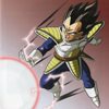
not look like this whatsoever. Take a look at this Vegeta cel I own -
http://i.imgur.com/stlKANd.png - Notice how soft the shading is? That's how Kai's shading looks too and that's how it
should look. Unfortunately FUNi's extensive sharpening has entirely flattened it, resulting in this peculiar watercolour look.
Lastly, the grain in the Season sets smear in and out of the image almost constantly. It's most apparent in the sky and shading. I made a gif of this many months ago -
http://i.minus.com/in2PBIm0omfBU.gif - Take a look at Nappa's arm and the way the shading is 'dancing'. It's the grain fighting against the removal process on top of extensive sharpening. Not nice to look at.
Kai may be softer at a glance but if you look at each component and how it's
supposed to look -
it's very clearly the winner.
To address something that always comes up when I criticise this product - Yes, I know it's the only way to own the series without paying ridiculous money. Yes, I know it's better than the Orange Bricks. This doesn't negate the flaws nor save it from criticism though.


