Super Animation Catalogue 2.0
Re: Super Animation Catalogue 2.0 - Episode 71
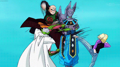
Like I said, the preview doesn't really look that bad, unless I've just gotten used to Tate, but you can tell right away that it's him, and the characters are obviously off model. But it does seem like people are justfying his art cause they like him. He's a good animator, but it's easy to see why people complain about him. What good is animation if it comes at the cost of good art? Ugly art work can easily turn people off, even if that's "his style". Not saying that he has to be perfectly on model all the time, but a lot of off model shots at least look the characters. But with him, it seems he does it purposely, and the characters don't really look like who they should.

Re: Super Animation Catalogue 2.0 - Episode 71
Karasawa and Higashide are definitely the best animators working on this show for me.
Also the one who posted above me is right.
Also the one who posted above me is right.

Re: Super Animation Catalogue 2.0 - Episode 71
Shida never get's too away from the character sheets, that's a lie.
For 72, I'm expecting higashide correcting tate, one can dream
For 72, I'm expecting higashide correcting tate, one can dream

Re: Super Animation Catalogue 2.0 - Episode 71
No, it isn't. Shida's work is very far from the character sheets.cuartas wrote:Shida never get's too away from the character sheets, that's a lie.
[spoiler]

 [/spoiler]
The ears are different, the face shape is different, the eyes are different, the shading is different. They're a departure in a way that you personally enjoy.
I'm not using that as a defense for Tate. Just because one animator goes off-model in a way you like, doesn't mean another necessarily does the same. If you don't like him, you don't like him, but let's actually be realistic here.
Follow me on Twitter for countless shitposts.
Deadtuber.
Deadtuber.
-
Anime Kitten

- I Live Here
- Posts: 4275
- Joined: Mon May 23, 2016 3:53 pm
- Contact:
Re: Super Animation Catalogue 2.0 - Episode 71
Beautiful.Ajay wrote:[spoiler]
-
Ki Breaker

- Born 'n Bred Here
- Posts: 6572
- Joined: Wed Jan 27, 2016 12:15 am
- Location: Edinburgh, Scotland
Re: Super Animation Catalogue 2.0 - Episode 71
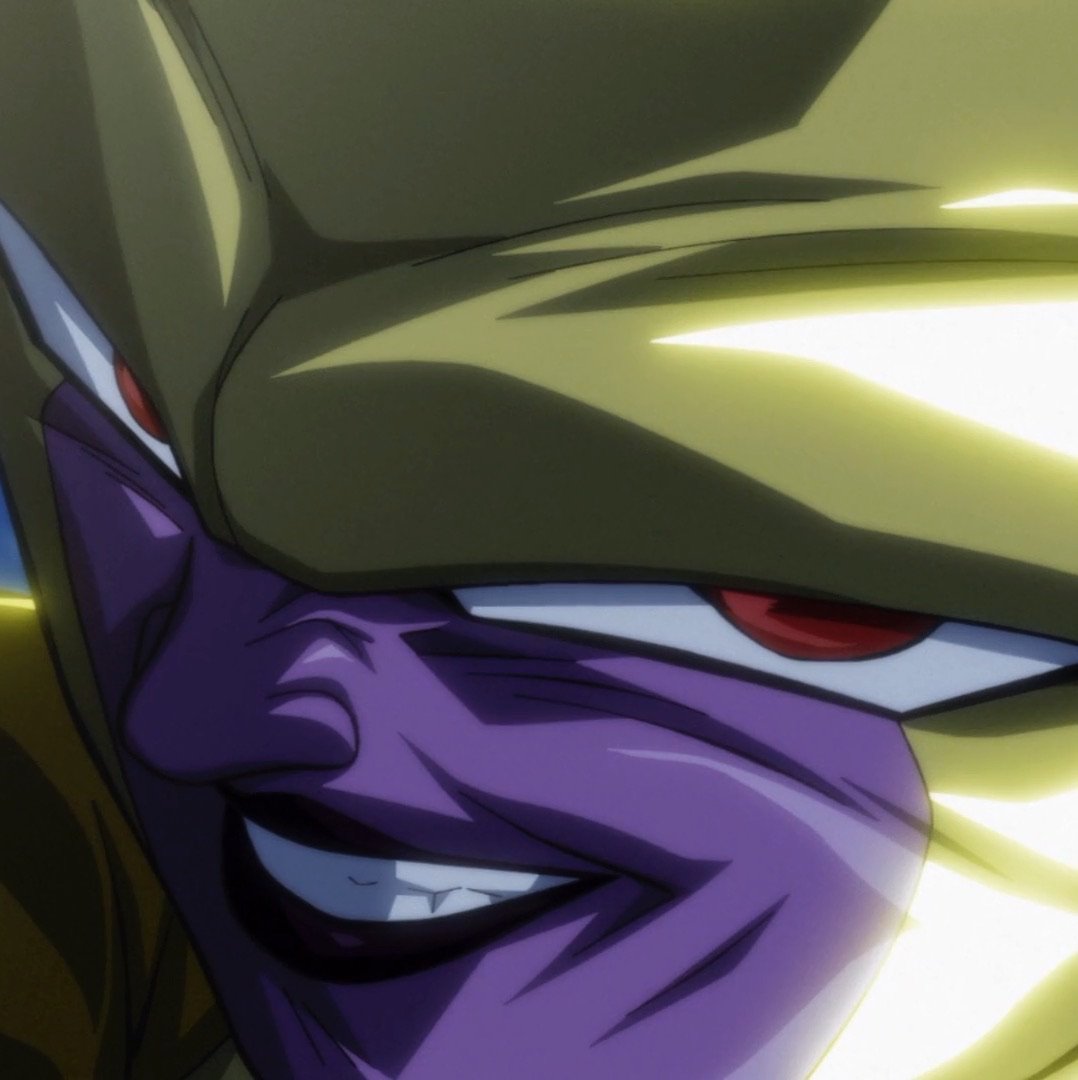
So those are made by Shida, those look nothing short of amazingAnime Kitten wrote:Beautiful.Ajay wrote:[spoiler]
I love how Shida manages to go off-model while not having the art end up rough like Tate (not that what Tate does is bad; he's still awesome). I'm glad his cuts are so seldom, as it allows him to put as much effort in as possible.
The Lord moves in mysterious ways but you don't have to. Please use your blinker
-
SansrivaaL

- I Live Here
- Posts: 3757
- Joined: Sat Mar 28, 2015 4:29 pm
- Location: Earth
Re: Super Animation Catalogue 2.0 - Episode 71
Jesus, those are amazing, Shida's amazingAjay wrote:No, it isn't. Shida's work is very far from the character sheets.cuartas wrote:Shida never get's too away from the character sheets, that's a lie.
[spoiler]
The ears are different, the face shape is different, the eyes are different, the shading is different. They're a departure in a way that you personally enjoy.
I'm not using that as a defense for Tate. Just because one animator goes off-model in a way you like, doesn't mean another necessarily does the same. If you don't like him, you don't like him, but let's actually be realistic here.
-
DragonBallFan8001

- Beyond Newbie
- Posts: 100
- Joined: Thu Jun 26, 2014 10:27 am
- Location: The Netherlands
Re: Super Animation Catalogue 2.0 - Episode 71
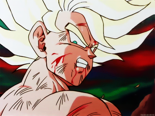
That image reminds me of some of Studio Cockpit's work. I think it's mainly the way Gohan's right arm is positioned. Studio Cockpit often had a similar way of drawing characters.Sodhi wrote:#63 image just leaked
Sakai Hiroyuki is supposed to be the AS.

-
SonsOfUlron21

- Beyond Newbie
- Posts: 171
- Joined: Sun Feb 15, 2015 8:34 pm
- Location: Training with BEERUS
Re: Super Animation Catalogue 2.0 - Episode 71
DragonBallFan8001 wrote:That image reminds me of some of Studio Cockpit's work. I think it's mainly the way Gohan's right arm is positioned. Studio Cockpit often had a similar way of drawing characters.Sodhi wrote:#63 image just leaked
Sakai Hiroyuki is supposed to be the AS.
Shouldn't that be 73 not 63
Re: Super Animation Catalogue 2.0 - Episode 71
Yea supposed to be 73  .
.
-
JazzMazz
- I Live Here
- Posts: 2217
- Joined: Thu Nov 03, 2016 7:28 am
- Location: Mordor, the Borg cube and Voldemort's lair all at the same time in the year 199X

Re: Super Animation Catalogue 2.0 - Episode 71
Is it just me, or does the character art look rather sharp? I personally real like the look and hope they can maintain the level of polish throughout the episode.SonsOfUlron21 wrote:DragonBallFan8001 wrote:That image reminds me of some of Studio Cockpit's work. I think it's mainly the way Gohan's right arm is positioned. Studio Cockpit often had a similar way of drawing characters.Sodhi wrote:#63 image just leaked
Sakai Hiroyuki is supposed to be the AS.
Shouldn't that be 73 not 63
-
Shreyas_Singh

- Beyond Newbie
- Posts: 144
- Joined: Sat Dec 17, 2016 8:47 pm
Re: Super Animation Catalogue 2.0 - Episode 71
Naoki Tate is to 'Super' what Shingo Yamashita is to 'Naruto Shippuden'. Both are creative madmen who put a lot of time and effort into their work ,despite the horrible schedule. Then when it's on the show, the viewers will pause the video, find awkward images ,post screenshots on the internet and call it "garbage animation" while completely ignoring what the artists were going for : interesting movement. Now of course these animators are not perfect by any stretch of the imagination,but its safe to say that their style is not for everyone . Personally I'm glad Tate is on the team to provide some interesting variety of style to an otherwise visually boring looking show thanks to non animation friendly character designs and a poor time schedule.
Feel free to correct me if I say something wrong.
-
JazzMazz
- I Live Here
- Posts: 2217
- Joined: Thu Nov 03, 2016 7:28 am
- Location: Mordor, the Borg cube and Voldemort's lair all at the same time in the year 199X
Re: Super Animation Catalogue 2.0 - Episode 71
I agree with some of the sentiment here, the difference being that I'm pretty sure Shingo had a really good schedule to do his work under. Also calling them mad-men, seems a tad hyperbolic. Tate is a principled enough animation to try and make his work proportioned correctly when nothing is happening, but his art feels very basic most of the time, probably due to the schedule as well as the amount of work he needs to do.Shreyas_Singh wrote:Naoki Tate is to 'Super' what Shingo Yamashita is to 'Naruto Shippuden'. Both are creative madmen who put a lot of time and effort into their work ,despite the horrible schedule. Then when it's on the show, the viewers will pause the video, find awkward images ,post screenshots on the internet and call it "garbage animation" while completely ignoring what the artists were going for : interesting movement. Now of course these animators are not perfect by any stretch of the imagination,but its safe to say that their style is not for everyone . Personally I'm glad Tate is on the team to provide some interesting variety of style to an otherwise visually boring looking show thanks to non animation friendly character designs and a poor time schedule.
I feel like most fans would rather desert Tates progressive style for something a lot more on-model and boring like this.
[spoiler][/spoiler]
Though I don't think it's particularly bad, the only real merit it possesses is how on model it is. The work itself is not very inbetweened and the motion itself really suffers because of it, thats without even mentioning the poor timing throughout that makes everything weightless.
-
Shreyas_Singh
- Beyond Newbie
- Posts: 144
- Joined: Sat Dec 17, 2016 8:47 pm
Re: Super Animation Catalogue 2.0 - Episode 71
Madmen was meant to be a complimentJazzMazz wrote:I agree with some of the sentiment here, the difference being that I'm pretty sure Shingo had a really good schedule to do his work under. Also calling them mad-men, seems a tad hyperbolic. Tate is a principled enough animation to try and make his work proportioned correctly when nothing is happening, but his art feels very basic most of the time, probably due to the schedule as well as the amount of work he needs to do.Shreyas_Singh wrote:Naoki Tate is to 'Super' what Shingo Yamashita is to 'Naruto Shippuden'. Both are creative madmen who put a lot of time and effort into their work ,despite the horrible schedule. Then when it's on the show, the viewers will pause the video, find awkward images ,post screenshots on the internet and call it "garbage animation" while completely ignoring what the artists were going for : interesting movement. Now of course these animators are not perfect by any stretch of the imagination,but its safe to say that their style is not for everyone . Personally I'm glad Tate is on the team to provide some interesting variety of style to an otherwise visually boring looking show thanks to non animation friendly character designs and a poor time schedule.
I feel like most fans would rather desert Tates progressive style for something a lot more on-model and boring like this.
[spoiler][/spoiler]
Though I don't think it's particularly bad, the only real merit it possesses is how on model it is. The work itself is not very inbetweened and the motion itself really suffers because of it, thats without even mentioning the poor timing throughout that makes everything weightless.
Feel free to correct me if I say something wrong.
-
JazzMazz
- I Live Here
- Posts: 2217
- Joined: Thu Nov 03, 2016 7:28 am
- Location: Mordor, the Borg cube and Voldemort's lair all at the same time in the year 199X
Re: Super Animation Catalogue 2.0 - Episode 71
It's something I notice a lot espicially from fans who grew up with shows like Dragonball and Z. Most fans are very casual when it comes to things like art and animation, meaning that they often make there judgment by slowing down the animation to see for any model inaccuracies. Most people don't like any sort of change of artstyle within a show, even if it is for the better, the community response to the new pokemon designs are a great example of this.Shreyas_Singh wrote:Madmen was meant to be a complimentJazzMazz wrote:I agree with some of the sentiment here, the difference being that I'm pretty sure Shingo had a really good schedule to do his work under. Also calling them mad-men, seems a tad hyperbolic. Tate is a principled enough animation to try and make his work proportioned correctly when nothing is happening, but his art feels very basic most of the time, probably due to the schedule as well as the amount of work he needs to do.Shreyas_Singh wrote:Naoki Tate is to 'Super' what Shingo Yamashita is to 'Naruto Shippuden'. Both are creative madmen who put a lot of time and effort into their work ,despite the horrible schedule. Then when it's on the show, the viewers will pause the video, find awkward images ,post screenshots on the internet and call it "garbage animation" while completely ignoring what the artists were going for : interesting movement. Now of course these animators are not perfect by any stretch of the imagination,but its safe to say that their style is not for everyone . Personally I'm glad Tate is on the team to provide some interesting variety of style to an otherwise visually boring looking show thanks to non animation friendly character designs and a poor time schedule.
I feel like most fans would rather desert Tates progressive style for something a lot more on-model and boring like this.
[spoiler][/spoiler]
Though I don't think it's particularly bad, the only real merit it possesses is how on model it is. The work itself is not very inbetweened and the motion itself really suffers because of it, thats without even mentioning the poor timing throughout that makes everything weightless.They're unique in their own right ,but yeah I think anime fans have trained their eyes for many years with on model stiff animation of dbz and Pokémon,even early parts of Naruto and when they see something 'abstract' like this it gives them the impression that the artist cant draw .I'm just speculating here maybe this is the mentality behind the negative reaction to naruto's and Tate's animation ,also the new character designs for Pokémon.
-
Shreyas_Singh
- Beyond Newbie
- Posts: 144
- Joined: Sat Dec 17, 2016 8:47 pm
Re: Super Animation Catalogue 2.0 - Episode 71
Why doesn't Super use impact frames more often during action scenes ? Impact frames https://imgur.com/gallery/sCrUM .I mean if I can make this then anyone can make this,its very simple and effective.
Feel free to correct me if I say something wrong.
-
Psykomatik
- Regular
- Posts: 521
- Joined: Thu Sep 24, 2015 7:37 am
Re: Super Animation Catalogue 2.0 - Episode 71
https://www.youtube.com/watch?v=e8DJNNtPBDI
This is the best color correction you'll find on YouTube.
(Don't mind the title, it's just clickbait.)
EDIT: Oh, and there's this one too: https://www.youtube.com/watch?v=-SgVLpqqq00
This is the best color correction you'll find on YouTube.
(Don't mind the title, it's just clickbait.)
EDIT: Oh, and there's this one too: https://www.youtube.com/watch?v=-SgVLpqqq00

Re: Super Animation Catalogue 2.0 - Episode 71
That actually looks amazing.Psykomatik wrote:https://www.youtube.com/watch?v=e8DJNNtPBDI
This is the best color correction you'll find on YouTube.
(Don't mind the title, it's just clickbait.)
EDIT: Oh, and there's this one too: https://www.youtube.com/watch?v=-SgVLpqqq00
-
BakaManiaHD
- Beyond Newbie
- Posts: 223
- Joined: Thu Jun 30, 2016 12:57 am
- Location: France
Re: Super Animation Catalogue 2.0 - Episode 71
I wonder what software he's usingAvok wrote:That actually looks amazing.Psykomatik wrote:https://www.youtube.com/watch?v=e8DJNNtPBDI
This is the best color correction you'll find on YouTube.
(Don't mind the title, it's just clickbait.)
EDIT: Oh, and there's this one too: https://www.youtube.com/watch?v=-SgVLpqqq00
kill me
-
Jinzoningen MULE

- I Live Here
- Posts: 4405
- Joined: Thu Mar 24, 2016 8:33 pm
- Location: Salt Mines
Re: Super Animation Catalogue 2.0 - Episode 71
It's okay, I guess. He's mostly just lowering the saturation and contrast, but it unavoidably causes problems with the shading.Avok wrote:That actually looks amazing.Psykomatik wrote:https://www.youtube.com/watch?v=e8DJNNtPBDI
This is the best color correction you'll find on YouTube.
(Don't mind the title, it's just clickbait.)
EDIT: Oh, and there's this one too: https://www.youtube.com/watch?v=-SgVLpqqq00
Retired.