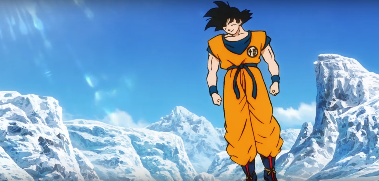
Didn't the Maeda DB designs have one line for muscle definition?Asura wrote:The more I look at this the more I hate this art style. Where is the detail??? There is literally zero linework on his fingers, the muscles are three straight lines, just ugh...FortuneSSJ wrote:I'm not feeling the artstyle though. I was expecting a Maeda style approach, but what we got is bouncier and looser than that. It's not as offensive as Pokémon Sun and Moon or One Piece Movie 6, but it's still not my cup of tea. Goku also looks like Luffy in some frames, like this one:
[spoiler][/spoiler]
Also, I think this is generally the right idea for how muscles should be shown in the series. Soft and loosely defined, but still obstinately visible. Not to mention, the designs are meant for the animators to use as a reference to which they can expand upon and add their own unique details to, so it isn't necessarily a bad thing. Its more for frame of reference than anything else, and like good character designs do, is a frame of reference that allows for malleability.


 [/spoiler]
 [/spoiler]


 She/Her