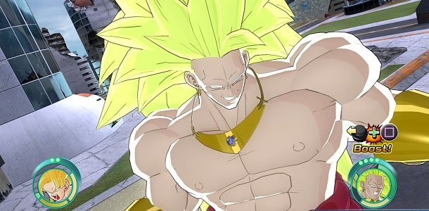
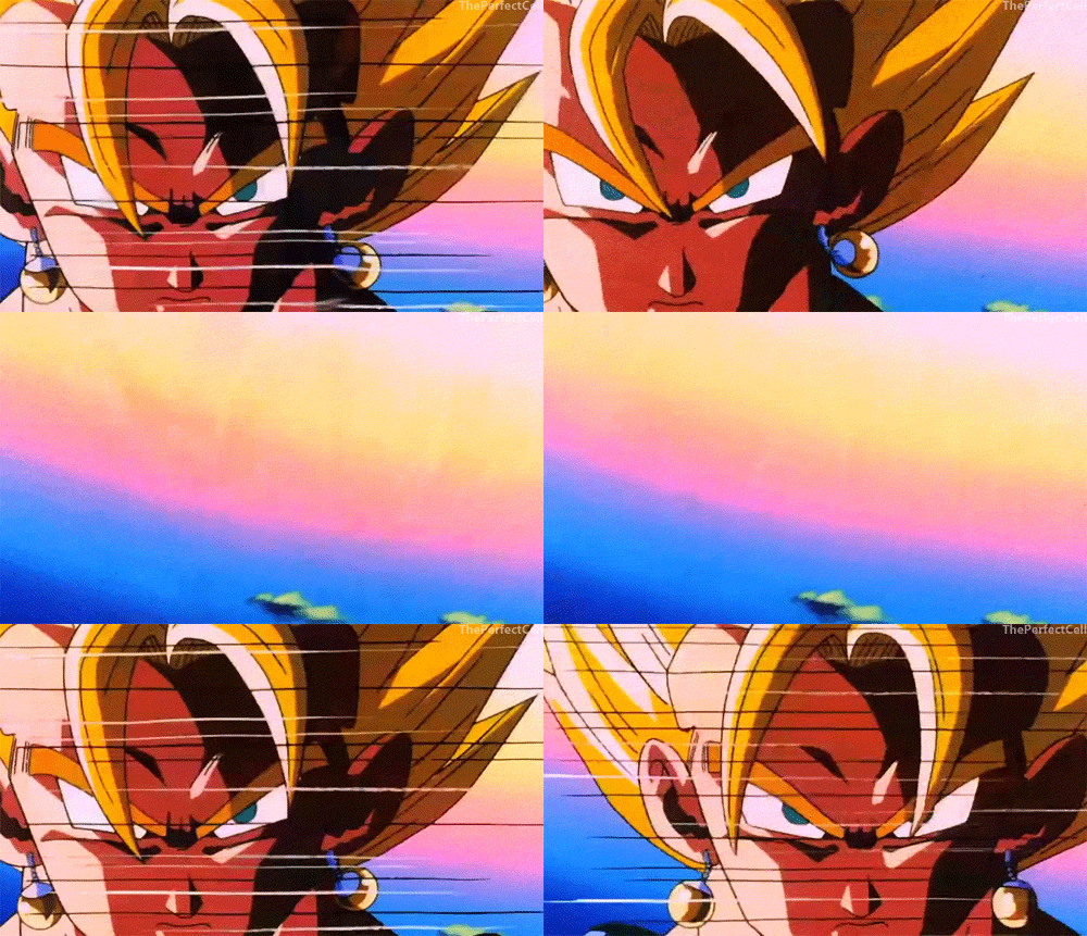
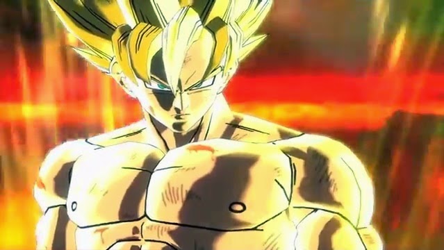
See, these kind of images are exactly what I was talking about. I don't find the textures and some of the special effects aesthetically pleasing at all, at least compared to RB1. In the examples above, for instance, in the first shot the shading is so overblown. The shadow on Goku's right eye looks like a burnt hole just like the thick shadows across his chest. They are so distracting and not subtle at all. It creates such big contrast to the light texture of his skin. Moreover, the outlines on his body and hair are too dark and thick which makes him look like a doughy plastic toy which shines too much. Then the second one the aura is so volatile and undefined it's as if he's dousing in Fanta. Furthermore, his face is so lit and glossy due to the effects that it becomes hardly defined just as the stern shadows on his bangs. However, in that shot his chest is far better and almost looks like it could have been from the series itself because the transition from shadow to light is more subtle, that is the shadows aren't too dark and the light skin isn't too light or shiny.
Here, for example, even BT3 was more refined in that regard.
The left one is how it looks in the game and the shadows across his body do not conflict or contrast too much with the light skin. I know it depends on scene to scene and where the actual light comes from and in what intensity, but overall it does not change too much from the way it looks here. If anyone can find a better picture for comparison, go for it.
In RB1 it is the same except in HD and thus cleaner and sharper.
To me this looks as if it could have been ripped straight from the anime series itself. Freezer's look, his sharply defined and clean body as well as the unobtrusive and defined shading make it almost like the series.
In motion it probably looks better. Take this video
here as an example. Pay attention to the first few seconds when Vegeta stands there. He looks clean, sharp and the shading on his body on the right side and on his gloves is not too crass. The lines demarcating his muscles are not too thick and dark, making for a subtle transition between dark and light textures. Overall, this looks just like the anime. And I am not talking about the way he stands there so stiffly or the way his mouth moves. That's absolutely not my point and doesn't factor into my preferring of RB1's graphics over that of BL for example. Obviously things could definitely be improved in that regard.
Now RB1 it stays mostly the same as in BT3. It has the most accurate color palette and subtle shading in my view, making it look - I'll repeat:
look - like the series. I am not talking about all the special effects, auras, facial expressions, the backgrounds and animations. I am solely talking about the way the characters' outward appearance is, that is the models' textures. And in that regard I think RB1 is still untouched.

