Super Animation Catalogue 2.0
Re: Super Animation Catalogue - [Updated with #58]
Yes, tate has loose drawings, and exaggerated expressions. That allows him to animate really fluidly.

Re: Super Animation Catalogue - [Updated with #58]
1) The overreaction with Yamamuro's designs is over 90000. Is not that bad. It's all about tastes, but overall is what makes DB looks the way it always looked. The guy has that huge responsability for a reason.
2) I'm tired of the One Piece references when we're talking about Dragon Ball drawing (not animation, just drawing). Absolutely different universes and styles. Enough with Luffy when we talk about Goku's appeal, for real. I hope not to offend anyone.
3) I don't like old SFX with modern Dragon Ball. It doesn't fit. I never understood the necessity of trying that, except for some pieces of music. I agree that DBZ had really good SFX, but with the way they do DBS, it doesn't fit well. Again, a matter of tastes, I guess, but when that happens is just nostalgia taking control.
PS: Long live Tate.
Re: Super Animation Catalogue - [Updated with #58]
I'm terrified of where this conversation is going to go, but...
Tate's loose drawings are primarily stylistic than strictly practical. It's not like Shida's cut was less fluid than Tate's work just because his style is stiffer. They're just two equally great animators on totally opposite ends of the spectrum stylistically.
Funnily enough both are totally off-model, which I think is an important reminder that adherence to a model sheet does not determine quality.
I mean, we've literally just seem Mr. On-Model Ishikawa get picked apart. It's all about the intent and the success of what you were trying to achieve.
Tate's Room of Spirit and Time cut was torn to pieces by animation fans for being non-sensically smeary, for example. They felt the motion lines were too over the top and distracting, harming the motion rather than enhancing it. That's a solid critique that takes into account the intentions and style of the animator. I like the cut, but I 100% respect that critique.
On-model vs off-model doesn't actually mean much more than just, "Hey, your drawing doesn't look like this drawing". If someone wasn't trying to do that in the first place, then nothing's actually being said there.
Yashima is criticised now and then, but his whole purpose is to scribble out episodes on his own to free up animators' schedules. His work isn't ever going to be super polished and I'm sure he knows that. We know that, so there's nothing much to say there.
Bit of a ramble, but I'm about to sleep and I kinda desperately wanted to try and preempt the usual conversations that tend to follow these debates.
Follow me on Twitter for countless shitposts.
Deadtuber.
Deadtuber.
-
ArchedThunder

- Born 'n Bred Here
- Posts: 5718
- Joined: Fri Dec 03, 2010 8:03 am
Re: Super Animation Catalogue - [Updated with #58]
Most of the fight in 53 had Lee Joo-hyon's faces, so I don't think Ishikawa actually had anything to do with it.kinisking wrote:Ishikawa has a lot to prove this episode though. I swear, if it's another fight with little to no animation, I'll be disappointed.
-
DainIronfoot
- OMG CRAZY REGEN
- Posts: 754
- Joined: Sun Apr 05, 2015 12:13 am
Re: Super Animation Catalogue - [Updated with #58]
Don't want "that" debate to stray this topic another direction. I just wanted to know who did the Vegeta vs Magetta episode because it personally stood out to me as one of the better "good art episodes" of Super. I remember the reception by others was positive too. Thank you Sodhi for supplying that information for me.
Re: Super Animation Catalogue - [Updated with #58]
Don't worry, even if it did stray into another direction, it wouldn't have been your fault. People were discussing it before you. I liked that episode too though, but I don't think it had a lot of action.DainIronfoot wrote:Don't want "that" debate to stray this topic another direction. I just wanted to know who did the Vegeta vs Magetta episode because it personally stood out to me as one of the better "good art episodes" of Super. I remember the reception by others was positive too. Thank you Sodhi for supplying that information for me.
Disclaimer: I might get into a disagreement with you. Sometimes I might even get feisty about it. I'll never harbor negative feelings because of it though. I hope you feel the same way!Jinzoningen MULE wrote: Maybe I should start making it a point not to comment when I'm not sure of something. Too many people know what they're talking about around here.
I made a bet with Alee9977 that Vegeta won't be beaten quickly by an opponent. If I lose, I switch my avatar to Vegeta getting beat by hit. If I win, he switches it to Vegeta holding Black by his hair. This will last a month.
Re: Super Animation Catalogue - [Updated with #58]
It started because I said I liked that Goku shot from the NEP haha. I didn't know it was going to cause this.
-
A Man named RJ

- Beyond Newbie
- Posts: 151
- Joined: Tue Apr 12, 2016 1:55 am
Re: Super Animation Catalogue - [Updated with #58]
Adding to that - not taking awayAjay wrote:I'm terrified of where this conversation is going to go, but...
Tate's loose drawings are primarily stylistic than strictly practical. It's not like Shida's cut was less fluid than Tate's work just because his style is stiffer. They're just two equally great animators on totally opposite ends of the spectrum stylistically.
Funnily enough both are totally off-model, which I think is an important reminder that adherence to a model sheet does not determine quality.
I mean, we've literally just seem Mr. On-Model Ishikawa get picked apart. It's all about the intent and the success of what you were trying to achieve.
Tate's Room of Spirit and Time cut was torn to pieces by animation fans for being non-sensically smeary, for example. They felt the motion lines were too over the top and distracting, harming the motion rather than enhancing it. That's a solid critique that takes into account the intentions and style of the animator. I like the cut, but I 100% respect that critique.
On-model vs off-model doesn't actually mean much more than just, "Hey, your drawing doesn't look like this drawing". If someone wasn't trying to do that in the first place, then nothing's actually being said there.
Theres a rule of illustration (and really any media/medium) that states before you can break the rules, you have to know them. Tate clearly KNOWS the rules, he chooses to break them and can control it when he does, and that's what makes his cuts GREAT.
in this case the rules are in regard to shot composition (adherence to the rule of thirds and a good guide line of sight, and generally how interesting a particular shot is, or how easy it is to read the action - in the mentioned example of that you can see 2 characters in the middle of a grueling action, basically stuff like that.), and Basic figure proportions - including an understanding of Anatomy.
Mother's Basement has an entire series designated to shot composition with his What's in an OP[ening] series. His videos from erased go into great detail about skillfully directing the line of sight. If you've seen Erased I recommend a visit to that video "Whats in an OP" and "Whats In a Scene"
When you understand these things it makes it easier to spot when these things are purposely being broken (shame so many people shit on that image, to me it was my fav in episode 5) or stylized, or when it's broken because of lack of control - something like this which is blocky and amateurish, and looks like the creator doesnt know their proportions properly.
It's the difference between something like this
[spoiler]
 [/spoiler]
[spoiler]
 [/spoiler]
[spoiler]
 [/spoiler]
And something like THIS
[spoiler]
 [/spoiler]
[spoiler]
 [/spoiler]
[spoiler]
 [/spoiler]
[spoiler]
 [/spoiler]
Top Knows compositions and proportions, Bottom does not.
______________________________________
With regards to the topic of shot composition, this series has some REALLY well composed shots, especially in this arc alone. I'm going to request some of your favs, so Pull some up if you have em, please!
I am an Animator, Illustrator, and Voice Actor. Check out MY Animation Thesis! HERE
-
Mazingerdestro

- Regular
- Posts: 747
- Joined: Thu May 19, 2016 5:42 am
Re: Super Animation Catalogue - [Updated with #58]
Well after watching the last 4 episode I can clearly say that in general super's animation lacks consistency between the key animators.
Yes Z suffered from the same thing.
The body proportions change between episodes, the hairstyles etc.
Currently I am also watching weekly gyakuten saiban (a series that most people criticize in the animation department) and the difference with Super is quite huge.
Yes Saiban has its share of "no animation days" and in general the episodes do not require huge animated cuts since most of the "action" is Naruhodo explaining with wind effects around him or "weird moment" days but in general the art is more consistent. We don't see Naruhodo losing height and then gaining it again, or his hair getting longer and shorter.
Episode 57 was a great example of the right body types that the characters should have as well as episode 13. I don't mind less animation but better art. However, Super feels like in the middle. They don't have enough time for animation so they push themselves to the limit. Why? Why not make episodes with more still images and more "camera moving up and down creating the illusion of animation"? The recent DAYS episode did that. Almost a whole football match was done with still images and recycled frames.
Don't animators and the staff in general have meetings? Gathering and adapting their art to each others' style? Ok we have Yamamuro's models but what if let's say Tate can't draw them (or doesn't want to)? Also what if key animators X, Y, Z are unable to adapt to Yamamuro's designs? Having predetermined designs means nothing when the animators can't draw them.
Re: Super Animation Catalogue - [Updated with #58]
I liked the little sequence (is that what it's called??) at the end of the episode where Gowasu is talking about how Zamasu is learning about the duties of a Kioshin and they show Zamasu sinisterly walking through a dark hallway with his tea. The way it was animated and the lighting, it looked pretty creepy and cool. Of course, it wasn't the most fluid animation ever, nor the best, but i think that was the beauty of it.
-
A Man named RJ
- Beyond Newbie
- Posts: 151
- Joined: Tue Apr 12, 2016 1:55 am
Re: Super Animation Catalogue - [Updated with #58]
From my understanding of film, a seqence is several scenes pasted together into a continuity, however in refering to animation cuts (each thing onscreen before a cut to something else)being compiled and grouped together, "sequence" or "animated sequence" fits together much better. I think what you're referring to should qualify as a sceneHit!! wrote:I liked the little sequence (is that what it's called??) at the end of the episode where Gowasu is talking about how Zamasu is learning about the duties of a Kioshin and they show Zamasu sinisterly walking through a dark hallway with his tea. The way it was animated and the lighting, it looked pretty creepy and cool. Of course, it wasn't the most fluid animation ever, nor the best, but i think that was the beauty of it.
1 sequence =
[spoiler]Scene where he's kissing wife goodbye
scene where he gets in car and starts is
scene where he gets stuck in traffic
scene where he's walking into the building - and greeting his best friend/coworker
scene where he's called into to bossess office and fired.[/spoiler]
And looking back at it, it's nice. Has nice lighting, and the pillar animation is really pleasant.
There is something to say with being conservative with your animation. Sometimes it can be pulled off very well. Gintama is the king of this - but DBS could never try it. Old shows are really good at this kind of thing. Instead of actually animating something, they simply make smart cuts, and make use of the camera to compensate for the lack of drawings. This shouldnt be done too much, however as people will catch on and criticize the show.
I am an Animator, Illustrator, and Voice Actor. Check out MY Animation Thesis! HERE
-
Metalwario64
- Born 'n Bred Here
- Posts: 6301
- Joined: Thu Feb 07, 2008 1:02 am
- Location: Namek
Re: Super Animation Catalogue - [Updated with #58]
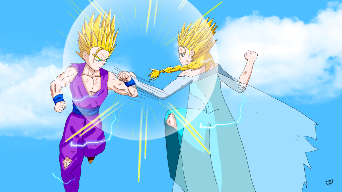
Ahahaha!! Is that Gohan vs. Frozen?!A Man named RJ wrote: [spoiler]
....*Hrmph*.... Uh... anyway, that was a good write up.
"Kenshi is sitting down right now drawing his mutated spaghetti monsters thinking he's the shit..."--Neptune Kai
"90% of you here don't even know what you're talking about (there are a few that do). But the things you say about these releases are nonsense and just plain dumb. Like you Metalwario64"--final_flash
"90% of you here don't even know what you're talking about (there are a few that do). But the things you say about these releases are nonsense and just plain dumb. Like you Metalwario64"--final_flash
Re: Super Animation Catalogue - [Updated with #58]
Nope nope nope. That's why we have the manga, lol. Great art, but still.Mazingerdestro wrote: Episode 57 was a great example of the right body types that the characters should have as well as episode 13. I don't mind less animation but better art.
We live in an era where the possibilies of animation are inmense thanks to tecnology advances (even though DB animators keep using some old techniques). We used to enjoy DBZ, but nowadays we realize it wasn't a great show in terms of good animation. It was pretty normal (I'm talking about just the tv show, not OVA's or movies). With all due respect, I think you're overreacting by saying that you prefer more art consistency rather than good animation. That's going too far.
One of the things I'm enjoying the most in DBS is the variety of art and animation styles. It brings a certain degree of freshness that I really like and I always look forward to enjoy. And considering is a show with a terrible schedule and it was created out of nowhere, that's a good thing to have.
Re: Super Animation Catalogue - [Updated with #58]
I watched that series until ep 18 but it is hard for me to follow although I like how they are doing everything similar to the games.Mazingerdestro wrote:Well after watching the last 4 episode I can clearly say that in general super's animation lacks consistency between the key animators.
Yes Z suffered from the same thing.
The body proportions change between episodes, the hairstyles etc.
Currently I am also watching weekly gyakuten saiban (a series that most people criticize in the animation department) and the difference with Super is quite huge.
Yes Saiban has its share of "no animation days" and in general the episodes do not require huge animated cuts since most of the "action" is Naruhodo explaining with wind effects around him or "weird moment" days but in general the art is more consistent. We don't see Naruhodo losing height and then gaining it again, or his hair getting longer and shorter.
Episode 57 was a great example of the right body types that the characters should have as well as episode 13. I don't mind less animation but better art. However, Super feels like in the middle. They don't have enough time for animation so they push themselves to the limit. Why? Why not make episodes with more still images and more "camera moving up and down creating the illusion of animation"? The recent DAYS episode did that. Almost a whole football match was done with still images and recycled frames.
Don't animators and the staff in general have meetings? Gathering and adapting their art to each others' style? Ok we have Yamamuro's models but what if let's say Tate can't draw them (or doesn't want to)? Also what if key animators X, Y, Z are unable to adapt to Yamamuro's designs? Having predetermined designs means nothing when the animators can't draw them.
The art isn't consistent in that show either, you can see Phoenix with a big body in one shot and with a smaller one in the next, it's better than DBS but I think DBS has better animation (at least toei made their op well).
Re: Super Animation Catalogue - [Updated with #58]
If somebody prefers art over animation you are having an episode like 35, good art but barely animated.PMD wrote:Nope nope nope. That's why we have the manga, lol. Great art, but still.Mazingerdestro wrote: Episode 57 was a great example of the right body types that the characters should have as well as episode 13. I don't mind less animation but better art.
We live in an era where the possibilies of animation are inmense thanks to tecnology advances (even though DB animators keep using some old techniques). We used to enjoy DBZ, but nowadays we realize it wasn't a great show in terms of good animation. It was pretty normal (I'm talking about just the tv show, not OVA's or movies). With all due respect, I think you're overreacting by saying that you prefer more art consistency rather than good animation. That's going too far.
One of the things I'm enjoying the most in DBS is the variety of art and animation styles. It brings a certain degree of freshness that I really like and I always look forward to enjoy. And considering is a show with a terrible schedule and it was created out of nowhere, that's a good thing to have.
-
Mazingerdestro
- Regular
- Posts: 747
- Joined: Thu May 19, 2016 5:42 am
Re: Super Animation Catalogue - [Updated with #58]
The fight parts were just fine. The only boring stuff were the in between with Beerus and Champa.Alee9977 wrote:I watched that series until ep 18 but it is hard for me to follow although I like how they are doing everything similar to the games.Mazingerdestro wrote:Well after watching the last 4 episode I can clearly say that in general super's animation lacks consistency between the key animators.
Yes Z suffered from the same thing.
The body proportions change between episodes, the hairstyles etc.
Currently I am also watching weekly gyakuten saiban (a series that most people criticize in the animation department) and the difference with Super is quite huge.
Yes Saiban has its share of "no animation days" and in general the episodes do not require huge animated cuts since most of the "action" is Naruhodo explaining with wind effects around him or "weird moment" days but in general the art is more consistent. We don't see Naruhodo losing height and then gaining it again, or his hair getting longer and shorter.
Episode 57 was a great example of the right body types that the characters should have as well as episode 13. I don't mind less animation but better art. However, Super feels like in the middle. They don't have enough time for animation so they push themselves to the limit. Why? Why not make episodes with more still images and more "camera moving up and down creating the illusion of animation"? The recent DAYS episode did that. Almost a whole football match was done with still images and recycled frames.
Don't animators and the staff in general have meetings? Gathering and adapting their art to each others' style? Ok we have Yamamuro's models but what if let's say Tate can't draw them (or doesn't want to)? Also what if key animators X, Y, Z are unable to adapt to Yamamuro's designs? Having predetermined designs means nothing when the animators can't draw them.
The art isn't consistent in that show either, you can see Phoenix with a big body in one shot and with a smaller one in the next, it's better than DBS but I think DBS has better animation (at least toei made their op well).

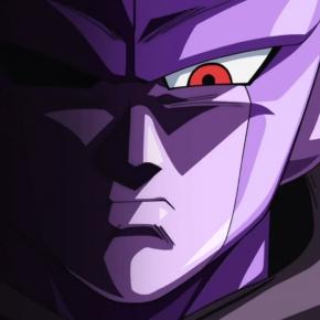
Re: Super Animation Catalogue - [Updated with #57]
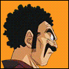
Looks like he just ate a ton of shrooms, lolBakaManiaHD wrote:I really dislike the way Vegeta looks in this episode.. But for some reasons,i liked Goku
[spoiler][/spoiler]

Re: Super Animation Catalogue - [Updated with #57]
It looks that they made his eyes with circles on Paintz_cherub wrote:Looks like he just ate a ton of shrooms, lol
乃亜
Dragon Ball: The Others Discussion Thread
Are we too old to enjoy new Dragon Ball movies/series?
Dragon Ball: The Others Discussion Thread
Are we too old to enjoy new Dragon Ball movies/series?
Spoiler:
Re: Super Animation Catalogue - [Updated with #58]
This popped up from someone I follow on Twitter illustrating the differences between the older character designs and the newer ones.
Nothing particularly new, but I thought it might be helpful to see instead of read what I've been talking about for god knows how long now.
[spoiler]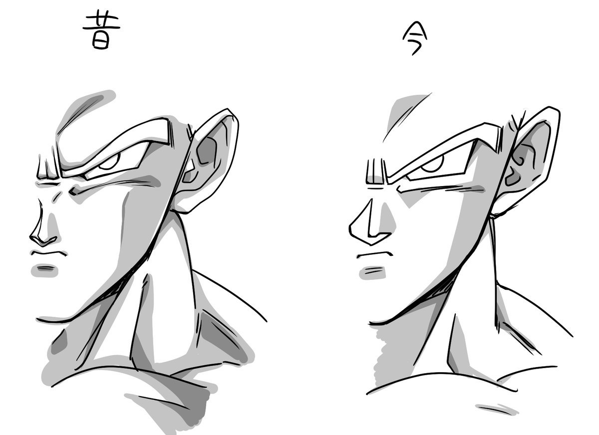 [/spoiler]
Key things to note are the shading differences. The shadows used to follow the shape of the face, indent at the cheek, and curve in around the brow. The current designs take a straight line up across the cheek which leads to a much flatter looking character.
The eye shape particularly bothers me in the newer work. It's very angular and stiff looking, which tends to make the work look very bland and expressionless. It's why I call Yamamuro's designs "too mechanical". The older designs make better use of curves and actually arch the eye shape for more dramatic visuals. Animators like Shimanuki and Tate do a good job of bringing this back in Super, but it's sadly not all too common.
While the current nose design is a bizarre shape that almost looks like a gaping hole in the middle of the face, the older designs have a fully formed nose that actually indicates the shape of the nose - where it slants down the side and where the underside sits. You can sort of see this suggested in the newer work, but doesn't work nearly as well.
Hopefully that better demonstrates the point a little clearer. One design is exceptionally expressive, the other... not so much.
What's kinda cool/frustrating is that there's a promo artist working right now who really understands how to draw Dragon Ball in 2016 while maintaining the best parts of the older designs. Unfortunately, I don't know his name, but his recent work has been so good:
[spoiler]
 [/spoiler]
If the hair was a little less stiff and the shading like the aforementioned, I'd be really happy. Just subtle changes that make a world of difference!
--
Doing two posts in one here:
Something that also might interest you are these supervisor correction sheets. I've these for a while now and was sitting on them to compliment a video I'd been planning, but I don't think I'll have a chance to do it anytime soon.
With Super's schedule, we spend a lot of time talking about how inconsistent episodes can look. How things look great in one scene and then look abysmal the next. Quite often this is the result of having multiple animation supervisors of varying quality, but in other cases, it's that supervisors simply don't have any time to actually do their jobs properly. Well, I think these demonstrate just how drastically this can affect the quality of an episode, and not just in close-up scenes:
[spoiler] [/spoiler]
The top image is the genga submitted by a key animator for approval from animation supervisor. The yellow sheet is the supervisor correction that is then used in the final cut. This is a pretty extreme correction, but it's not entirely uncommon:
[spoiler] [/spoiler]
As you can see, even some of the subtler examples in there make a pretty significant difference. Sadly, it really seems like the time to properly do this part of the job simply isn't there particularly often. This is why you quite often see the chief animation supervisor stepping in and performing this part of the role, instead.
I bring this up because 1) episode 57, although not consistent in every scene, did feature many cuts that looked heavily corrected by Karasawa, and 2) episode 58 showcased a very interesting difference between Yashima's regular frame and Yokoyama's clean-up.
It'll be interesting to see if episodes begin to get just that little more consistent as the series begins to catch up with itself. I'm sure we'll always see differences so long as multiple supervisors work on an episode, but for single supervisor episodes, it'd be cool to see those messy frames vanishing under corrections.
Nothing particularly new, but I thought it might be helpful to see instead of read what I've been talking about for god knows how long now.
[spoiler]
[/spoiler]Key things to note are the shading differences. The shadows used to follow the shape of the face, indent at the cheek, and curve in around the brow. The current designs take a straight line up across the cheek which leads to a much flatter looking character.
The eye shape particularly bothers me in the newer work. It's very angular and stiff looking, which tends to make the work look very bland and expressionless. It's why I call Yamamuro's designs "too mechanical". The older designs make better use of curves and actually arch the eye shape for more dramatic visuals. Animators like Shimanuki and Tate do a good job of bringing this back in Super, but it's sadly not all too common.
While the current nose design is a bizarre shape that almost looks like a gaping hole in the middle of the face, the older designs have a fully formed nose that actually indicates the shape of the nose - where it slants down the side and where the underside sits. You can sort of see this suggested in the newer work, but doesn't work nearly as well.
Hopefully that better demonstrates the point a little clearer. One design is exceptionally expressive, the other... not so much.
What's kinda cool/frustrating is that there's a promo artist working right now who really understands how to draw Dragon Ball in 2016 while maintaining the best parts of the older designs. Unfortunately, I don't know his name, but his recent work has been so good:
[spoiler]
[/spoiler]If the hair was a little less stiff and the shading like the aforementioned, I'd be really happy. Just subtle changes that make a world of difference!
--
Doing two posts in one here:
Something that also might interest you are these supervisor correction sheets. I've these for a while now and was sitting on them to compliment a video I'd been planning, but I don't think I'll have a chance to do it anytime soon.
With Super's schedule, we spend a lot of time talking about how inconsistent episodes can look. How things look great in one scene and then look abysmal the next. Quite often this is the result of having multiple animation supervisors of varying quality, but in other cases, it's that supervisors simply don't have any time to actually do their jobs properly. Well, I think these demonstrate just how drastically this can affect the quality of an episode, and not just in close-up scenes:
[spoiler]
[/spoiler]The top image is the genga submitted by a key animator for approval from animation supervisor. The yellow sheet is the supervisor correction that is then used in the final cut. This is a pretty extreme correction, but it's not entirely uncommon:
[spoiler]
[/spoiler]As you can see, even some of the subtler examples in there make a pretty significant difference. Sadly, it really seems like the time to properly do this part of the job simply isn't there particularly often. This is why you quite often see the chief animation supervisor stepping in and performing this part of the role, instead.
I bring this up because 1) episode 57, although not consistent in every scene, did feature many cuts that looked heavily corrected by Karasawa, and 2) episode 58 showcased a very interesting difference between Yashima's regular frame and Yokoyama's clean-up.
It'll be interesting to see if episodes begin to get just that little more consistent as the series begins to catch up with itself. I'm sure we'll always see differences so long as multiple supervisors work on an episode, but for single supervisor episodes, it'd be cool to see those messy frames vanishing under corrections.
Follow me on Twitter for countless shitposts.
Deadtuber.
Deadtuber.
-
Anime Kitten
- I Live Here
- Posts: 4275
- Joined: Mon May 23, 2016 3:53 pm
- Contact:
Re: Super Animation Catalogue - [Updated with #58]
Aside from the atrocious nose, I like the new design better.
Yeah, you probably hate me now.
Yeah, you probably hate me now.