Jinzoningen MULE wrote:
Both of them are pathetic proportionally. That's a shame too, because I actually liked his last cover. I thought he was getting better with the composition, guess not.
Their heads are a bit big, but other than that the proportions seem fine to me.
Maybe that was the wrong word. Disjointed? Yeah, I think disjointed is a better word for what I meant.
Edit: To be specific, Zamasu's face (notably his eyes) is poorly structured, neither of their necks support their heads properly. Despite the fact that we're supposed to be looking up at them, only the bottom half of the drawing and their heads are indicative of that, especially with Goku Black, whose posture is straight from the neck to the waist. The proportion of Zamasu's arms is definitely off.
Jinzoningen MULE wrote:
Both of them are pathetic proportionally. That's a shame too, because I actually liked his last cover. I thought he was getting better with the composition, guess not.
Their heads are a bit big, but other than that the proportions seem fine to me.
Ditto
"*sarcastically* Yeah, sure, let's go see Yamcha."
I mean it's not a great piece or anything, it certainly still has the stiff look that Yamamuro has these days for example, but I'm not really seeing the proportion or perspective issues.
ArchedThunder wrote:I mean it's not a great piece or anything, it certainly still has the stiff look that Yamamuro has these days for example, but I'm not really seeing the proportion or perspective issues.
If no one else is seeing it, I do have weak depth perception, so it could be that.
Octorockandroll wrote:
Black looks more off to me. He seems way more muscular here than I remember.
Isnt that supposed to be a good thing?
Also, could you guys explain to me how this cover looks off? I dont think I'm catching on
Like it or not, Black isn't supposed to be so muscular. Yamamuro also messed up with his turtleneck shirt, it's not that tight.
Oh, I also forgot to mention he should have only 3 bangs on his forehead, and there he's been drawn with four. Not a major error but I wouldn't expect the character designer to make such errors. At least he kept the ahoge.
悟 “Vincit qui se vincit”
What I consider canonical
Spoiler:
Dragon Ball Manga
Jaco: The Galactic Patrolman
Yo! Son Goku and Friends Return
Additional lore from Toriyama
Dragon Ball Daima
Octorockandroll wrote:
Black looks more off to me. He seems way more muscular here than I remember.
Isnt that supposed to be a good thing?
Also, could you guys explain to me how this cover looks off? I dont think I'm catching on
Like it or not, Black isn't supposed to be so muscular. Yamamuro also messed up with his turtleneck shirt, it's not that tight.
Oh, I also forgot to mention he should have only 3 bangs on his forehead, and there he's been drawn with four. Not a major error but I wouldn't expect the character designer to make such errors. At least he kept the ahoge.
This is just nitpicking at its finest, lmao.
Doesnt really matter though, right? People complain a lot about how super has "Less muscular characters" "Thin", and now we get a more musuclar black, and you dont want that somehow? Consider his age, too. (Honestly, idk his age, but i guess hes quite old i think.)
Don't get me wrong, I like that art but I was pointing out some errors which I didn't expect to see from Yamamuro considering he handles characters design. I also don't complain about how Super's characters are slimmer because that's how Toriyama draws these days, and I like his current style.
I obviously want to see characters have some muscle mass, but I prefer it to look realistic, and nowadays Toriyama's way of drawing muscles is very realistic, and I like it.
悟 “Vincit qui se vincit”
What I consider canonical
Spoiler:
Dragon Ball Manga
Jaco: The Galactic Patrolman
Yo! Son Goku and Friends Return
Additional lore from Toriyama
Dragon Ball Daima
emperior wrote:
Like it or not, Black isn't supposed to be so muscular. Yamamuro also messed up with his turtleneck shirt, it's not that tight.
Oh, I also forgot to mention he should have only 3 bangs on his forehead, and there he's been drawn with four. Not a major error but I wouldn't expect the character designer to make such errors. At least he kept the ahoge.
This is just nitpicking at its finest, lmao.
Doesnt really matter though, right? People complain a lot about how super has "Less muscular characters" "Thin", and now we get a more musuclar black, and you dont want that somehow? Consider his age, too. (Honestly, idk his age, but i guess hes quite old i think.)
Don't get me wrong, I like that art but I was pointing out some errors which I didn't expect to see from Yamamuro considering he handles characters design. I also don't complain about how Super's characters are slimmer because that's how Toriyama draws these days, and I like his current style.
I obviously want to see characters have some muscle mass, but I prefer it to look realistic, and nowadays Toriyama's way of drawing muscles is very realistic, and I like it.
Its not like we dont make mistakes. We all make mistakes, even when its greatly unexpected
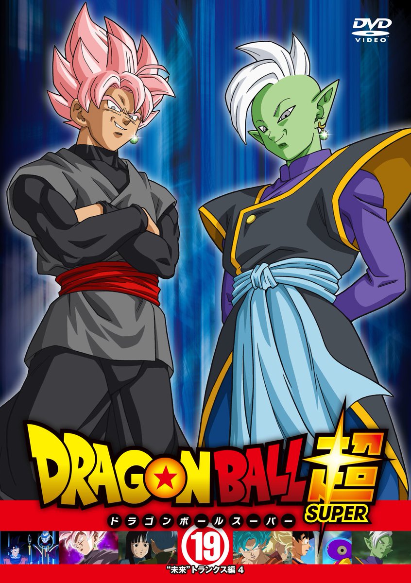
samuo2 wrote:And to rub it in, the cover of the new DVD of Dragon Ball Super, draw by Yamamuro.
[spoiler][/spoiler]
Heroes artists are awesome.
Is not perfect, but when it comes to Yamamuro you guys are looking for even the more minimal defect, very far-fetched...
Goddammit, what is up with Black's Bulge? That is distractingly huge.
---
Since there has been a lot of argument about this tournament being better than the last, I decided to look back on what we got previously and boy was I disappointed(namely in the earlier parts of the tournament).
This is the most animated the Botamo fight was. It literally wasn't animated.
[spoiler][/spoiler]
As for the Frost fight from the same episode, there were only three scenes that I found remotely serviceable.
[spoiler]
[/spoiler]
Episode 34, it was only okay, but since it was a Yashima episode, I'll give it a pass.
Episode 35 had some okay art and direction, but where's the animation?
I enjoyed episode 36, though I can easily say that all the action episodes of this pre-tournament have been more animated, thus far.
Episode 37 had a strong second half, but the first was very weak. I would say it was far weaker than the first half of 79, which I personally found very wonky at points.
Episode 38 was great as usual, but I liked episode 80 a slightly more.
Episode 39 was okay, but this I found Manabes work on this tournament to be far better done. I would even say that I found Futoshi's cut here was better than the majority of the SSB Kaio-ken.
[spoiler][/spoiler]
Episode 40 was Yashima again, and he did what Yashima does best, Yashima things.
The only real action sequences from the episode were these scenes. Which to be honest with you, I thought were okay.
[spoiler]
[/spoiler]
Not particularly impressive, but I thought it was nice enough. I just wonder who did them, it didn't look like Yashima.
I don't think I need to mention episode 41.
Overall, I think this arc is going in the right direction, the results of the weekly breaks is beinning to show over time, with animation 30 episodes ago, being pretty sub-par for the most part in comparison to the episodes in this most recent pre-tournament. Hopefully that trend can continue in this weeks episode.
JazzMazz wrote:
Not particularly impressive, but I thought it was nice enough. I just wonder who did them, it didn't look like Yashima.
That was certainly Yashima corrected by Miyuki Yokoyoma.
Episode 39 was okay, but this I found Manabes work on this tournament to be far better done. I would even say that I found Futoshi's cut here was better than the majority of the SSB Kaio-ken.
[spoiler][/spoiler]
0:00 to 0:07 looks like it belongs in the new opening, to be honest
The scene before the opening title card appears? Yeah, it is definitely reminiscent of that.
Also, I found a video while searching the interwebs,that said this scene from path to power was credited as Mamoru Hosada's key animation.
[spoiler]https://www.youtube.com/watch?v=PXwypRDERqI[/spoiler]
Does anyone think that at least some of the stuff here is Booru worhty? I really thought the scene at the end of the video was really well done.
samuo2 wrote:And to rub it in, the cover of the new DVD of Dragon Ball Super, draw by Yamamuro.
[spoiler][/spoiler]
Heroes artists are awesome.
I don't know why people post so nasty comments about the cover art. It's a great shot that makes both villains look intimidating. Adding the extra muscles on Black fixes some errors with the series where Goku is shown muscular and Black, who is suppose to be him even stronger has normal size hands even if his sleeves look so tight. Also look at Black's face. He looks like a (excuse my language) sadistic fuck. So he is perfect. At the same time look Zamasu's hands. They are skinny as they should be. The contrast between Black and Zamasu makes sense.
The only thing that's not perfect is maybe the length of Zamasu's hair but during the seasons we seen Zamasu with numerous types of hair length so I am pretty sure that there are no specific measurements.
Most of the time in the show either zamasu's hair or eyes or even mouth look so akward. Seen him drawn so well is a nice change.
I enjoy seen people having different ideas and opinions but don't just hate something because you don't like the artist as a person. Enjoy the art and go beyond the person who did it. The same thing should be done for praising. Dont praise someone because he once did something good. Enjoy his current work
Octorockandroll wrote:
Black looks more off to me. He seems way more muscular here than I remember.
Isnt that supposed to be a good thing?
Also, could you guys explain to me how this cover looks off? I dont think I'm catching on
Like it or not, Black isn't supposed to be so muscular. Yamamuro also messed up with his turtleneck shirt, it's not that tight.
Oh, I also forgot to mention he should have only 3 bangs on his forehead, and there he's been drawn with four. Not a major error but I wouldn't expect the character designer to make such errors. At least he kept the ahoge.
Black is not supposed to be any less muscular than Goku itself trough, it's just that his anime design is closer to actual Toriyama's design. Its more a matter of liking him being muscular or not, trough it's true that they should have consistency and he looks really different to his apareances in the show itself.
Personally I like the cover. Could be waaay better, but I don't think its bad.
English is not my first language. Please excuse my gramatical mistakes.


 [/spoiler]