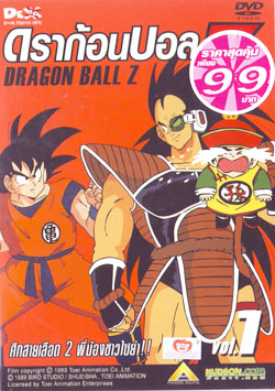
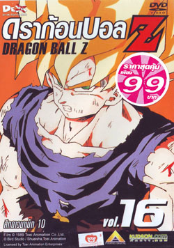
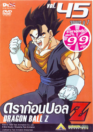
Before I begin, kudos kei17 for a thread that essentially combines two factors that form my daily existence. I've never been one to commonly associate disciplined design with Dragon Ball although it does fortunately occur now and again. I don't recall the Thai DVD releases however regarding their appearance, I completely concur. Hopefully as a result of this thread, additional rarely spread designs will come to light.
To no surprise I'm sure, I believe the packaging for Japan's 'Dragon Boxes' would currently have to be the finest examples of merging the franchises' illustrious illustrations with winning design, from composition to typefaces. Admittedly, it's a wobbly statement as I don't own any of the original sets although in my defence, to even suggest this without doing so is a testament to the strength of their visuals. Numerically, I'd lead with 'Z' followed by the original series, 'GT' and finally the 'Movies'. Even with the length and contents of the series, I admire how the background for 'Z's set was purely represented with an appropriate 'super' single colour whereas both the original series and 'GT' were given concise, suitable themes. As of recent, I'd have give the packaging for Kai (notably Japan's Blu-ray box sets) their fairly deserved props for maintaining orderly and striking design. I'd usually overlook what FUNimation had churned out over the years albeit Kai and the recent 'Movie Collection' sets are vast improvements.
Whether it's their rarity, uncommon (yet appreciated) size and originally intended artwork or simply a representation of commercial 90's Japanese graphic design, I admittedly harbour an undeniably infatuation for the theatrical Laserdiscs. Having managed to fortunately snag Movie 8 (shout-outs to
Rakuten), I'm expressing from experience.


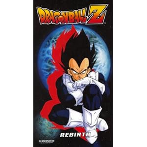


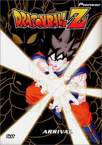
I always did like the cover art for these


 She/Her


