So what's with the main site and forums anyway? I mean, the content is great, don't get me wrong. But the design looks like it hasn't been updated since the early 90s. Also, what's up with using the default skin on the forums?
Do you guys need some tips? I can help out with design. Sites that look dated like this one can be a major turn off with some fans.
Site Design
-
Innagadadavida

- I Live Here
- Posts: 3480
- Joined: Thu Nov 13, 2008 12:25 am
- Location: Arkansas, USA
-
Super Ghost Kamikaze

- I'm, pretty, cozy, here...
- Posts: 1809
- Joined: Mon Feb 04, 2008 5:10 pm
-
Innagadadavida
- I Live Here
- Posts: 3480
- Joined: Thu Nov 13, 2008 12:25 am
- Location: Arkansas, USA

"Daizenshuu EX, the way it was meant to be seen! Digitally remastered for the twenty-first century!"
... Well, someone had to. ^_^
I like it the way it is, but the way websites look hasn't particularly mattered to me. ^^.
I do find that tables have a tendency to be easier to navigate than div layers (*tries to kick something, but can't decide who/what to blame so kicks the air instead*). Usually when major layout changes happen (well, when anything updates, really) it's more of an inconvenience than anything... though somehow I suspect that if Daizex underwent a major layout revamping (which I kinda doubt, considering the work that'd require to fix something that isn't broken), most of the shortcomings of the 'new and improved' web era won't come with it. (*scoffs at web2.0* *then gripes about FreedomScientific*).
... On a completely different note, My site could use a complete redesign from the ground up... and CSS and I don't get along... ... ...</thinlyveilednotPM>
Dr Gero, in Budokai 2 wrote:Go, my Saiba Rangers!
Akira Toriyama, in Son Goku Densetsu wrote:You really can’t go by rumors (laughs).
-
VegettoEX

- Kanzenshuu Co-Owner & Administrator
- Posts: 17845
- Joined: Sat Jan 10, 2004 3:10 pm
- Location: New Jersey
- Contact:
Were Daizenshuu EX my full-time job, and were it not something that has indeed been a staple of the online DBZ web community since 1998...
... yes, it would look like something designed in the Web 2.0 era .
.
Trust me, it's not something that has escaped my imagination or future plans, but it's just not something entirely feasible at the moment.
... yes, it would look like something designed in the Web 2.0 era
Trust me, it's not something that has escaped my imagination or future plans, but it's just not something entirely feasible at the moment.
:: [| Mike "VegettoEX" LaBrie |] ::
:: [| Kanzenshuu - Co-Founder/Administrator, Podcast Host, News Manager (note: our "job" titles are arbitrary and meaningless) |] ::
:: [| Website: January 1998 |] :: [| Podcast: November 2005 |] :: [| Fusion: April 2012 |] :: [| Wiki: April 2026 |] ::
:: [| Kanzenshuu - Co-Founder/Administrator, Podcast Host, News Manager (note: our "job" titles are arbitrary and meaningless) |] ::
:: [| Website: January 1998 |] :: [| Podcast: November 2005 |] :: [| Fusion: April 2012 |] :: [| Wiki: April 2026 |] ::
-
Bardock the Mexican

- Regular
- Posts: 563
- Joined: Sat Dec 17, 2005 10:54 pm
- Location: Delano, CA
It's a great site and doesn't need to change to bring it up to the so called standards of recent times thing. It's got an old-internet charm that makes it distinct. What some may call a antiquated system to be thrown out some others call a good thing that shouldn't be replaced.VegettoEX wrote:Were Daizenshuu EX my full-time job, and were it not something that has indeed been a staple of the online DBZ web community since 1998...
... yes, it would look like something designed in the Web 2.0 era
Trust me, it's not something that has escaped my imagination or future plans, but it's just not something entirely feasible at the moment.
Ejercito Zapatista de Liberacion Nacional: Es nuestra palabra sencilla...
-
Innagadadavida
- I Live Here
- Posts: 3480
- Joined: Thu Nov 13, 2008 12:25 am
- Location: Arkansas, USA
-
Freeza Heika

- OMG CRAZY REGEN
- Posts: 957
- Joined: Mon Jul 28, 2008 3:03 pm
- Location: Indianapolis
I guess it's great that you're attempting to better Daizex, but it is fine the way it is, and not to sound like an ass, but an inordinate amount of your posts are criticism. Not to say criticism is bad, but sometimes you just need to force yourself to wear the rose-colored glasses for everyone else's sake.Innagadadavida wrote:I'm glad not everybody thinks of things like that. The internet would be a very ugly place.
Seriously, a simple CSS update would do this site wonders. It wouldn't take very long at all.
-
VegettoEX
- Kanzenshuu Co-Owner & Administrator
- Posts: 17845
- Joined: Sat Jan 10, 2004 3:10 pm
- Location: New Jersey
- Contact:
No, no. Innagadadavida is entirely correct and welcome to suggest said things. I don't expect every single person to love and just accept every single little item.Freeza Heika wrote:I guess it's great that you're attempting to better Daizex, but it is fine the way it is, and not to sound like an ass, but an inordinate amount of your posts are criticism. Not to say criticism is bad, but sometimes you just need to force yourself to wear the rose-colored glasses for everyone else's sake.Innagadadavida wrote:I'm glad not everybody thinks of things like that. The internet would be a very ugly place.
Seriously, a simple CSS update would do this site wonders. It wouldn't take very long at all.
My only real "excuse" is that I spend all day working on this kind of stuff, and I have very little desire to do it when I get back home
So how am I typing forum responses all day and occasionally making news updates? Well, that takes even less time to do, and I can do THAT while AT work
It's a labor of love that I started as a teenager, and all I want to do is keep it alive and continue to enjoy the fandom. It makes me smile! Doesn't mean I'm not self-aware of everything, though.
:: [| Mike "VegettoEX" LaBrie |] ::
:: [| Kanzenshuu - Co-Founder/Administrator, Podcast Host, News Manager (note: our "job" titles are arbitrary and meaningless) |] ::
:: [| Website: January 1998 |] :: [| Podcast: November 2005 |] :: [| Fusion: April 2012 |] :: [| Wiki: April 2026 |] ::
:: [| Kanzenshuu - Co-Founder/Administrator, Podcast Host, News Manager (note: our "job" titles are arbitrary and meaningless) |] ::
:: [| Website: January 1998 |] :: [| Podcast: November 2005 |] :: [| Fusion: April 2012 |] :: [| Wiki: April 2026 |] ::

I like the site's simple appearance. Though in all fairness, I don't know anything about anything when it comes to site designing, so simplicity is a must for my soul's well-being. 
Side note: it's also one of two silly reasons I never made Bird Mountain (my Toriyama website).
Side note: it's also one of two silly reasons I never made Bird Mountain (my Toriyama website).
Captain Christopher Pike wrote:The away team will consist of myself, Cadet Kirk, Mr. Sulu, and Ensign Olsen.
The Geeky Gentleman: For all your comics, movies, TV and other geeky needs.Freeza Heika wrote: for the land of the cool, and the home of the Appule

I love the way the site looks, it's classy. I love the colors that are being used, or maybe I'm just used to them. I don't know. The only 'negative' thing that comes to mind is the vertical scrolling. On my computer it's fine, but when I go away on the weekends and the only interwebs I have is via the PSP, it can be a real pain to have to load all of the stuff that's on the main page. If it's really image heavy it won't even load the site.
Last edited by SatoSky on Tue Nov 18, 2008 5:21 pm, edited 1 time in total.
-
BrollysKin

- OMG CRAZY REGEN
- Posts: 911
- Joined: Tue Apr 25, 2006 10:32 pm
- Location: Minnesota
- Contact:
-
SSJ2bardock

- I Live Here
- Posts: 2592
- Joined: Sun Apr 20, 2008 1:10 am
- Location: Chicago
I find the site easy to navigate and presentable. It's really doesn't need an update, it would be a superfluous change.
Last edited by SSJ2bardock on Tue Nov 18, 2008 7:08 pm, edited 1 time in total.
PSN Stay_Slapped
Let’s play FighterZ
Let’s play FighterZ

Yeah, I like the site the way it is, although more content is always nice.
Say I paid you five grand to take a few days off work to devote your time to adding more content to the site, Mike. Would you pull?
Say I paid you five grand to take a few days off work to devote your time to adding more content to the site, Mike. Would you pull?
Code: Select all


 She/Her
 I don't have a problem with the layout of the main site at all, it has a nice "old-school" feel.
And about the forum layout, what is there that Mike has the options to change?
And by the way, the layout has been updated... a bit:
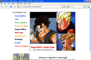
PS: Hey VegettoEX, could possible re-upload the full size images of what the site used to look like way back in the days. I'm talking about the ones that are linked to in the post that was on the main page on 01 January 2008.
And about the forum layout, what is there that Mike has the options to change?
And by the way, the layout has been updated... a bit:
PS: Hey VegettoEX, could possible re-upload the full size images of what the site used to look like way back in the days. I'm talking about the ones that are linked to in the post that was on the main page on 01 January 2008.
-
Freeza Heika
- OMG CRAZY REGEN
- Posts: 957
- Joined: Mon Jul 28, 2008 3:03 pm
- Location: Indianapolis
If you click it you get this:SSj_Rambo wrote:I don't have a problem with the layout of the main site at all, it has a nice "old-school" feel.
And about the forum layout, what is there that Mike has the options to change?
And by the way, the layout has been updated... a bit:
PS: Hey VegettoEX, could possible re-upload the full size images of what the site used to look like way back in the days. I'm talking about the ones that are linked to in the post that was on the main page on 01 January 2008.

Actually, the link the picture takes you to is broken, all you get is a "The webpage cannot be found" message. Thank you for giving me the correct link!Freeza Heika wrote:If you click it you get this:SSj_Rambo wrote:I don't have a problem with the layout of the main site at all, it has a nice "old-school" feel.
And about the forum layout, what is there that Mike has the options to change?
And by the way, the layout has been updated... a bit:
*Snip*
PS: Hey VegettoEX, could possible re-upload the full size images of what the site used to look like way back in the days. I'm talking about the ones that are linked to in the post that was on the main page on 01 January 2008.
*Snip*
-
Hao_Kaiser

- Beyond-the-Beyond Newbie
- Posts: 437
- Joined: Wed Nov 02, 2005 1:36 pm
- Location: Kentucky
I love the look of the site, if only for the fact that it has been that way since I found it as a 10 year old.
I'd actually be a little put off if it tried to look fresh and new. As it is now, it's the Daizenshuu EX I've always known, and I'd really like to see it stay that way.
Also, Mike has, what, 4 individual creations he has to keep up with outside of his day job? Let's give the guy some slack.
I'd actually be a little put off if it tried to look fresh and new. As it is now, it's the Daizenshuu EX I've always known, and I'd really like to see it stay that way.
Also, Mike has, what, 4 individual creations he has to keep up with outside of his day job? Let's give the guy some slack.
-
Innagadadavida
- I Live Here
- Posts: 3480
- Joined: Thu Nov 13, 2008 12:25 am
- Location: Arkansas, USA