Discussion regarding the entirety of the franchise in a general (meta) sense, including such aspects as: production, trends, merchandise, fan culture, and more.
I can dig it. this'll probably be locked though because it's not really Dragonball related.
The Dragonboxes are like a middle aged woman who still looks good through simply taking good care of her skin and body with maybe a tiny bit of makeup while the Orange Bricks are like a middle aged woman who get's 50 tons of botox, makeup and plastic surgery in order to look younger and as a result looks even worse. ~ ringworm128 Still recording Toonami broadcasts on VHS after all these years! #1 Paikuhan fan!
I for one, greatly dislike it though, because it's a very boring font, and that's all it is. I hate modern logos that are nothing more than a "stylized" font.
"Kenshi is sitting down right now drawing his mutated spaghetti monsters thinking he's the shit..."--Neptune Kai "90% of you here don't even know what you're talking about (there are a few that do). But the things you say about these releases are nonsense and just plain dumb. Like you Metalwario64"--final_flash
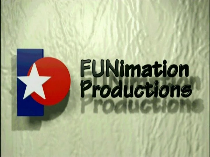
Well, to make this Dragon Ball related, this is the logo that will appear on future DVD/Blu Ray cases of Dragon Ball footage (future movies, Super, the Kai Buu Saga, the 4 OVAs/Jump Specials, etc.)
You can go through your collection and see how much FUNimation has grown by just looking at the logo.
I kinda like the new style and I don't see really why it'd be locked as the company dubbs the Dragon Ball franchise and has aged ties to it itself. If they done red font and a white background it would have looked better imo.
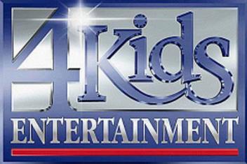
I really actually like the old logo. I mean, it's extremely simplistic, yes, but it looks very old-school, immediately recognizable and somewhat nostalgic, like the old 4Kids! logo, which I used to see a lot when I was younger and watched Yu-Gi-Oh! I prefer simple to overly-complicated, but it still needs to have SOME defining factor, unlike this new logo.
I rode by a sign the other day that looked near-exactly like that eyes/noseless smile in Funi's new logo. It was either for a park or an apartment complex. I wasn't thinking to take a picture of it.
I prefer the previous one, to be honest.
The font of the new one is way too "modern", and I really don't like the look of it.
Last edited by DoomieDoomie911 on Wed Jan 13, 2016 11:33 am, edited 2 times in total.
Cipher wrote:Dragon Ball is the story of a kind-hearted, excitable child who uses the power of friendship to improve those around him as he grows into a dangerous obsessive who sometimes accidentally saves the world.
Looks boring as hell. What was wrong with the previous logos? They were actually pretty good and reminded me of oldschool anime, y'know with that star and stuff. But this doesn't even look like anything. It looks like the logo for a frozen yogurt shop.
Akira Toriyama wrote:My policy is to try and forget things once they’re over. Since if I don’t discard the old and focus on what’s new, I’ll overload my brain capacity. I still haven’t lived down going, “Who the heck is Tao Pai-pai?” that one time I was talking with Ei’ichiro Oda-kun. But the fact that there are still people reading the series after all this time… All I can say is; “thank you.” Really, that’s all.
Akira Toriyama wrote:Drawing Dragon Ball again reminded me of two things--how much I love it, and how much I never want to do it again.
Kunzait_83 wrote:And if you're upset because all this new material completely invalidates the tabletop RPG rulebook-sized statistical system and flowchart for the characters' "canonical Power Levels" that you'd been working on painstakingly for the last bunch of years now... well I don't think there's a kind, non-blunt way of saying this, but that's 100% entirely your own misguided fault for buying so deeply into all this nonsensical garbage in the first place. And that you also have IMMENSELY skewed and comically backwards priorities in what you think is most important and needed to make a good Dragon Ball story.
Zephyr wrote:Goodness, they wrote idiotic drivel in a children's cartoon meant to advertise toys!? Again!? For the ninetieth episode in a row!? Somebody stop the presses! We have to voice our concern over these Super important issues!
Kamiccolo9 wrote:Fair enough, I concede. Sean Schemmel probably has some kind of hidden talent. Maybe he is an expert at Minesweeper. You're right; calling him "talentless" wasn't fair.
Michsi wrote: Mon Jul 04, 2022 11:29 amIn Super Piccolo got yelled off the stage by Vegeta in the U6 Tournament arc and lost to Jiminy Cricket in the ToP , he deserved 15 new transformations with his theme song played by Metallica in the background.