
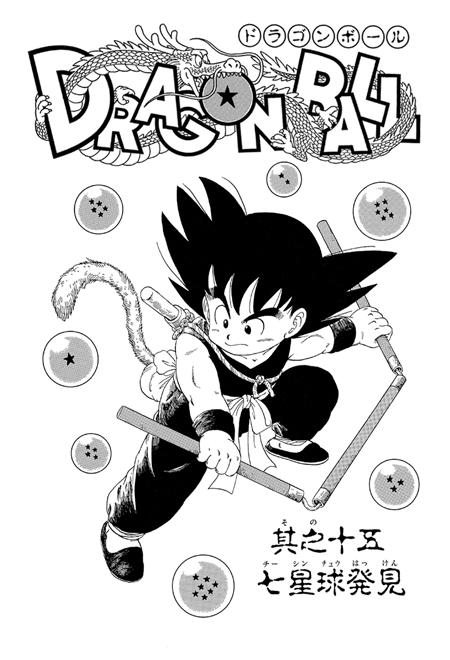
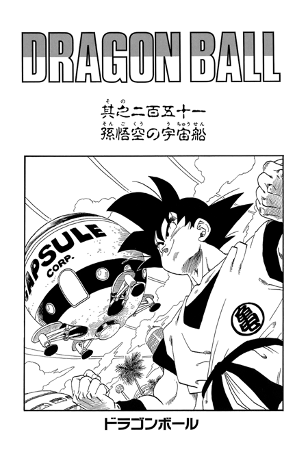
You have the original manga logo, depicting a playful, chibified Shenron snaking around the bolded text and taking a bite into the one-star Dragon Ball that makes up the 'o'. Although many associate this iconic design with the "early years", it persevered for a very long time and was still consistently used by the Saiyan arc.
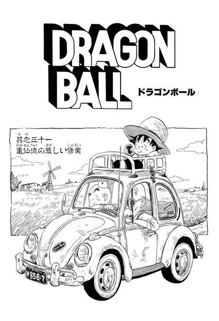
Alongside that main logo, a blocky back-up logo would also sometimes appear. This design inspired the logo for the original anime, which added another cartoon Shenron in a ring.
Some darker, more simplistic titles are sometimes interspersed between these two main ones, usually to complement the appearance of a powerful new enemy.
Around the time of the Namek arc, the Shenron logo starts to get phased out in favour of more minimalist designs, most notably the two-toned, block-capitals logo which also persists for a good few years. This naturally marks the series' shift to a darker tone, though there's a Star Wars flavoured boldness to it.
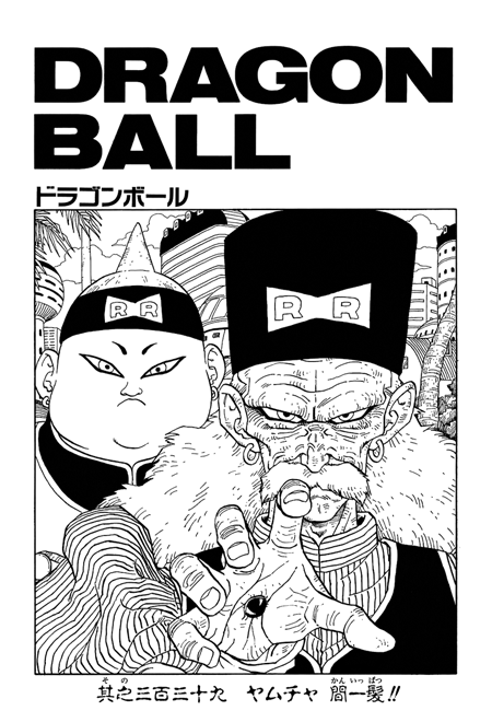
As we move into the subsequent arcs, this already simplistic logo slowly starts to be replaced by even more minimalist fonts. Completely gone is the whimsical flourish of the older logos, replaced with a stark, black, angular "DRAGONBALL". There's a quiet confidence to it. The cute animals and boob jokes may be missed by some, but Toriyama (and his editors) know what you're really here for: raw, distilled, fist-pumping, skull-popping, planet-busting ACTION.
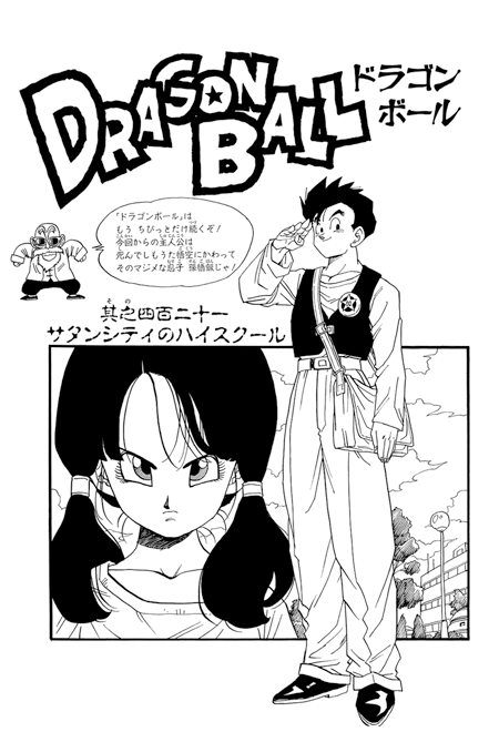
As soon as we move into the fledgling Great Saiyaman arc, the logo once again shifts back to a more bubbly, cartoonish look with jumbled characters and thick black outlines. Hey, it started to look more like an actual logo again! The plain black title fonts intermittently reappear for the especially dramatic chapters like Vegeta's sacrifice.
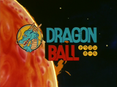
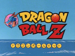
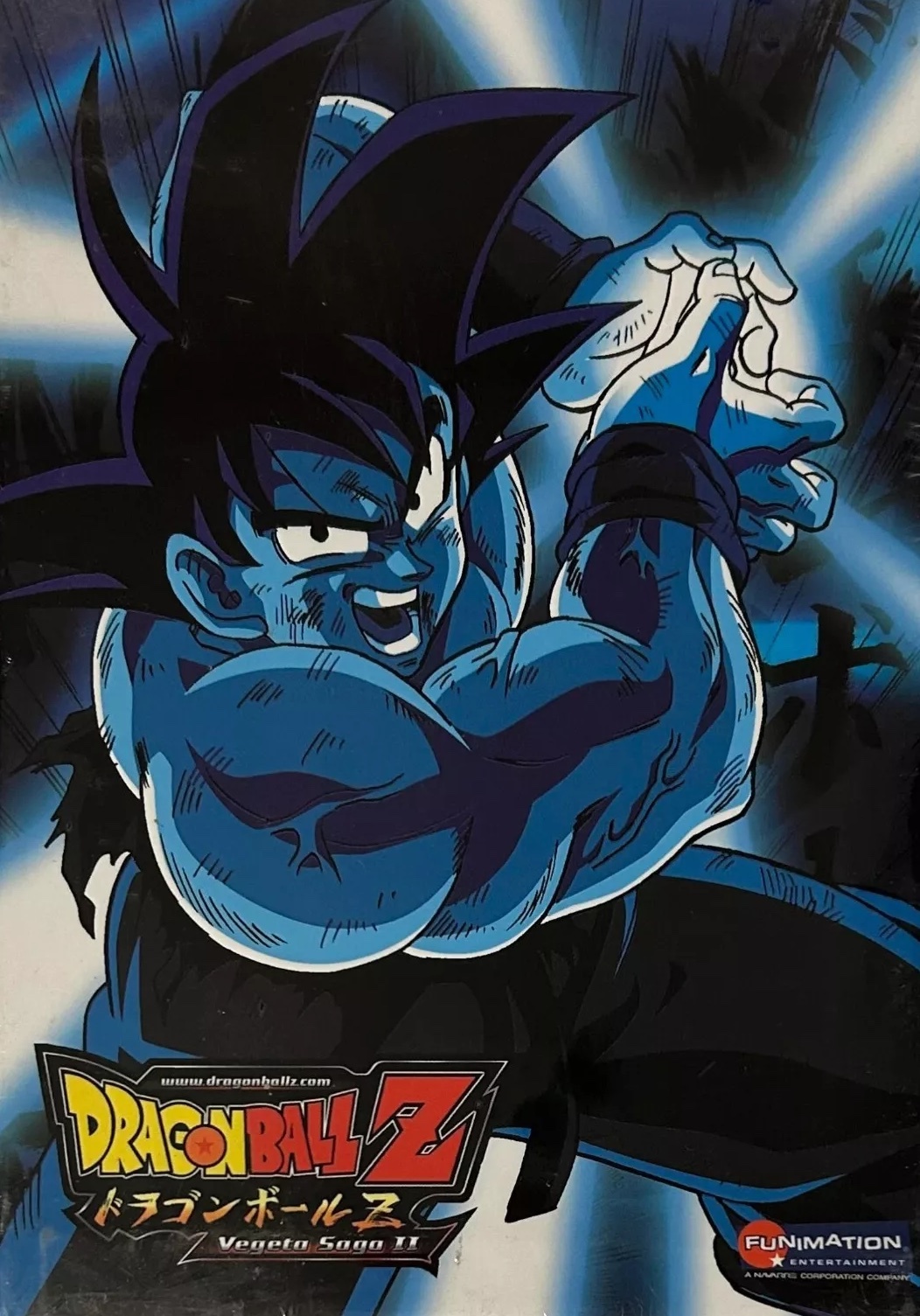
Moving back to the anime world, Shenron pokes his head out again for the Dragon Ball Z logo. The contrast between the fun, blocky "Dragon Ball" and the harsh, angular "Z" must have struck a chord with people.
Following the big revival of the franchise in 2013, we see much more consistent logo branding across the board for most Dragon Ball projects, including movies, comics, and anime. It obviously owes a lot to the DBZ logo, with almost the exact same font, though the characters are more squished together, creating a streamlined look. Many subtitles have been slapped next to this one, including Z, Super and the upcoming Daima. Honestly, I really like it.

Which are your favourites? Do you think Dragon Ball needs consistent branding, or do you prefer when Toriyama and the gangs experiment with the designs?


