Dragon Ball Z: Cooler Double Feature Discussion
-
SSJ2bardock

- I Live Here
- Posts: 2592
- Joined: Sun Apr 20, 2008 1:10 am
- Location: Chicago

From bottom to top I see; green fading to turqoise to teal to a darker teal. I actually prefer this over the Dragonbox footage, where it's light green to dark. I see no problem with the 'faux-remastered' version as it gives off a much more vibrant feel. In the end it's a matter of preference, and we have not seen the film masters ourselves before; we do not know for certain what the actual intended colors are even if the Dbox were indeed to have been advertised to present forth footage 'the way it was meant to be seen' (unintentional FUNi ad phrase usage).

Um...what?
It's been long established that Namek's sky is supposed to be green. Not blue. The TV series prior to any remasterings had a green color. The movie, prior to any remasterings, had a green color. The MANGA even has a green colored sky whenever Toriyama did cover pages that involved color.
We DO know what the intended colors are and the Dragon Boxes have certainly proven a lot more than what FUNi's remastering has what the actual intended colors are meant to be. Remember, Toei did the remastering for the Dragon Boxes. FUNi hired an outsider to do the remastering. I'd say Toei, being the company who actually animated the series and movies, knows a lot more about what the intended colors are than what FUNi's hired guy knows.
[url=http://www.youtube.com/user/TsukentoX]YouTube Profile[/url]
Roger that.
I guess I didn't take into account the examples you listed in response before I put together my comment. I stand corrected, my bad.
Concerning the subject of Toei performing an 'in-house'(?) remastering process; I'm well aware that their purpose in putting forth the 'intended' colors is evidently much more trustworthy in opposition to FUNi's. However, it doesn't mean that they couldn't take upon any liberty in perhaps the resurgance of any tampering of original shades of colors. Not that I'm of the belief that the company would do that. Just pointing out the possibility.
-
Acid_Reign

- Advanced Regular
- Posts: 1056
- Joined: Wed Jan 24, 2007 5:59 am
- Location: Massachusetts, USA
- Contact:
I think the movies’ dub music has always been overdone. I haven’t seen the “Cooler” flicks in a while, but generally speaking there were rarely ever any breaks in the soundtrack. The lack of aural variance like pregnant pauses that were present in the Japanese version seemed to make the movies go flat from lack of contrast, and thus tension. It also made the movie seem to go by really quickly; despite being shorter than the typical American movie the Japanese version always seemed to “take its time” while the English felt rushed.SSJ2bardock wrote:Do you think it's really bad and makes it feel like a 45 minute AMV or do you think it was actually well placed when used? Somewhere in between?
Then there’s the fact that it consisted almost entirely of songs. Not background music, mind you, but full-out songs, many of which did not reflect the mood of the film at all and seemed only to exist for the purpose of having something to listen to while you watched the movie. In fact, the volume was often louder than or conflicted with the actual dialogue, and I’d usually turn the TV volume up (which of course also meant turning the music up) just to hear what was going on.
I think that if I had to part with the original music at all for a dub (which I shouldn’t), I would much prefer an original score, like in the series, than a constant alternation between Joe Schmoe Band #1–5 playing over the whole movie.
Well, at least it’s a PNG, but the size is still wrong. I just told you exactly how to do it; what more do you need? (Aside from the raw, unprocessed screenshots, which are crucial but have not yet been provided.)jjgp1112 wrote:New comparison
It looks closer to the D.Box when the FUNi Single is in the middle, but when you look at them side-by-side, the differences are obvious. Not that it isn’t a vast improvement over the Singles, but it still isn’t a worthy opponent for the D.Box in terms of overall image fidelity, and that’s mostly because FUNi can not leave well enough alone.mAcChaos wrote:Wow, that Double Feature actually looks close to the Dragon Box version.
No, it doesn’t. The detail has been eroded by DNR. It would be more evident if your comparison shot was at full resolution, but since it’s been downscaled, it’s looks sharper than it really is.jjgp1112 wrote:It actually looks just as sharp as the Dragon Box, just with no grain.
Godofchaos pushed it as well. I’m not quite sure what it takes for it to sink in.ect5150 wrote:Dude, I've tried pushing this before and nobody listens.
Although I wish they would!
Unless you know exactly what you're doing, just take your images and resize them to 875x480 or 656x480 for comparisons (or 702x513 works as well for the 4x3 image, if you want to extrapolate like we are doing with the 16x9 image... I think... anyways).
It’s 875×480 for Widescreen (“16:9”); 656×480 for Standard (“4:3”).
I don’t know how you’re getting 702×513 or what you mean by “extrapolate,” but even if it is right for some type of display I would advise against using it for now just to avoid confusion.
You may want to do that, but it’s hard to tell where to draw the line. If you zoom in far enough you will notice that there is no clear division between the colored pixels and the black area; it just kind of fades out. I don’t know if this is because of the lens used in the film scan, padding added by the encoder, or the result of compression, but the fact that it isn’t seen on most TV sets should not require cropping for a computer encode. I personally aim to see as much as possible, no matter how minuscule.The only other thing to really add to it is the possible cropping of the outer-most left and right pixels that aren't shown. But that might just help them with their own encodes.
Yes, that was the article that I recommended to you about a year ago. Glad to see you passing it along. It’s an eye-opener, really, though it’s probably too verbose for people who are only posting the casual screenshot. Which is why I posted the abridged version… if even that is too much for people to follow then I don’t really know what to say.They should read this!!!!!! But I don't think they give a damn.
In my mind, the price is worth it for what you get. The Japanese sets are as close to flawless as you can get. When I bought the Dragon Boxes, I knew I only had to buy them once. Not two to four times (Pioneer, FUNi Singles, UUE, Season Sets); only one. That and three sturdy boxsets for the entire series + the movies easily trumps a million individual flimsy boxsets for each tiny little segment of the series and movie grouping. Not to mention the extras. I realize it’s not for everyone, but if you’re as unsatisfied with the new releases as I was, it makes sense to cut out the middle man.TheMajinRedComet wrote:I am sorry really, I just think that that Japanese dvds are too expensive. almost 30 bucks for a 50 minute movie is a little much for me even if they do have pretty covers.
Look at specific details one after the other on both screenshots and tell me there’s “no loss of detail.” There is no such thing as removing grain without also removing detail in automated processing. The colors are relatively similar, but they are not as close to the originals as they should be: the whites are too purple, the browns are too orange, and the greens are too blue. Even without considering which one is the original and which one is redone, I can not honestly say that the color scheme on the FUNi shot looks more appealing.Gozar wrote:But anyway, with those comparisons. As far as Movie 5 goes. The Double Features trumps the DBOX in this case. Just about the same coloring, minus the grain and no loss of detail. Beautiful. IMO the slightly upped brightness looks nice.
Here’s the thing though: annoying or not, that’s how the film looks. If you don’t like it, that’s fine: you can fine-tune the look on your own TV set or computer to suit your preference. But to mass produce something that has been “pre-tuned” and present it as if that is how the movie actually looks is unfair and wrong. There is no reason that personal preference should be reflected in a commercial DVD unless it comes from the creator(s), and even then it’s arguable whether that should be the one and only viewing option (see: Lucas’ updates to the original Star Wars trilogy).bkev wrote:I'm gonna agree with Gozar. I like the dragonbox, but its level of darkness is sometimes annoying. Now if it was as bright as FUNimation's, but with the same level of detail, I'd like that. This goes for movie five currently; I think movie 6 looks horrible.
Well, it’s not noticeable on a TV because TVs (newer ones, at least) often have denoisers built right into them. I know from playing the Dragon Box video on my HD set that there appears to be less visible grain than a direct rip of the same scene on my computer. But, for the most part you are right. Even if your set doesn’t have a built-in denoiser, if you sit far enough away it really isn’t that noticeable.Tsukento wrote:That's called grain, my friend. :p And it's certainly on the TV series.
Thing is, it's not noticeable on a TV.
“Excellence.” Right…Gozar wrote:What I want to know is. Why don't they all look like Movie 5? If they just ran the prints through a machine, what is it that made varying qualities from Movie 5's excellence to Season 2?
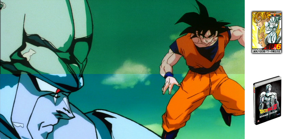
Kaboom raises a very good point. Another theory, or perhaps an addendum to that one, might be that they adjusted the individual settings for each volume, and then automated it, for that volume only.SSj Kaboom wrote:Mostly the state of the original film, probably. Just look at the shot of Vegeta and Goku from movie 6. Even the DragonBox was really bright, with the skintones and yellows on Vegeta's face barely distinguishable (not to mention that's a very fast-moving shot). The original material itself has as much to do with the results as the process does.
I don’t know about that. The Matrix has a hyper-stylized look that would be very hard to recreate in real life. If there was a particular look desired for Dragon Ball, as a 2D animation, they probably just would have done it at the cel-level. I’m sure there probably was some kind of processing done to it, but in this case I believe it’s more an instance of the film inherently looking like that.Snail wrote:So, I doubt the Dbox footage film masters originally had the 'foggy effect' that some prefer, and of which some do not, but instead an extensive(?) procedure of a 'meshing' of different filters and layers.
Again, this is not the right size, even without the movie covers on the side. And you show more of one shot than the other.Tanooki Kuribo wrote:Tanooki brings this to the table:
Again, this is something you can do on your own if you’re determined enough. It does not belong on the DVD at all.BrollysKin wrote:See I just prefer the blue sky more than the green, whether or not that was the original intention or not. I do think Cooler is too blue however, and I would have liked it if they were able to keep the sky blue, but Cooler green.
Even if you could view the film masters directly, the colors have very likely faded over time. That’s why it’s called a “restoration process”: the purpose is to restore the look of the original because your source material no longer accurately reflects that. Seeing as Toei personally colored the original frames and FUNi did not, I certainly trust them moreso than anyone else in what they say the colors look like. It may be a matter of preference for the end-user, but it is certainly not a matter of preference for FUNimation, a dubbing company that had nothing to do with the creative decisions behind the show’s visuals.Snail wrote:From bottom to top I see; green fading to turqoise to teal to a darker teal. I actually prefer this over the Dragonbox footage, where it's light green to dark. I see no problem with the 'faux-remastered' version as it gives off a much more vibrant feel. In the end it's a matter of preference, and we have not seen the film masters ourselves before; we do not know for certain what the actual intended colors are even if the Dbox were indeed to have been advertised to present forth footage 'the way it was meant to be seen' (unintentional FUNi ad phrase usage).
Here’s something for everyone: Can someone provide me with unaltered screenshots (read: untouched by VLC or any other program aside from a ripper and frameserver like VirtualDubMod) of the frames in question? I want to do proper comparison shots.
D'oh. I just noticed your post regarding the guide (*slow as hell*). I'll get to work on grabbing a couple of those specific shots from my Dragon Box by following your method. Thanks for the help, btw.
Edit: Here's for starters. This is the very first frame of Super Saiyan Goku's face close up just after the scene switches from a full body shot.

Edit: Here's for starters. This is the very first frame of Super Saiyan Goku's face close up just after the scene switches from a full body shot.
Last edited by Tsukento on Mon Nov 17, 2008 11:20 am, edited 1 time in total.
[url=http://www.youtube.com/user/TsukentoX]YouTube Profile[/url]
-
Tanooki Kuribo
- I Live Here
- Posts: 4563
- Joined: Wed Sep 08, 2004 12:23 am
- Location: Manhattan, New York
- Contact:

-
Acid_Reign
- Advanced Regular
- Posts: 1056
- Joined: Wed Jan 24, 2007 5:59 am
- Location: Massachusetts, USA
- Contact:
No problem. I’m a video guy; this is what I do.Tsukento wrote:D'oh. I just noticed your post regarding the guide (*slow as hell*). I'll get to work on grabbing a couple of those specific shots from my Dragon Box by following your method. Thanks for the help, btw.
Thank you!!!!Edit: Here's for starters. This is the very first frame of Super Saiyan Goku's face close up just after the scene switches from a full body shot.
So, what process did you end up using?
I would say it does, if only to make it as objective as possible. It almost looks like you’re playing favorites, even if it’s unintentional. Also, be sure to resize correctly.Tanooki Kuribo wrote:Yea, I just noticed but, I don't think that really matters. If it does I will gladly do it over.
Went with using DVD Decrypter (I actually had the program on this comp from a good while back).
I did everything that you said to do for VirtualDub Mod. For whatever reason though, saving the snapshot directly through VirtualDub Mod gave the image some kind of weird ass transparency effect. So I used the "Copy Output Frame to Clipboard" option, pasted into Photoshop and saved it from there.
I'm currently in the process of finding that shot of Coola with the sun behind him.
[url=http://www.youtube.com/user/TsukentoX]YouTube Profile[/url]
-
Acid_Reign
- Advanced Regular
- Posts: 1056
- Joined: Wed Jan 24, 2007 5:59 am
- Location: Massachusetts, USA
- Contact:
That’s so weird! The same thing happens to me. Figured I had a buggy version or something. Maybe I should change my advice.Tsukento wrote:Went with using DVD Decrypter (I actually had the program on this comp from a good while back).
I did everything that you said to do for VirtualDub Mod. For whatever reason though, saving the snapshot directly through VirtualDub Mod gave the image some kind of weird ass transparency effect. So I used the "Copy Output Frame to Clipboard" option, pasted into Photoshop and saved it from there.
Also, what resizing method did you use?
Great; looking forward to future shots!I'm currently in the process of finding that shot of Coola with the sun behind him.
Seriously. I thought it may have been my settings or something. I was ready to tear my hair out.Acid_Reign wrote:That’s so weird! The same thing happens to me. Figured I had a buggy version or something. Maybe I should change my advice.
The very same shown in the screenshot you provided for VirtualDub Mod, using the resize filter and going with Precise Bicubic (A=-1.00). Only thing I did with Photoshop was paste and save.Acid_Reign wrote:Also, what resizing method did you use?
Here's a few.Acid_Reign wrote:Great; looking forward to future shots!


[url=http://www.youtube.com/user/TsukentoX]YouTube Profile[/url]
-
Tanooki Kuribo
- I Live Here
- Posts: 4563
- Joined: Wed Sep 08, 2004 12:23 am
- Location: Manhattan, New York
- Contact:
About the re-sizing... Iam using Metalwario64's screen caps from this thread. I don't have the DVD's. I have the Blu-Ray. If this isnt up to what you wanted then just ignore it. Sorry.
I know Coolers face lines seem to be a bit off in where they meet into the next screen shot, but the colors are all there.
I know Coolers face lines seem to be a bit off in where they meet into the next screen shot, but the colors are all there.
Time for even more movie 5 screens from the Dragon Box for comparison purposes. An interesting thing worth noting from what I've seen so far. If the double feature screens are right, then it shows a little more on the bottom than the Dragon Box does. HOWEVER, the Dragon Box shows more on the top than the double feature does.


[url=http://www.youtube.com/user/TsukentoX]YouTube Profile[/url]
-
Chrono Trigger
- Advanced Regular
- Posts: 1269
- Joined: Sun Jul 06, 2008 11:13 am
- Location: Chicago, Illinois
- Contact:
Why can't they just put the entire picture in there? Why do they cut stuff out? (That's for any version)Tsukento wrote:Time for even more movie 5 screens from the Dragon Box for comparison purposes. An interesting thing worth noting from what I've seen so far. If the double feature screens are right, then it shows a little more on the bottom than the Dragon Box does. HOWEVER, the Dragon Box shows more on the top than the double feature does.
I completely respect your opinion, and I respect you. I enjoyed discussing this with you, even if I don't completely agree.
If we're all here for a reason then I'm just visiting.
If it's held in your heart then you can't let go.
If we're all here for a reason then I'm just visiting.
If it's held in your heart then you can't let go.
-
Yi Xing Long

- Beyond-the-Beyond Newbie
- Posts: 329
- Joined: Sun Nov 13, 2005 6:10 pm
The movies were animated full-screen; however, they were then cropped to a letterbox format to make them widescreen, since that is how they are supposed to be viewed. The reason for this is that it was easier to animate it in full-screen and then crop it than it was to animate it in widescreen. For Funimation's re-releases of the movies they decided to release them in the proper format; however, they had to crop them by themselves. They zoomed out as much as possible to allow as much of the frame to be shown as possible, then they cropped it into widescreen. Toei's are not zoomed out quite as far as Funimation's. Because of all of this there will obviously be subtle differences.Chrono Trigger wrote:Why can't they just put the entire picture in there? Why do they cut stuff out? (That's for any version)Tsukento wrote:Time for even more movie 5 screens from the Dragon Box for comparison purposes. An interesting thing worth noting from what I've seen so far. If the double feature screens are right, then it shows a little more on the bottom than the Dragon Box does. HOWEVER, the Dragon Box shows more on the top than the double feature does.
-
BrollysKin

- OMG CRAZY REGEN
- Posts: 911
- Joined: Tue Apr 25, 2006 10:32 pm
- Location: Minnesota
- Contact:

I like them both. I'm gonna buy the Funi double feature first, and then buy a Movies Dragonbox so I can have them all. They both look awesome.BrollysKin wrote:This is silly, just choose which one you like better.
The series doesn't start with the arrival of Raditz. Stop being lazy and watch Dragonball.
-
SSJ Helldog

- Regular
- Posts: 743
- Joined: Fri Aug 31, 2007 4:15 pm
- Location: FL, USA
- Contact:
-
SSJ2bardock
- I Live Here
- Posts: 2592
- Joined: Sun Apr 20, 2008 1:10 am
- Location: Chicago
-
Freeza Heika

- OMG CRAZY REGEN
- Posts: 957
- Joined: Mon Jul 28, 2008 3:03 pm
- Location: Indianapolis