Discussion regarding the entirety of the franchise in a general (meta) sense, including such aspects as: production, trends, merchandise, fan culture, and more.
-
jjgp1112
- Kicks it Old-School
- Posts: 7816
- Joined: Mon Jul 23, 2007 10:15 pm
- Location: Crooklyn
Post
by jjgp1112 » Sat Apr 25, 2009 7:59 pm
One thing I've noticed is that a lot of DBZ products from the early 90's use the DBZ logo from the beginning of Cha-La Head-Cha-La:

As opposed to the one we know now:
So I want to know: when did Toei adopt the current DBZ logo? Did Funi create it with their old Pioneer releases (
like this), and then Toei edited it to red and yellow? Or did TOEI create it themselves?
Yamcha: Do you remember the spell to release him - do you know all the words?
Bulma: Of course! I'm not gonna pull a Frieza and screw it up!
Master Roshi: Bulma, I think Frieza failed because he wore too many clothes!
Cold World (Fanfic)
"It ain't never too late to stop bein' a bitch." -
Chad Lamont Butler
-
Taku128
- I'm, pretty, cozy, here...
- Posts: 1675
- Joined: Thu Aug 03, 2006 1:22 am
Post
by Taku128 » Sat Apr 25, 2009 9:10 pm
Your question made me curious so I did a bit of googling for official products that used the newer logo before FUNi did any dubbing on DBZ. First I looked at the Japanese movie posters, but they used the series logo. Next I looked up superpope's Dragon Ball game guide for boxart from the games, and found these.

This is the first game that uses the new style logo, but it's a Dragon Ball game, so there's no Z. It was released in October 1989, six months after DBZ's TV debut.

This is the first Z game to use the new style logo. It came out a year after Dragon Ball 3 did. This game was released in October, 1990.
Most of the other games used this newer style logo instead of the original logo. What I'm curious about now is how the new style DBZ logo came to be used in all official products over the original version of the logo. Anyone else have any more info?
-
Saiyan
- Beyond Newbie
- Posts: 291
- Joined: Tue Jul 12, 2005 8:22 pm
- Location: New Jersey, USA
Post
by Saiyan » Sat Apr 25, 2009 9:43 pm
From those two images, the logo looks like it was created due to spacing issues.
-
Daijuken
- Not-So-Newbie
- Posts: 70
- Joined: Sun Mar 08, 2009 5:43 pm
- Location: Back in the UK
Post
by Daijuken » Sat Apr 25, 2009 11:41 pm
I always assumed the current logo was a FUNi spawn, it just seems a bit "hardcore", dare I say?, for Toei. I mean look what they did to the GT logo, sort of took the original design and "gangsta'd " it up a bit.
-
kei17
- I Live Here
- Posts: 4142
- Joined: Wed Dec 05, 2007 9:23 am
Post
by kei17 » Sun Apr 26, 2009 12:10 am
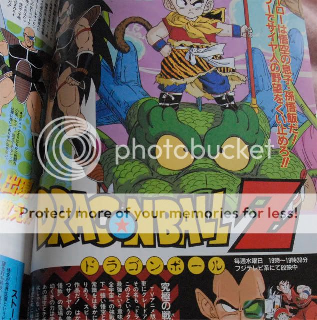
On
Gekkan Out, an anime magazine, released just after starting DBZ, the current logo was already used.
But it's Dra
con (It's just an error, I think*) and has different colours on "o" and "BALL".
In France, where DBZ's been aired from 1990, the current one was used.


Covers of Japanese Laserdisc release have a unique logo that has yellow Z.
Last edited by
kei17 on Sun Apr 26, 2009 12:19 am, edited 1 time in total.
-
Kingdom Heartless
- I Live Here
- Posts: 3393
- Joined: Sun Jul 20, 2008 12:21 am
- Location: QLD, Australia
-
Contact:
Post
by Kingdom Heartless » Sun Apr 26, 2009 12:17 am
Huh... Dracon? That's weird.
Yo! Cal's the name. Nice to meet you!
Lover of all that is pure and fun in the worlds of Dragon Ball, Jim Henson and so forth!
3DS Friend Code 1418-7854-8786. I'm always playing Pokemon, so PM me yours for Friend Safari and battling! :D
-
SSj_Rambo
- I Live Here
- Posts: 3496
- Joined: Tue Apr 01, 2008 4:10 pm
- Location: West City
Post
by SSj_Rambo » Sun Apr 26, 2009 12:18 am
Taku128 wrote:This is the first game that uses the new style logo, but it's a Dragon Ball game, so there's no Z. It was released in October 1989, six months after DBZ's TV debut.
Actually, the handheld game
Dragonball Z: Gonbare! Son Gohan used the new logo before that, in September of 1989:
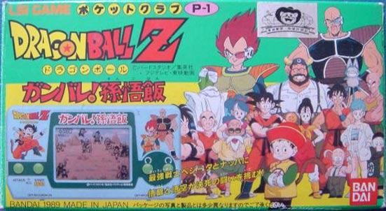
I agree, it was probably used for space, and to look more flashy.
-
Taku128
- I'm, pretty, cozy, here...
- Posts: 1675
- Joined: Thu Aug 03, 2006 1:22 am
Post
by Taku128 » Sun Apr 26, 2009 12:33 am
Looks like a coloring error to me. Fill in the white space in the C with the color yellow and it would be a G. Maybe Toei provided them with an uncolored logo and they colored it themselves?
-
Innagadadavida
- I Live Here
- Posts: 3480
- Joined: Thu Nov 13, 2008 12:25 am
- Location: Arkansas, USA
Post
by Innagadadavida » Sun Apr 26, 2009 12:38 am
Daijuken wrote:I always assumed the current logo was a FUNi spawn, it just seems a bit "hardcore", dare I say?, for Toei. I mean look what they did to the GT logo, sort of took the original design and "gangsta'd " it up a bit.
Adding a brushed metal texture and coloring in the font makes things "gangsta?" Hmmm... Who would have known.

-
Tanooki Kuribo
- I Live Here
- Posts: 4563
- Joined: Wed Sep 08, 2004 12:23 am
- Location: Manhattan, New York
-
Contact:
Post
by Tanooki Kuribo » Sun Apr 26, 2009 12:41 am
I would have never noticed that "C" in the DragonBall logo if it wasn't pointed out.
-
Daijuken
- Not-So-Newbie
- Posts: 70
- Joined: Sun Mar 08, 2009 5:43 pm
- Location: Back in the UK
Post
by Daijuken » Sun Apr 26, 2009 8:41 am
Innagadadavida wrote:Daijuken wrote:I always assumed the current logo was a FUNi spawn, it just seems a bit "hardcore", dare I say?, for Toei. I mean look what they did to the GT logo, sort of took the original design and "gangsta'd " it up a bit.
Adding a brushed metal texture and coloring in the font makes things "gangsta?" Hmmm... Who would have known.
Coupled with "Step In To The Grand Tour" in the background, yes, it does.

-
Acid_Reign
- Advanced Regular
- Posts: 1056
- Joined: Wed Jan 24, 2007 5:59 am
- Location: Massachusetts, USA
-
Contact:
Post
by Acid_Reign » Sun Apr 26, 2009 1:32 pm
Innagadadavida wrote:Adding a brushed metal texture and coloring in the font makes things "gangsta?" Hmmm... Who would have known.
Well, it’s
clearly a graffiti font…
-
jda95
- Advanced Regular
- Posts: 1360
- Joined: Tue Nov 25, 2008 1:51 am
- Location: 神様の神殿
-
Contact:
Post
by jda95 » Sun Apr 26, 2009 6:30 pm
The French logo also has the space in the G.


