MarcFBR wrote:I wouldn't necessarily trust the director's memory on colors from decades ago. You'd look at materials and use your judgement. That's what they generally try and do when remastering Disney films. They'll bring people in if they can, but in general, they look at materials, and they use their judgement.
That's what I'm saying; everyone has a different opinion of how it should be done, there's multiple ways, and no real fool-proof way.
On the Dragon Box masters though, I've seen Kei post around a note from Toei's consumer services (I think?) acknowledging that the colors are indeed slightly off. How they're off isn't mentioned (most likely because it differs in every episode.) Just looking at it and comparing it to all other releases (I'm not saying one or two), cels, and a lot of promotional shots and whatnot, evidence points to this even though you really can't say what the originals looked like 100% or say exactly how they're off without guessing. It doesn't make it bad. It just is.
The reason I think they went with these colors as they did is because it was consistent to what they had, would add a lot of extra work in color correction, and opened the exact bag of worms we have now. At least the way they are they can say, hey, these are what the masters look like even if they're slightly off. We didn't mess with it.
MarcFBR wrote:Which still doesn't always equate to reality for cel based shows, as paint doesn't always match 100%, people don't always follow those guidelines, especially when work is being rushed with a weekly show. Not to mention post production tweaking, or color issues with machines. Color guides may purposefully have slightly altered coloring based on knowing limitations of equipment that will be used.
And a slight shift to red isn't 'radical', especially when the evidence that it is wrong is limited to VHS recordings and Nth gen film copies, neither of which are known for color accuracy.
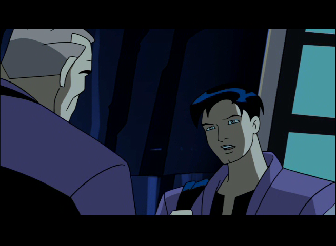
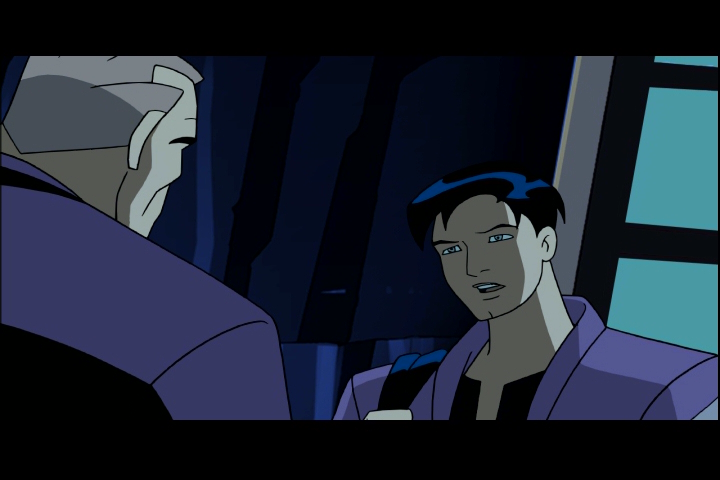
Yeah. This actually comes up on the Batman: TAS DVDs. Bruce Timm mentions that they regret picking an off-blue for the dark shade to all of Robin's green elements instead of just going black (Their color pallet was something around 16 colors, apparently), and then points out a scene where the Japanese didn't even follow their color sheets and just used black instead.
Hell, for cel animated shows, a lot of the time you're lucky if they used anything CLOSE to the right color. Who remembers watching the old Ninja Turtles shows and finding scenes where their bandanas would be completely mixed up? I think there's one Leonardo title card used on multiple episodes where he has an orange bandana, too.


