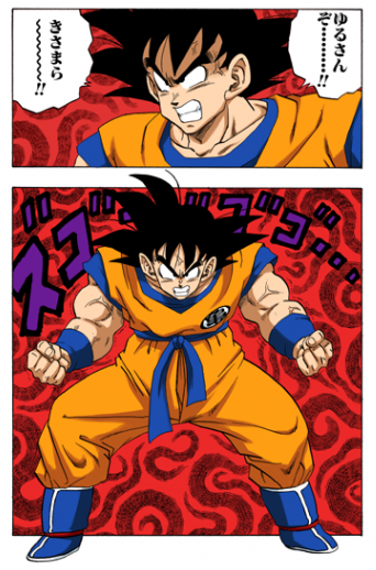
dbboxkaifan wrote:This is possibly my least favourite animation style of Dragon Ball:

I am speechless at the sight of this cap, the render of goku is just incredibly hard to look at rushed or not, it just emphasizes the sub-standard quality level of cheapness Toei seems to have in their anime now. It reminds me of the derpy DBZ sagas opening, it doesnt even seem accurate at all but just an abstract adaption of what they*think* goku looks like, that or the budget and animators are both equally terrible. Worst render I've seen yet. It was the reason why I ignored the One piece-Toriko-DB cross over.
FortuneSSJ wrote:The thing I dislike most in animation nowadays is the CGI use.
When bad used (most of the time) it looks horrible.
TheGreatness25 wrote:There are times where the characters look great, this new art style isn’t so kind to backgrounds or details.
I just don't like the direction they're taking with DBZ either. I cant see the series going into CGI territory as hinted with BoG, it makes it look sometimes like a video game with jarring 3D scenarios. CGI is the worst thing they could add to DBZ, my stance on it is that CGI for cartoons/anime is very situation reliant depending on how much of it youre staring at and how long. It also heavily dependant on how seamless it is so that its not noticable. The CGI used in BoG is exactly what it didn't do. It was jerky and far too obvious where it started and finished, I get they were trying to make the fights look more "realistic" or emmersive but oh-god no it didn't. It just made the backgrounds look artificial and too clean.
Flame Dragon wrote:That Gohan picture really is lifeless compared to the original.
In the original Gohan looked shocked and desperate, the tears were drawn to look real (instead of being drawn like cartoon style tears, all white and no depth...) meanwhile in the new it looks like Gohan is a little pissy because someone ate his cookie.
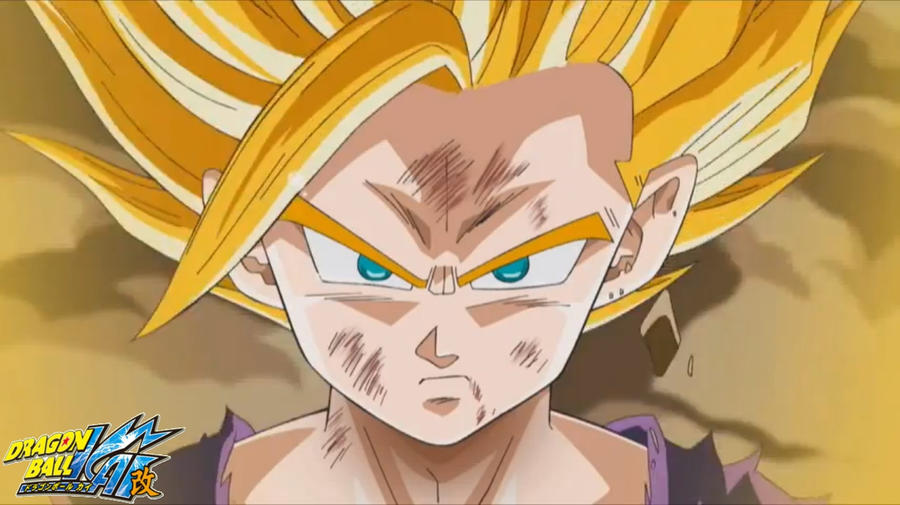
You think thats bad? SSJ2 Kai-Gohan just looks ugly and the bright single-toned colours make it look cartoony and ametuerish.
- Ears are higher up on head
- Eyes are larger and Irises are smaller / Eye brows are longer
- Clothing is a lighter shade
- Mouth is longer
- Pecks are lowered
- SSJ2 bang is thicker and flatter / animation is wispy
- Hair is all one tone (and orange rather than dark gold)
- Hair style is completely off. (Flatter and mane-like) as opposed to straight up an compact.


Its not an official model but its a lazier incarnation of how they would draw it if it was.It reflects their newer, uglier art designs.


