"Correcting" Style

Discussion regarding the entirety of the franchise in a general (meta) sense, including such aspects as: production, trends, merchandise, fan culture, and more.
User avatar
Attitudefan
I Live Here
Posts: 2963
Joined: Tue Aug 03, 2010 9:51 pm
Location: Canada

"Correcting" Style

Post by Attitudefan » Thu Jul 16, 2015 7:33 pm

Hi guys!

I have been pondering this topic for awhile now, and I just can't seem to wrap my head around it. I hope it doesn't turn into a long winded post, so I'll try to make it as short as possible and to the point.

What I have noticed among my peers here on the forum, and many other Dragonball fans across the world is about how certain styles need to be "corrected". I am not talking about Last House's art being 'fixed' whereby the proportions are corrected; instead, I am talking about how a certain 'style' of artwork is considered 'too old' and not 'up to date'. Thus, in the past, such as with the author of Dragonball Multiverse, fans and official artwork has gone back to "correct" the style of the work that was done in the manga or in the anime to fit the current look (Yamamuro's work specifically). I've seen artwork where artists have taken frames from the manga or anime and change the proportions to fit Yamauro's style, and only his style, making it seem like that is the only way the characters should look. Yes, people want a remake of the anime, but by doing so, they want to ignore the manga material of what the characters looked like in specific time periods of production, to go for Yamamuro's style. As such, I've seen artwork that has changed the ear size, the muscle definition, the way the noses look, and 'corrected' pupil size so it looks like it comes from the Buu arc or Dragonball Super.

Why do people think that the old artwork looks "incorrect" or "unofficial"? Hell, Toei even seems to agree where Chala's opening was redone to fit the current style instead of the old style (the 2008 special is what I am referring to). They have even changed all the movie artwork to sweep the old style and artists under the rug and deem it not Dragonball looking enough! To me, this is injustice to the artists of the past, and I have a bias against the new style. I love the old look, yet, while the anime and manga has it, if they ever remake it (like HunterxHunter) newer fans will never know of the older version, and consider it bad just because it looks like the manga did at the time and that it looks "old".
Image

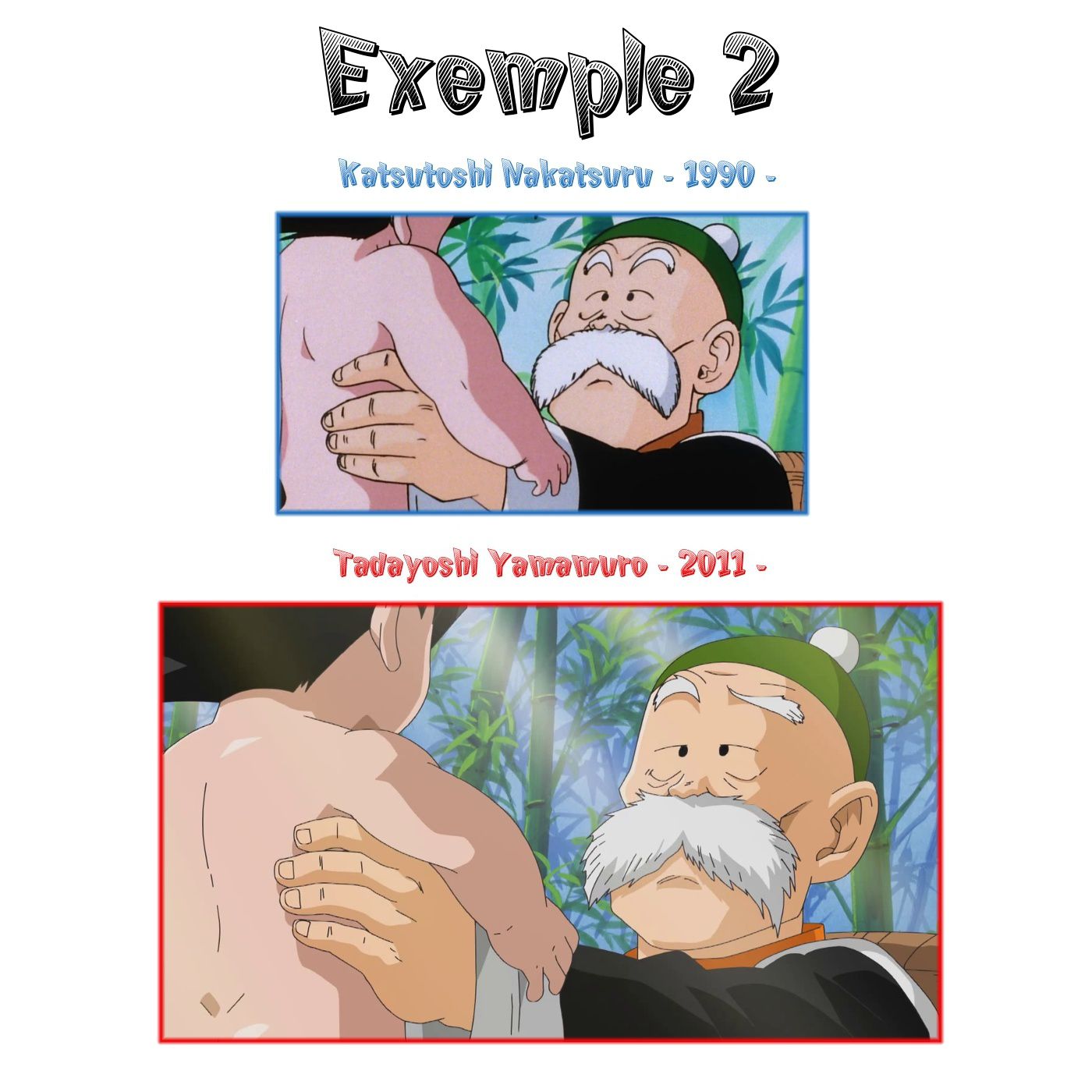
These are examples of Toei hiding the style of old by getting rid of it in or on official products. This is also a trend with fanartist, to not duplicate the manga, but to duplicate Yamamuro! :crazy:
My favourite art style (and animation) outside Toriyama who worked on Dragon Ball: Katsuyoshi Nakatsuru, Masaki Satō, Minoru Maeda, Takeo Ide, Hisashi Eguchi, Katsumi Aoshima, Tomekichi Takeuchi, Masahiro Shimanuki, Kazuya Hisada

User avatar
VegettoEX
Kanzenshuu Co-Owner & Administrator
Posts: 17789
Joined: Sat Jan 10, 2004 3:10 pm
Location: New Jersey
Contact:

Re: "Correcting" Style

Post by VegettoEX » Thu Jul 16, 2015 7:41 pm

I... don't agree with your premise! Because I agree with you!

In the examples you posted above, the older style looks "more" like "Dragon Ball" to me. Maybe because I'm actually of that age group / era?

The shiny new stuff seems to take shortcuts in shading and line/stroke depth. To me, that takes character away from the art itself. Combine that with my opinion that some of today's artists (including ones that have been around for a long time and are still doing it!) can't seem to hit the right perspectives and angles and proportions... and yeah, I disagree with your premise.

The old stuff is better!
:: [| Mike "VegettoEX" LaBrie |] ::
:: [| Kanzenshuu - Co-Founder/Administrator, Podcast Host, News Manager (note: our "job" titles are arbitrary and meaningless) |] ::
:: [| Website: January 1998 |] :: [| Podcast: November 2005 |] :: [| Fusion: April 2012 |] :: [| Wiki: 20XX |] ::

User avatar
Draconic
I Live Here
Posts: 2096
Joined: Mon Jul 13, 2015 3:44 pm
Location: Romania

Re: "Correcting" Style

Post by Draconic » Thu Jul 16, 2015 7:49 pm

I must say that I agree 100% !
That style is not bad by any means, but it certainly loses it's charm, not to mention that sometimes it just doesn't fit the tone of it all. The original art and shading gives it a feeling of uniqueness. The new one, on the other hand, looks more shiny and cartoonish, without much soul. And to me, what makes Dragon Ball what it is, is the soul and love you feel yourself when you watch it. Maybe I am a bit biased, since I love everything classic, but I tend to think I am truly not, since I do enjoy it and do wish we would see a remaster where everything is brought a little up to date. I don't think that style is what should be used, though. It looks to clean and smooth and Dragon Ball as a whole is nothing like that. I also agree that by trying to "fix" the classic look is kind of a slap in the face of every artist who worked on the show before.

I may sound like a little hipster, but the old style has something that can't be replicated. And I would say that even if I were introduced to it after finding out first about the new one.

I mean, just look at the poster(?) with Garlic Jr. The original feels like you could see the artist drawing it, while the second one looks like any shmuck could do in photoshop.
Check out the videos below, made by yours truly!

Goku vs Beerus BOG/Super mash-up https://gofile.io/d/kKKnMe

Vegeta vs Freeza ROF/Super mash-up https://gofile.io/d/MKPepW

User avatar
Doctor.
Banned
Posts: 10558
Joined: Sat Jul 26, 2014 10:02 am
Location: Portugal

Re: "Correcting" Style

Post by Doctor. » Thu Jul 16, 2015 7:52 pm

VegettoEX wrote:The shiny new stuff seems to take shortcuts in shading and line/stroke depth. To me, that takes character away from the art itself. Combine that with my opinion that some of today's artists (including ones that have been around for a long time and are still doing it!) can't seem to hit the right perspectives and angles and proportions... and yeah, I disagree with your premise.
The examples he posted? Yeah sure. Any trailer for DB Heroes or any recent special? Them too. But if we're talking about the most recent "shiny new stuff", as in Dragon Ball Super? I disagree, not so much. The line thickness if very varied and the shading is usually well done in the two episodes we've received so far. The animation itself may be not up to par to the movies, but it looks a lot more professional in terms of artwork.

User avatar
Attitudefan
I Live Here
Posts: 2963
Joined: Tue Aug 03, 2010 9:51 pm
Location: Canada

Re: "Correcting" Style

Post by Attitudefan » Thu Jul 16, 2015 7:56 pm

Awesome!! I'm gad you love the old style too!
Maybe because I'm actually of that age group / era?
I'm pretty sure this would be the case. It would probably be more with the younger fans, but I don't have the research to back that up.
The shiny new stuff seems to take shortcuts in shading and line/stroke depth. To me, that takes character away from the art itself. Combine that with my opinion that some of today's artists (including ones that have been around for a long time and are still doing it!) can't seem to hit the right perspectives and angles and proportions... and yeah, I disagree with your premise.
Definitely. The depth just seems strange on much of the new art, from official sources or not. However, I just went to deviantart to search for Dragonball, and from artists there had emulated Yamamuro's character designs and colouring style. It is near impossible to see anything that looks remotely like the old style (like what MetalWario did with that Vegeta picture in another thread).

It might seem like cherry picking, but this is what came up in a quick search (and I find this is widespread, "correcting" frames from Dragonball to fit the new art!)
he examples he posted? Yeah sure. Any trailer for DB Heroes or any recent special? Them too. But if we're talking about the most recent "shiny new stuff", as in Dragon Ball Super? I disagree, not so much. The line thickness if very varied and the shading is usually well done in the two episodes we've received so far. The animation itself may be not up to par to the movies, but it looks a lot more professional in terms of artwork.
I'm less critiqing the new style, and asking more about why is it considered more "official" than another style (like the manga or older arcs of the anime). If they have flashbacks, redrawn scenes, etc., it all looks like Super's style rather than something else (like something closer to the manga). You're current profile picture, Doctor, looks nothing like Goku in the Saiyan arc. So, Why does the art have to look like that in every Dragonball related content, unofficial or not? Hell, the Multiverse fanmanga looks nearly identical to Super's style over the manga's style from different eras. Does the art HAVE to look like that all the time?
Last edited by Attitudefan on Thu Jul 16, 2015 8:03 pm, edited 2 times in total.
My favourite art style (and animation) outside Toriyama who worked on Dragon Ball: Katsuyoshi Nakatsuru, Masaki Satō, Minoru Maeda, Takeo Ide, Hisashi Eguchi, Katsumi Aoshima, Tomekichi Takeuchi, Masahiro Shimanuki, Kazuya Hisada

User avatar
SuicidalZerg
Beyond-the-Beyond Newbie
Posts: 326
Joined: Fri Apr 12, 2013 12:01 am
Location: Utah, United States.
Contact:

Re: "Correcting" Style

Post by SuicidalZerg » Thu Jul 16, 2015 8:02 pm

I agree with you man... the new style just looks like it was rushed or badly done. The movie posters in particular make it so that I actually want to see if I can find the old ones, and print them off as DVD covers to replace the really bad-looking ones that come with the Funi movie sets... The old style actually looks like effort was put into making it look good, and that the artist's soul was put into that effort.
Nozawaberries commercial: https://www.youtube.com/watch?v=Mdqta3iB6ZM

Twitch stream: http://www.twitch.tv/suicidalzerg
Planet Minecraft skins: http://www.planetminecraft.com/member/son_gohan/
Youtube: https://www.youtube.com/user/SC2SuicidalZerg
NA Battle tag: SuicidalZerg.158
MC username: SuicidalZerg

User avatar
Doctor.
Banned
Posts: 10558
Joined: Sat Jul 26, 2014 10:02 am
Location: Portugal

Re: "Correcting" Style

Post by Doctor. » Thu Jul 16, 2015 8:07 pm

Attitudefan wrote:I'm less critiqing the new style, and asking more about why is it considered more "official" than another style (like the manga or older arcs of the anime). If they have flashbacks, redrawn scenes, etc., it all looks like Super's style rather than something else (like something closer to the manga). You're current profile picture, Doctor, looks nothing like Goku in the Saiyan arc. So, Why does the art have to look like that in every Dragonball related content, unofficial or not? Hell, the Multiverse fanmanga looks nearly identical to Super's style over the manga's style from different eras. Does the art HAVE to look like that all the time?
Of course it doesn't look anything like Goku in the Saiyan arc, this isn't Goku in the Saiyan arc, it's Goku in Super.

Likewise, Toriyama's style has evolved over time too, and his style in the Boo arc is nothing like his style in the Saiyan arc. In fact, his style in the Boo arc looks closer to the current style of the franchise than it does to his older style. If people prefer Yamamuro's style to base their fanart on, then that's their preference, but it's considered "official" more often because Yamamuro's style is the face of the franchise nowadays, whether you like it or not.

User avatar
Attitudefan
I Live Here
Posts: 2963
Joined: Tue Aug 03, 2010 9:51 pm
Location: Canada

Re: "Correcting" Style

Post by Attitudefan » Thu Jul 16, 2015 8:11 pm

Doctor. wrote:
Attitudefan wrote:I'm less critiqing the new style, and asking more about why is it considered more "official" than another style (like the manga or older arcs of the anime). If they have flashbacks, redrawn scenes, etc., it all looks like Super's style rather than something else (like something closer to the manga). You're current profile picture, Doctor, looks nothing like Goku in the Saiyan arc. So, Why does the art have to look like that in every Dragonball related content, unofficial or not? Hell, the Multiverse fanmanga looks nearly identical to Super's style over the manga's style from different eras. Does the art HAVE to look like that all the time?
Of course it doesn't look anything like Goku in the Saiyan arc, this isn't Goku in the Saiyan arc, it's Goku in Super.

Likewise, Toriyama's style has evolved over time too, and his style in the Boo arc is nothing like his style in the Saiyan arc. In fact, his style in the Boo arc looks closer to the current style of the franchise than it does to his older style. If people prefer Yamamuro's style to base their fanart on, then that's their preference, but it's considered "official" more often because Yamamuro's style is the face of the franchise nowadays, whether you like it or not.
But does that warrant official material, when going over the older parts of the series, to give it the new style? According to your argument, no, they should make Goku look like Goku did in 1989 (except, Toei doesn't do that).
My favourite art style (and animation) outside Toriyama who worked on Dragon Ball: Katsuyoshi Nakatsuru, Masaki Satō, Minoru Maeda, Takeo Ide, Hisashi Eguchi, Katsumi Aoshima, Tomekichi Takeuchi, Masahiro Shimanuki, Kazuya Hisada

User avatar
Doctor.
Banned
Posts: 10558
Joined: Sat Jul 26, 2014 10:02 am
Location: Portugal

Re: "Correcting" Style

Post by Doctor. » Thu Jul 16, 2015 8:14 pm

Attitudefan wrote:But does that warrant official material, when going over the older parts of the series, to give it the new style? According to your argument, no, they should make Goku look like Goku did in 1989 (except, Toei doesn't do that).
It depends, you always have that purist part of the fanbase who want to leave the style intact so we can notice the evolution in Toriyama's style over time, then there's the (much bigger) part of the fanbase who prefers when it's all "new" and done in Yamamuro's style. I say it's a win-win for Toei, they can do it easier while imitating Yamamuro's style than Toriyama's and most of the fanbase like it more, anyway.

User avatar
JulieYBM
Patreon Supporter
Posts: 18545
Joined: Mon Jan 16, 2006 10:25 pm
Location: 🏳️‍⚧️🍉

Re: "Correcting" Style

Post by JulieYBM » Thu Jul 16, 2015 8:15 pm

There isn't much point in re-doing something exactly as it was done before. There also isn't much point in drawing something terribly, as is the case with a lot of modern key visuals associated with Dragon Ball. Better artists ought to be hired but I doubt that will happen.
💙💜💖 She/Her 💙💜💖

User avatar
Attitudefan
I Live Here
Posts: 2963
Joined: Tue Aug 03, 2010 9:51 pm
Location: Canada

Re: "Correcting" Style

Post by Attitudefan » Thu Jul 16, 2015 8:19 pm

I find that strange, since the new Jojo anime tried their best to replicate the manga to its style during the certain arcs. Sure there were some liberties, it was the same in the DB anime! The 22nd arc had moments where it looked like the Saiyan arc manga long before Toriyama got there. I see Fist of the North Star generally still looks to replicate the style of the manga as well during its certain arc, even in newer material. Just because it is new, doesn't mean that they cannot do the sketchy looking muscles and other details from the 80s.

I find great sadness that older artists' work are swept under the rug because of Yamamuro and the lack of respect in the fan base for the older artists who worked on DB.
There isn't much point in re-doing something exactly as it was done before. There also isn't much point in drawing something terribly, as is the case with a lot of modern key visuals associated with Dragon Ball. Better artists ought to be hired but I doubt that will happen.
That's a huge problem, I agree. But I'm worried that people have been normalized to Yamauro's style so much today, that in the future, we won't see the older style (or something similar) ever again.
My favourite art style (and animation) outside Toriyama who worked on Dragon Ball: Katsuyoshi Nakatsuru, Masaki Satō, Minoru Maeda, Takeo Ide, Hisashi Eguchi, Katsumi Aoshima, Tomekichi Takeuchi, Masahiro Shimanuki, Kazuya Hisada

User avatar
Captain Space
I'm, pretty, cozy, here...
Posts: 1520
Joined: Thu Mar 05, 2015 3:52 pm

Re: "Correcting" Style

Post by Captain Space » Thu Jul 16, 2015 8:22 pm

Attitudefan wrote:
Maybe because I'm actually of that age group / era?
I'm pretty sure this would be the case. It would probably be more with the younger fans, but I don't have the research to back that up.
Younger fan here (19, only got into DB about two or three years ago), and while I can't claim to speak for my entire demographic, I think a lot of the redrawings end up looking a bit...manufactured? Like, I like the modern style when it's its own thing. Battle of Gods is (for the most part, a few exceptions notwithstanding) a very pretty movie; ditto RF. But like, I love the original gothic, stylised look of the Dead Zone movie (not just the poster, the whole movie) and I think that Dead Zone poster comparison is a perfect example of when this 'modern' DB art style just doesn't work.

So yeah, I basically agree. The current style isn't bad by any means, but it shouldn't be force-fed to people as the one true way of drawing Dragon Ball.
"Actually I didn’t know what Bulma’s real hair color was" --Toriyama

User avatar
Quebaz
Advanced Regular
Posts: 1203
Joined: Tue Jun 26, 2012 8:57 am
Location: Portugal
Contact:

Re: "Correcting" Style

Post by Quebaz » Thu Jul 16, 2015 8:30 pm

It's about consistency and having things all look like they're from the same "medium" at any given time, which is what most of the deviantart users and even official staff who do these sort of "redraws" are looking for. It even goes back into marketing, if the newest main Material has X artstyle, wouldn't remaking older material or producing other, non-important art (stuff like posters and the like) with the same art style be a bonus step to atract people into the series?

Don't get me wrong, I totally agree with you in that the older stuff looks better to me, the remade movies posters look hilariously bad compared to the old ones and some of the recent game covers haven't looked all that great either.
A LUZ INFINITA!
Steam: Quebaz
PSN: BSSJ3
Tumblr

User avatar
TheDevilsCorpse
Moderator
Posts: 11378
Joined: Sun Jun 20, 2010 4:34 am
Contact:

Re: "Correcting" Style

Post by TheDevilsCorpse » Thu Jul 16, 2015 8:35 pm

Quebaz pretty much hit the nail on the head for me. It's about consistency. I'm not saying that Yamamuro's current art style is what Dragon Ball needs to look like (I haven't really enjoyed animated material's style since Buu ended), but placing Toriyama's manga version of Piccolo from the 23rd Budokai next to his Buu Arc self is a more than a little jarring. Trying to handle all the different merchandise and stuff with the various art styles would be a huge mess, so I honestly think the uniform approach the franchise has taken is for the best (plus it's easier to bring old character into the new style than it is to draw the new ones in the older styles).

Now if they wanted to do specifically themed merchandise (here's a cup with Freeza art style designs) or an animated special in the the Piccolo Junior/Saiyan Arc era and that art style to help it fit into that era, go for it. But if we're in Dragon Ball Super and Goku suddenly decides to flashback to all the major battles in his life, then the style should remain uniform regardless of the era being depicted because the various art style evolutions are not hard coded into the character's growths/depictions at those points in time. Freeza Arc Goku should look like how Super Arc Goku is currently being depicted, because he's the same character. Aging in-universe didn't suddenly change his art style designs, especially since he's a Saiyan and "never changes" as the humans like Bluma put it.

This, however, doesn't mean I think things like the Dead Zone movie poster above need to be redone in the current style. Well, I don't really mind it being redone just on the notion of it being updated, but it shouldn't replace the original because it doesn't accurately represent the movie it's meant to depict.

If you just want to draw Garlic Junior? Draw him however you want.
If you want to flashback to the events of Garlic Junior in another series/special/whatever? Use the current style.
If you want to promote the actual Dead Zone movie? Use the original poster since that's the art style the movie was animated in.
Last edited by TheDevilsCorpse on Thu Jul 16, 2015 8:47 pm, edited 1 time in total.
Direct translations of the Korean DB Online timeline and guidebook.
My personal "canon" and BP list. (Coming Soon)

User avatar
JulieYBM
Patreon Supporter
Posts: 18545
Joined: Mon Jan 16, 2006 10:25 pm
Location: 🏳️‍⚧️🍉

Re: "Correcting" Style

Post by JulieYBM » Thu Jul 16, 2015 8:43 pm

Attitudefan wrote: That's a huge problem, I agree. But I'm worried that people have been normalized to Yamauro's style so much today, that in the future, we won't see the older style (or something similar) ever again.
We'll get a new look for key visuals eventually. We did, technically, when Shida Naotoshi drew the Gi'nyuu Tokusentai key visuals.
💙💜💖 She/Her 💙💜💖

User avatar
DragonBalllKaiHD
I Live Here
Posts: 2734
Joined: Sun Apr 19, 2009 2:37 pm
Location: Texas
Contact:

Re: "Correcting" Style

Post by DragonBalllKaiHD » Thu Jul 16, 2015 9:39 pm

Just for the record, the "newer" movie cover of Dead Zone was done by unknown artist, not Yamamuro, which was chosen by FUNimation for the DVD release.

Attitudefan, it seems to me that you are trying to force your perspective upon people here. The problem with the topics and posts you made every time I stumbled upon is that you are being biased about the older style that are long in the past, as in not used anymore mainly because Toriyama, as other have said, have evolved as an artist over time. By time the Boo arc roll around , Toriyama had already changed to an extent that it's nothing like his early work, which, in effect, prompted the character designers (in this case Nakatsuru and Yamamuro) to follow the author's style. Yamamuro still carries this over even to this day because the animation industry has already evolved before the end of the decade, and Toriyama's Boo arc style fits with modern anime better than 90s style. It's also about marketability and consistency. It doesn't mean I like Yamamuro's today style, but I prefer consistency over nostalgia. Just for the note, Yamamuro drew big bodies ( see Z #127) and he still draws them (see Battle of Gods). The problem with his designs is that he lacks extra details like he used to, that's all. He's still the best character designer available for Dragon Ball.

For Dragon Ball Super, the animation supervisors don't really have to match every details Yamamuro provided on character designs, so we will be seeing all variety of styles. You can bet they will try to recruit Naoki Tate, Katsuyoshi Nakatsuru, Naotoshi Shida, and Masahiro Shimanuki to be animation supervisors.

It looks like Yamamuro is getting better as a character designer as time goes (see Resurrection 'F'), so I'm not fretting over this. If this becomes a slight problem, director Chiaoka makes up for this.
Last edited by DragonBalllKaiHD on Thu Jul 16, 2015 9:51 pm, edited 3 times in total.
Katsuyoshi Nakatsuru's #1 biggest fan

User avatar
JulieYBM
Patreon Supporter
Posts: 18545
Joined: Mon Jan 16, 2006 10:25 pm
Location: 🏳️‍⚧️🍉

Re: "Correcting" Style

Post by JulieYBM » Thu Jul 16, 2015 9:44 pm

If the chief animation supervisor and animation supervisor continue to change with each episode then Dragon Ball Super is bound to have varying looks to it anyway. It'll be interesting to see where things go as production gets inevitably further and further behind.
💙💜💖 She/Her 💙💜💖

User avatar
Attitudefan
I Live Here
Posts: 2963
Joined: Tue Aug 03, 2010 9:51 pm
Location: Canada

Re: "Correcting" Style

Post by Attitudefan » Thu Jul 16, 2015 9:55 pm

I have admitted I was bias in my original post, so it was a bit of a warning for the rest of the thread.

However, the work done on super is nothing really like Toriyama's current designs either. So it is not like the current designers follow Toriyama anymore which they did in the past. I've read interviews of the animation teams going to Toriyama and watching him draw so they can correct their styles accordingly, and follow suit. It's also disappointing that people have felt the need to alter the original anime or manga to modernize it in their eyes, which I don't agree with and pretend the old stuff doesn't exist despite consistency!

I haven't seen Return of F nor have I seen Super in full just yet. So my opinions are really reserved for anything done before those two products (though I have seen Super's opening, it is nothing too noteworthy).

But I get it, consistency. It makes sense. However, what Captain Space brought up is something to highlight! One thing that happened in the original run of the DB anime is that they weren't afraid to cross different styles, including colour schemes. The Dead Zone does look very gothic in its designs and colours, which I find the new material fails to play around with. It is gunmetal grey in terms of style. I think of that reanimated episode that came on Raging Blast 2. The colours remain flat despite the setting around them being cloudy, and ghostly. The line art doesn't do anything special because of consistency. And Captain Space is right that the new style fits material made for the new style. When using it on older material like the remade anime for Raging Blast, it doesn't work. The new style is nice for what it is, but it only fits the current upbeat product over the dark gothic mood of the 80s and 90s when it needed to be dark at certain times.

I get that the specific movie poster isn't by Yamamuro, but it's the style they used resembles Yamamuro's character designs. Instead of playing around with the style a bit, they go for the typical unlike the original poster (and the rest of the movie). It's just like the new anime material is always forced to have 3 highlights on their skin no matter what the mood or setting is. That's a shame.
So yeah, I basically agree. The current style isn't bad by any means, but it shouldn't be force-fed to people as the one true way of drawing Dragon Ball.
I agree.
My favourite art style (and animation) outside Toriyama who worked on Dragon Ball: Katsuyoshi Nakatsuru, Masaki Satō, Minoru Maeda, Takeo Ide, Hisashi Eguchi, Katsumi Aoshima, Tomekichi Takeuchi, Masahiro Shimanuki, Kazuya Hisada

User avatar
JulieYBM
Patreon Supporter
Posts: 18545
Joined: Mon Jan 16, 2006 10:25 pm
Location: 🏳️‍⚧️🍉

Re: "Correcting" Style

Post by JulieYBM » Thu Jul 16, 2015 10:09 pm

Yamamuro can't correct every episode of Dragon Ball Super himself now, so there is definitely going to be some variance. Things should especially interesting should any of the popular episode directors at Toei Animation take a stab at directing for Dragon Ball Super. Yama'uchi Shigeyasu directed a lot for the second and third series so it would be lovely to have him back for Dragon Ball Super. He recently directed Happiness Charge! PreCure Episode #32 so it shouldn't be impossible for him to return. There's also Hatano Morio or Nagamine Tatsuya to consider. Strong directors will undoubtedly exhibit an influence over their episodes, especially if they work with strong animation supervisors.
💙💜💖 She/Her 💙💜💖

User avatar
Chuquita
Namekian Warrior
Posts: 15262
Joined: Sat Nov 20, 2004 2:16 am
Location: Somewhere

Re: "Correcting" Style

Post by Chuquita » Thu Jul 16, 2015 11:16 pm

JulieYBM wrote:Yamamuro can't correct every episode of Dragon Ball Super himself now, so there is definitely going to be some variance.
To which I am so, so grateful. TuT
One of the things I've been looking forward to most in getting a weekly series is that we may actually get a variety of art styles again. I missed that.
On hiatus.

Post Reply