
Let's start with the original ghoul with a heart of gold, Android #8.

It goes without saying that Android #8 is a spitting image of the classic Frankenstein's Monster design, specifically Boris Karloff's hulking, sewn-headed portrayal in the 1931 Universal movie. While Android #8 doesn't get a massive amount of focus in the manga, he's characterised as a pacifistic gentle giant who harbours immense strength that will be unleashed on those silly enough to enrage him. Mary Shelley's creature is characterised in much the same way, a misunderstood beast who doesn't know his own strength, though the monster is significantly more malevolent and violent than dear old Hacchan over here. In contrast to his inspiration, #8 is surprisingly eloquent and intelligent, though he's treated like a reject by the Red Ribbon Army who keep him chained up in Muscle Tower. His patched-together appearance naturally reflects this premise, and the more elaborate designs of later androids would indicate that he was very much a prototype build. In terms of clothing, he wears a navy blue jacket, trousers of the same colour and a lighter blue undershirt. Nothing particularly breathtaking, but it does reflect that he isn't really built for combat. Though his head and proportions could be off-putting, he could easily fit into human society and indeed does so when he gets his happy ending.
Overall, #8 has a fine design for a relatively unimportant supporting character but it's very simplistic and not overly original, so is therefore not very memorable to me. It's somewhat interesting to compare him to his pop cultural inspiration. He at least had the courtesy to more or less vanish after he stopped being relevant. 4/10.
Moving forward several years, we get to the man behind the mandroids himself: Dr. Gero, a.k.a. Android #20, and his loyal partner-in-crime Android #19.

Everybody knows the story by now. The designs of these two poly-carbide creepers were controversial from the get-go and, infamously, the negative feedback from Akira Toriyama's former editor Torishima influenced him to ditch them both prematurely to replace them with a new set of Android antagonists, though they too would ultimately get the same treatment. Toriyama was clearly trying to subvert reader expectations with these two. After an ominous warning from Future Trunks about two menacing Androids that are destined to kill all of the Z-Warriors bar Gohan and terrorise the Earth, it's only natural to expect that only a pair of badass Terminator-esque monsters could be that terrifying. Upon seeing them revealed, Torishima spared few kind words for the two, calling them "some geezer and a fatso", as well as "outdated and ridiculous". Harsh.
The overall theme with #19 and #20, as far as I can gather, is that they're a twisted distortion of the fairy tale characters Geppetto and Pinocchio. Geppetto is of course the kind, elderly dollmaker and Pinocchio is his creation, a wooden marionette that is magically brought to life. Gero/#20 is an evil scientist Geppetto and #19 is his murderous Pinocchio.
Their dress sense is certainly bizarre. Their clothes appear to be antiquated and vaguely European in style but are difficult to describe. Gero wears yellow boots, baggy brown trousers, a black waistcoat with red braces, a red belt, and ruffled orange pinstripe undershirt with yellow sleeves. He also wears a distinctive rectangular black cap that resembles a Russian ushanka fur hat, though it appears to be made of solid metal. Interestingly enough, #19 almost seems to wear the exact inverse of his creator, though his clothes are the same style. His baggy trousers have the orange pinstripe pattern of Gero's shirt, his waistcoat is creamy yellow and the ruffles on his shirt are black. He also wears a cap, though it's a smaller pointy one. Both of their caps have the Red Ribbon insignia on them. Both of them wear golden earrings, which proves to be a theme with later Androids too. Their colour schemes remind me of a custard cream and a jaffa cake for some reason. Mmm. The old-fashioned European look of their designs contribute to the Brothers Grimm fairy tale aesthetic Toriyama seemed to be going for.
The fact that Gero is Android #20 is not explicit at first, though the fact that he looks like Einstein is an obvious indicator that the two are one and the same. It's perplexing to me that Gero modelled an Android body that looks identical to his old, haggard human form. The only thing he seems to have changed, besides the glass casing exposing his brain, is that his Android body is tanner. Considering that he bothers with the Android #20 secret identity at all, you'd think he'd make his Android self look completely different, or at the very least much younger. Naturally, Piccolo sees right through it.
Let's address the literal elephant in the room that is #19. He's a big boi. Nobody aside from Abridged!Vegeta ever questions why Gero intentionally designed a fat, pale robot, or why Gero intentionally kept an elderly appearance. My only guess is that he wanted to make himself and #19 easily underestimated. Similarly, they exaggerate their robotic body language in their first rampage, always remaining eerily stiff and rigid even during flight, but then demonstrate amazing speed and agility when push comes to shove.
Overall, I feel that both Torishima and fans were too harsh on these two. Toriyama was obviously having a bit of a laugh when designing the pair and generally trying something new with the major arc villain formula. I honestly wish we could have seen more from them before they were unceremoniously escorted out back and shot behind a dumpster. They're both far from conventionally cool but their gaudy appearances contrasted against their stoic demeanours and ruthless slaughter of innocent civilians make for an unsettling combination. Their looks hearken back to a sillier, lighthearted time in Dragon Ball, but then catch you off guard when they gorily rip your throat out. However, the confusing aspects of their designs is a bit of a minus for me. I'll give 'em an 8/10.
Next, Androids #17 and #18, the real Androids who were always a part of this story.
While Androids #17 and #18 were designed to be cooler and hipper than lame old #19 and #20, they interestingly still retain a doll-like aesthetic, though with a much more modernised flavour. #17 and #18 are both disarmingly "perfect", looks wise, having the flawless complexions of porcelain dolls. However, they look roughly like normal human teenagers. This, of course, creates a slight uncanny valley effect, more so than the obviously freakish #19 and #20. #17 and #18 are of course identical twins in contrast to the polar opposite #19 and #20. Besides Gero himself (and Android #21 if you're so inclined to include her), they are the only known Androids to have once been human, making them more Cyborg. But no, I'm not gonna call them 'Artificial Humans' either.
What I've always wondered is how much Gero's experiments physically altered them. Did they always look this way? Considering how extensive their internal modifications are, there's barely anything human left in them. Whatever the case, they share the sharp, piercing blue eyes of Gero and #19.
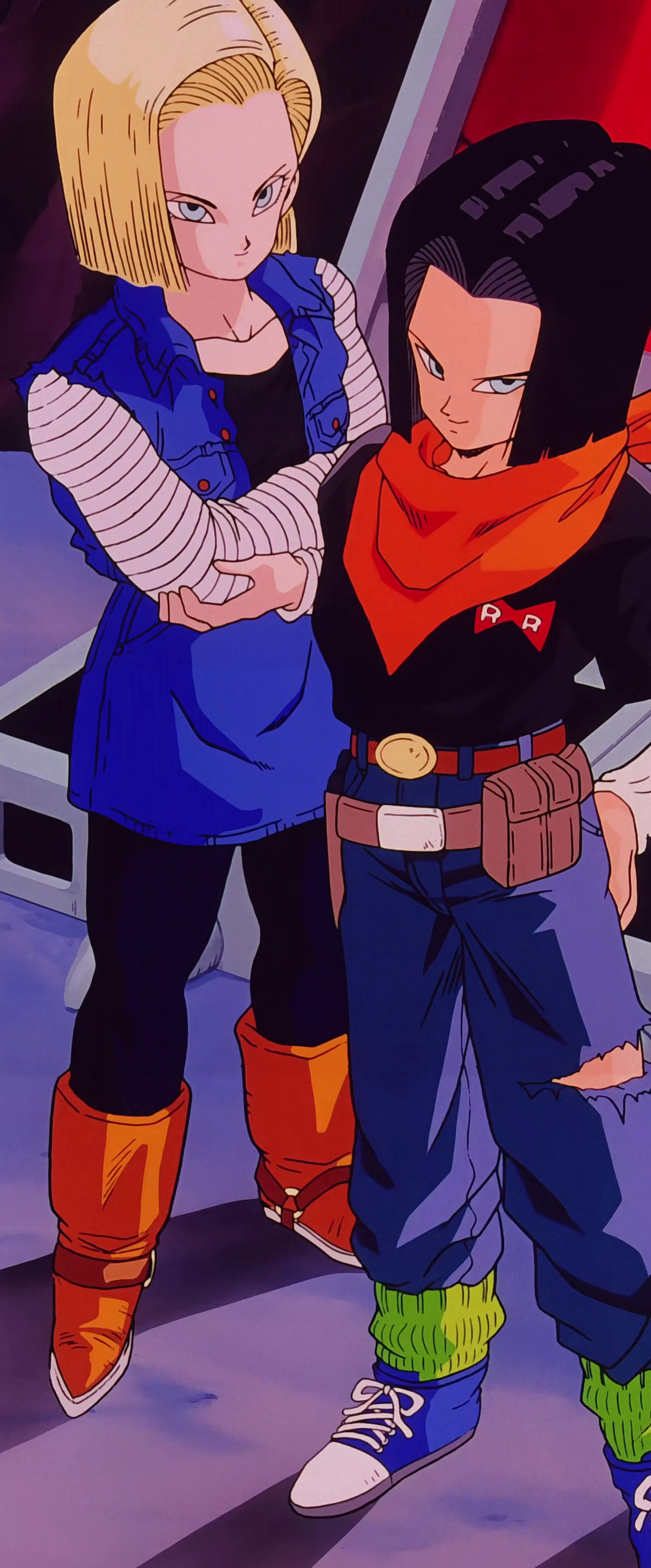
These Androids' aesthetic feels very much like an old man's perception of what young people dress like, which couldn't be more appropriate. There's something very action figure-y about their clothes. #17 even has a "toy" gun and holster. #17 wears a black shirt with a RRA logo, a long sleeved white undershirt, a large orange bandana, blue jeans (with a fashionable tear on one side), green socks and blue trainers/sneakers. #18 wears a denim blue jacket and miniskirt, black leggings, brown boots and a black shirt with those weird segmented white sleeves. Both of them have typical '90s shoulder-length curtain cuts, though #18 keeps one half behind her ear. Although it was a little before my time, I'm sure some early '90s teens wore this sort of shit, but there's still something a little childish about their outfits.
#18 is shown to be eager to ditch her original get-up after Vegeta ruins it, whereas #17 is a man so of course doesn't really care, though he does ditch the gun holster since he doesn't need it. Strangely, the Future Androids seem more attached to their RRA outfits and are never shown to change, with #17 even making a quip that he has four extra identical sets, Shaggy Rogers style. Good to see that Future Gero gave them spares. Maybe their different, more psychotic conditioning made them more loyal to the RRA iconography somehow. Anyway, can't really blame #18 because I've never been huge on her's or her brother's original designs. But they're okay, I guess. Android #19 and #20 may have been gaudy but design wise, they make more of an impression. Although both #17 and #18 both get much better outfits later, I can only judge their original designs. 7/10.
Moving on to Android #16. Don't care what anyone says, he has the purest soul of all, ginge or nah.
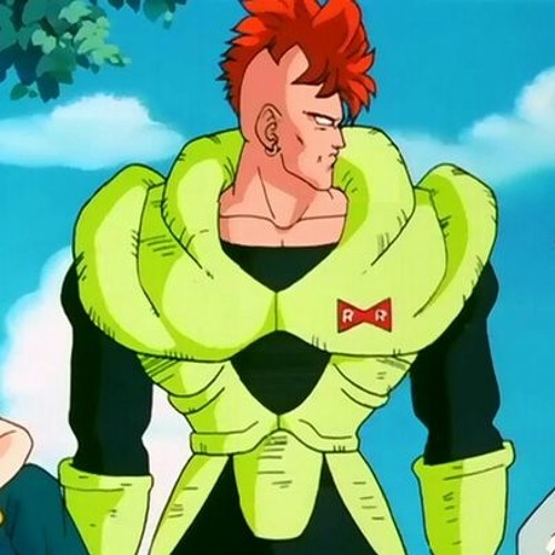
Android #16, in contrast to his kin, looks distinctly built for combat. Ironic, because according to later material, he was never meant to see battle. He wears a bodysuit of light green kevlar armour and green boots over a black jumpsuit. Quite concise and practical compared to the rest. Oh, and he's built like a brick shithouse. Considering that #16 is a fully mechanical android like #19, it almost feels like his armour is a part of his body since he never takes it off*
*I totally forgot that he takes the armour off on Dr. Briefs' operating table, though he does keep the black jumpsuit on
According to Toriyama, #16 is based on Gero's own son, Gebo, who presumably also had a ginger mohawk and height comparable to a fully grown grizzly bear. Since he died in battle, Gero seems overprotective of #16, which is probably why he's built with armour even in stasis.
There's honestly not much more to say. It's safe to say that #16 probably represents the mental image of what people probably thought the killer Terminators from the future would look like. However, in yet another dose of irony, he's programmed to have a similar conflict-avoidant personality as #8, presumably another sentimental measure by Gero to keep #16 out of danger. But yeah, 6/10.
Seeing as they were also designed by Toriyama and may have existed at some point in the manga continuity, I present the three defectives, Androids #13, #14 and #15. I'll only cover them briefly and I won't get into #13's Super transformation

Hoo boy, where do I even begin with these three? There's a clear American stereotype theme with this trio but otherwise they're as weird and random as you can get. #13 is a white American redneck, #14 is a hulking grey-skinned Native American and #15 is a bizarre purple-skinned pimp caricature. I can only wonder what the Toei staff must've thought when Toriyama passed them back these designs. "We have to animate these freaks?"
#13's got the infamous TRUCKER HAT, jacket and suspenders with no shirt. Even before the dub gave him his legendary Southern accent and coinciding personality adjustments, he still looks like a good ol' boy at first glance. #14 looks like a 1990s Rob Liefeld comic book character -- disposable ethnic caricature with no personality, single shoulder pad, long hairbraid, buff and shirtless. Yeah, not a lot going on with him. #15 is the real spotlight stealer. A purple-skinned dwarf dressed in a bright yellow pimp outfit, complete with an oversized yellow hat and a big Red Ribbon Army bowtie (quite a funny detail that he wears the logo itself, essentially). Dr. Gero must've been going through a very strange phase with this one.
I mean... fuck. #13 gets a solid 6/10, his look is not overly exciting but it's simple and effective. #14 gets like a 2/10, there's really nothing cool about him and his nonexistent personality. #15 gets the full WTF/10 rating.
For completion's sake, a quick look at Android #21, launcher of a million fetish fanarts.
#21's human form has a very '80s look about her -- the big, wild locks of hair and tacky quarter-patterned minidress, etc. What's funny though is that Toriyama's original concept art for her gave her fairly modest proportions, whereas ArcSys took the liberty of boosting her chest by several cup sizes for FighterZ. You know, for a self-confessed pervert, Toriyama tends not to gratuitously overdo the TnA, unfortunately the same cannot be said for most fan artists and indeed video game developers. Sigh. Either way, she looks the part of a cute scientist, and the game gives her a white labcoat with the RRA insignia.
Then we have her 'Majin' transformation, which still confuses me. How exactly did she get Majin Buu's DNA again (I struggle to believe he even has DNA as a magical being), especially since he appeared long after Dr. Gero died? Let me guess, his computer again? I don't think it's ever really explained. Either way, Majin #21 is a fun take on a distaff Super Buu, though it certainly is a drastic transformation from the cute brunette scientist to the full baggy white trousers and pink skin, with a black tube top added for some modesty. It's always amusing how Buu's clothes are such an ingrained part of his body. Speaking of baggy pants, it's funny how much Fat Buu's design cribs from Android #19. Presumably Toriyama was fond of him and wanted to give it another shot with no meddling editors in his way. Anyway, Majin #21 is clearly designed for fanservice, which I guess isn't a bad thing for variety because Dragon Ball doesn't have that many heavily sexualised female fighters anymore. A solid 8/10 for both.


