DragonBall Z: The Room 29 Productions Dub

Any general discussion regarding fan-created works of the Dragon Ball franchise, including AMVs, fan-art, fan-fiction, etc.
User avatar
Steven Perry
Advanced Regular
Posts: 1186
Joined: Mon Mar 27, 2006 10:27 am
Location: Hertfordshire, UK

Post by Steven Perry » Sun Aug 12, 2007 11:12 am

desirecampbell wrote:
Steven Perry wrote:You're totally right, Desiré. Can you help me with my poster (as in review it like you've done for Saiyan's, and possibly even work on it)? I'd appreciate it. :wink:
The 'hands' poster...

1. It doesn' show what the film is about as well as the 'face to face' one. It's a great secondary poster (like that 'Oozaru' poster) but shouldn't be the main/lead poster.

2. artistically, the composition is off-center (the hands are coming in at different angles, and Goku';s hand seems too far left) and it's a bit sparse.

Beyond that, just the regular: stock clouds look bad, the DBZ logo looks awful. Also, the "one shall stand... one shall fall" could stand to be a bit larger, I think.
Thanks, I'll look into that. You sure you can't give 'em a shot? Or is it that... you can't be bothered? :P

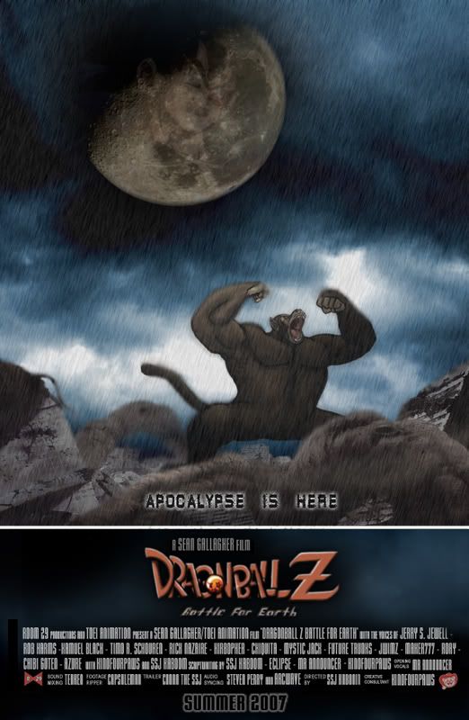
Here's that Apocalypse poster, please tell me what you think (can't wait for good/bad critique):


Image

Oh, and I think Kino's logo is awesome! If you say it's awful, you've gotta be on crack.
XBL: CallyMan90 | YouTube | DeviantART

~ LAST SURVIVING MEMBER OF ROOM 29 ~

User avatar
desirecampbell
Moderator
Posts: 4296
Joined: Sat Oct 22, 2005 9:55 pm
Location: Ontario, Canada
Contact:

Post by desirecampbell » Sun Aug 12, 2007 1:16 pm

KinoFourpaws wrote:... D'OH! I'm assuming you mean the logo on Steven's poster. Oh, well... I've never been particularly adept at drawing letters... >_<;
Since you've been kind enough to dispense crit for the posters, do you mind telling me what I need to work on regarding the logo? I'm not sure if I'll be able to go back and change it (really, though, it's already served its purpose for Conan's trailer), but it'd be nice to know what to do/avoid next time I try to attempt making one of those things. >_>;
I actually don't know who's done what for posters - and I'm actually strapped for time right now (I have just under an hour to spare before I have to head out again) but I will find time tonight to go over all the posters.

Quickly though, the logos, the regular DBZ logo on the 'face to face' poster looks bad because of the lens flare, the drop shadow (or is that a second layer of the logo?), the embossing - there's just too much there -it's too busy. The other DBZ logo, the one that looks hand-drawn, well, it just looks bad. It just screams unprofessional. I'm not totally against using a non-standard DBZ logo, but I'd hope for something more than that. (Shit, I sound like a dick - it's not terrible, it's just that I know we could collectively do better :))

Steven Perry wrote:Thanks, I'll look into that. You sure you can't give 'em a shot? Or is it that... you can't be bothered? :P
Here's that Apocalypse poster, please tell me what you think (can't wait for good/bad critique):
~snip~
Oh, and I think Kino's logo is awesome! If you say it's awful, you've gotta be on crack.
I have less than an hour to spare - in which time I also have to eat -before work :P But I promise that tonight I will get a full critique done.

Quickly though: the 'Apocalypse' poster is good. Just more of the same little things - not as explicit as the 'face to face' poster in regards to the movie being DragonBall Z, the logo looks like a hack job, stock filers (they're not as noticeable, though), the Oozaru is off center. Little things - the main thing is that the idea is good, an together we can build on that.


And Kino's logo, yeah, I think it looks rushed and unprofessional. As I said, I'm not against using a non-standard DBZ logo, but this one brings down the quality of the whole poster.


-edit-
If anyone who's made a poster has any of the original files used, post 'em - I think that collectively we can make a better poster than anyone separately. And, hey, that's the point of a community, right? :D
-/edit-

User avatar
bkev
I Live Here
Posts: 2540
Joined: Sat Jan 20, 2007 7:17 pm
Location: Twitter. Tweet-Tweet.

Post by bkev » Sun Aug 12, 2007 1:17 pm

I don't know what it is, but I'm not a big fan of the new background on the Oozaru poster.
Previous one for comparison's sake:
Image
However, I did like that you put Tullece in it - and the new 'Apocalypse is Now' word placement.

Damn, I almost had first reply!

User avatar
Steven Perry
Advanced Regular
Posts: 1186
Joined: Mon Mar 27, 2006 10:27 am
Location: Hertfordshire, UK

Post by Steven Perry » Sun Aug 12, 2007 1:54 pm

desirecampbell wrote:-edit-
If anyone who's made a poster has any of the original files used, post 'em - I think that collectively we can make a better poster than anyone separately. And, hey, that's the point of a community, right? :D
-/edit-
Excellent idea, Desiré. I'll post up my files soon- I hope you guys can take it from there! :D And as for the logo... I'd like a non-standard DBZ logo, but who can we get to draw it?
XBL: CallyMan90 | YouTube | DeviantART

~ LAST SURVIVING MEMBER OF ROOM 29 ~

User avatar
Kirbopher
Regular
Posts: 696
Joined: Sun Dec 04, 2005 2:10 am
Contact:

Post by Kirbopher » Sun Aug 12, 2007 2:37 pm

Here's my Tullece re-audition as requested.

User avatar
Steven Perry
Advanced Regular
Posts: 1186
Joined: Mon Mar 27, 2006 10:27 am
Location: Hertfordshire, UK

Post by Steven Perry » Sun Aug 12, 2007 4:58 pm

New concept:

Image

Tell me what ya think. :wink: I was going to put numbers, signs and stuff in the window (like scouter readings), but I don't have time! Tell me if it's worth continuing.
XBL: CallyMan90 | YouTube | DeviantART

~ LAST SURVIVING MEMBER OF ROOM 29 ~

User avatar
Supa Saiya-Jin Tullece
OMG CRAZY REGEN
Posts: 800
Joined: Sat May 19, 2007 5:18 pm
Location: Helena, Alabama

Post by Supa Saiya-Jin Tullece » Sun Aug 12, 2007 5:05 pm

That looks like it'd be a great poster! You should have another box in the HUD that has the reticule pointing at the FUNi HQ. That'd make it epic.

User avatar
Kaboom
Moderator
Posts: 14524
Joined: Mon Jan 09, 2006 6:07 pm

Post by Kaboom » Sun Aug 12, 2007 5:09 pm

Supa Saiya-Jin Tullece wrote:You should have another box in the HUD that has the reticule pointing at the FUNi HQ. That'd make it epic.
DO IT.


NOW.
[ BlueSky | Bsky: DBS Plots | DeviantArt | Twitter (Depreciated) ]

[PSN/Steam: KaboomKrusader | Switch FC: SW-4304-7361-2824 | ACNH Dream Address: DA-1637-4046-7415 ("SlamZone") ]

Powar Levuls! — DBZ | Movies & Specials | GT

User avatar
Eclipse
OMG CRAZY REGEN
Posts: 957
Joined: Sat Aug 27, 2005 9:40 pm
Location: Edmonton, Alberta, Canada

Post by Eclipse » Sun Aug 12, 2007 6:26 pm

Nice posters. Although now I feel the need to state a problem I've been noticing for a while in the posters

The credits. I noticed that the first row of text is pretty well done, however the next two start dropping in quality (Best example is comparing Kaboom's name in the last row with his name in the previous row)

The best way I can think of resolving this issue is redoing the credits (We might need to do that anyway) as a seperate PSD file, and then import into the poster psd themselves in Photoshop.

User avatar
Kaboom
Moderator
Posts: 14524
Joined: Mon Jan 09, 2006 6:07 pm

Post by Kaboom » Sun Aug 12, 2007 6:46 pm

Yeah. Either way, we do need to update the contents of the credits, since positions and roles have been changing around.
[ BlueSky | Bsky: DBS Plots | DeviantArt | Twitter (Depreciated) ]

[PSN/Steam: KaboomKrusader | Switch FC: SW-4304-7361-2824 | ACNH Dream Address: DA-1637-4046-7415 ("SlamZone") ]

Powar Levuls! — DBZ | Movies & Specials | GT

User avatar
Chuquita
Namekian Warrior
Posts: 15310
Joined: Sat Nov 20, 2004 2:16 am
Location: Somewhere

Post by Chuquita » Sun Aug 12, 2007 8:15 pm

Steven Perry wrote:New concept:

http://i9.photobucket.com/albums/a52/St ... dscopy.jpg

Tell me what ya think. :wink: I was going to put numbers, signs and stuff in the window (like scouter readings), but I don't have time! Tell me if it's worth continuing.

It does look very cool (I'd forgotten what the inside of his spaceship looks like).


*Points to the credits* My username's spelled with a "u" though. ^_^;;
On hiatus.

User avatar
Conan the SSJ
I Live Here
Posts: 2814
Joined: Sun Apr 17, 2005 8:40 am
Location: Ohio

Post by Conan the SSJ » Sun Aug 12, 2007 8:21 pm

Steven Perry wrote:New concept:

Tell me what ya think. :wink: I was going to put numbers, signs and stuff in the window (like scouter readings), but I don't have time! Tell me if it's worth continuing.
Pretty good work. However, are we to assume this poster is implying we have a deadline to have this fandub all finished by the 29th of this month? Or is it just a faux example for a finished version of the poster? I mean, I seriously doubt that's enough time for everything to be voice-recorded, edited together with from-ground-up sound effects, and two music tracks.
14 years later

User avatar
Kaboom
Moderator
Posts: 14524
Joined: Mon Jan 09, 2006 6:07 pm

Post by Kaboom » Sun Aug 12, 2007 8:26 pm

Yeah, I hope it's just a faux example.

Change it to 29.8.10, and that might be more realistic...
[ BlueSky | Bsky: DBS Plots | DeviantArt | Twitter (Depreciated) ]

[PSN/Steam: KaboomKrusader | Switch FC: SW-4304-7361-2824 | ACNH Dream Address: DA-1637-4046-7415 ("SlamZone") ]

Powar Levuls! — DBZ | Movies & Specials | GT

User avatar
KinoFourpaws
Regular
Posts: 645
Joined: Thu Sep 07, 2006 1:33 am
Location: Somewhere in the back of my mind...
Contact:

Post by KinoFourpaws » Sun Aug 12, 2007 11:34 pm

SSj Kaboom wrote:Yeah, I hope it's just a faux example.

Change it to 29.8.10, and that might be more realistic...
Oh, dear... let's hope it doesn't take that long. @_@;

And, Desire... the logo IS hand-drawn. >_>; I can see what you mean when you say it looks unprofessional, though. Maybe I need to look into taking Design classes... ._.

If I could get my sister to do so, she could probably whip up a really cool-looking logo to use for the posters instead; she's always been pretty good at lettering. I don't know if she'd be very obliging to, though (she'd probably think it was really silly to request it of her, especially since I'm the only one in the family who really bothers drawing anymore... :( ). In the meantime, I'll see what I can do to make the logo I made less amateurish-looking if anybody wants me to.

Also: Thank you for posting your audition again, Kirb! Now we can go through and pick out our new Tullece without worrying about skipping over anybody. Very helpful, yes. :)
Art, etc. links taken down for now. Will be updated at some point. I dunno.

I NEED A NEW SIGNATURE D:

Steam handle: KinoFourpaws. Want to shoot up some zambees?

User avatar
Mr. Announcer
Beyond-the-Beyond Newbie
Posts: 464
Joined: Sat Jan 14, 2006 7:28 pm
Location: Maryland
Contact:

Post by Mr. Announcer » Mon Aug 13, 2007 12:31 am

If anyone wants, I could try to design a logo for use on some of the posters since I've got nothing on my hands at the moment and I feel pretty useless... I'm pretty sure we can use multiple logos so Kino, be sure to ask your sister about that as well.

Also, this is probably a pressing matter for a lot of us, but school is gonna be starting up again soon and I probably wont have much time for recording then. Anyone know if we'll be able to finish recording this summer or if we can hold it off until winter break or something? Wow, that would make it a year of work on this wouldn't it?
For fanart that lacks in variety [url]http://www.announcerguy.deviantart.com[/url]

クリリンのことか~!!!

User avatar
desirecampbell
Moderator
Posts: 4296
Joined: Sat Oct 22, 2005 9:55 pm
Location: Ontario, Canada
Contact:

Post by desirecampbell » Mon Aug 13, 2007 1:47 am

Hey! Critiques!

Face to Face
--------------------------------------------
Image

What detracts from this being an awesome poster is the little aspects that while good idea, are executed badly. The clouds: too small, scale-up the clouds and blend them better; lens flares: on the tree and the logo, it just screams amateur. Also, the logo is way too busy, the drop shadow and the embossing - not good.

And the 'face to face' seems a bit small. *shrug* I dunno.

I like that the 'levels' of the characters have been changed, gives it a better composition. And as others have said, earlier versions had the fruit glowing, I think that would be nice too.

=========================


Apocalyse is Here (Pokemon Edition)
--------------------------------------------
Image Image

The original in blue looks great except that the Oozaru is a bit off center, though the moon compensates for this and balances the composition. And, yeah, the tag line is too small. And you might not be able to see A Telluce, if he isn't pointed out. Good idea though.

The red version is nice too, but the Oozaru's off-center stand is more noticeable and unbalanced with Telluce in the center. Good font-face, but again, too small. And the use of stock filer clouds really brings down the poster.

=========================


One Shall Stand
--------------------------------------------
Image

The composition is off-center, and seems rather sparse. And, again, the tag lines seem a bit small.

=========================


The End is Near
--------------------------------------------
Image

Other than it's a little hard to see Telluce (which is the point of the poster), this is awesome.

A The font style is too small and hard to read.

B Barely see 'DBZ'. I like the idea that it shouldn't be "too obvious" but make it a bit clearer.

=========================


Those are just the ones that I found flipping through the last sixty-goddamn-seven pages. If anyone has any others I missed feel free to bring them forward. Also, anyone with the original files for the posters, those'd be great too.

User avatar
Steven Perry
Advanced Regular
Posts: 1186
Joined: Mon Mar 27, 2006 10:27 am
Location: Hertfordshire, UK

Post by Steven Perry » Mon Aug 13, 2007 5:06 am

SSj Kaboom wrote:
Supa Saiya-Jin Tullece wrote:You should have another box in the HUD that has the reticule pointing at the FUNi HQ. That'd make it epic.
DO IT.


NOW.
... Okay, okay. Keep your shirt on. :roll:
Eclipse wrote:The best way I can think of resolving this issue is redoing the credits (We might need to do that anyway) as a separate PSD file, and then import into the poster psd themselves in Photoshop.
Yeah, I'll re-do the credits and post up an enlarged JPEG version (accompanied by the PSD file) so that it can be seen clearly for the cast to point out mistakes, give suggestions, and tell me about updated positions. I'll simply re-edit this post to show updates on the credits. I'll post the credits here when I get 'em done.
Conan the SSJ wrote:Pretty good work. However, are we to assume this poster is implying we have a deadline to have this fandub all finished by the 29th of this month? Or is it just a faux example for a finished version of the poster?
It's just an examp-

Wait... OH SHIT! The 29th?! :shock: I unintentionally did that! Something's going on here, seriously!

Anyway, that gives me an idea. We should release this on the 29th of whatever month.

Damn... the 29th? It's a conspiracy.

*Shivers*
Mr. Announcer wrote:Wow, that would make it a year of work on this wouldn't it?
People, let's NOT let this run on for more than a year...

Please. :(


We'll look like absolute losers. Oh, and thanks for offering to do the logo, Mr. A. Kino's doing one too, right? The more the better! :D
desirecampbell wrote:Apocalypse is Here (Pokemon Edition)
Y'know... a 'Pokémon' edition sounds pretty good. :lol: I think I'll keep both variants!
desirecampbell wrote:Those are just the ones that I found flipping through the last sixty-goddamn-seven pages. If anyone has any others I missed feel free to bring them forward.
Here's Saiyan's second one:

Image

Thanks for the reviews, Desiré. I'll see what I can do... and if I can't do anything, the PSD files are below.

-------------------------------------------------------------------------------------------------------------
PSD files

I don't have any of Saiyan's ones. You'll have to contact him for that; but he seems to have stopped contributing to this project and ceased checking up on it.

'Apocalypse Is Here' (Blue Edition)

'Apocalypse Is Here' (Red Edition)

'One Shall Stand'

'The End Is Near'

My early edition of 'Face To Face'

Kaboom's Oozaru

Dragonball Z original logo
XBL: CallyMan90 | YouTube | DeviantART

~ LAST SURVIVING MEMBER OF ROOM 29 ~

User avatar
Eclipse
OMG CRAZY REGEN
Posts: 957
Joined: Sat Aug 27, 2005 9:40 pm
Location: Edmonton, Alberta, Canada

Post by Eclipse » Mon Aug 13, 2007 5:40 am

August 2010? That's waaay too realistic.
I was hoping we'd start recording by July and finish the recording at least around now and start editing in September...then release in like November
=P

At least, we should finish this before the end of the year. We were slacking off a bit here and there =P

User avatar
Steven Perry
Advanced Regular
Posts: 1186
Joined: Mon Mar 27, 2006 10:27 am
Location: Hertfordshire, UK

Post by Steven Perry » Mon Aug 13, 2007 6:06 am

We've got 107 days until our one year anniversary... :?

Which means we've been working on it for...

*Pulls calculator out*


258 days. And we haven't even started recording. :|


EDIT:


Ladies and gentlemen, may I present to you...


Image

(I did the FUNimation thing :P )
XBL: CallyMan90 | YouTube | DeviantART

~ LAST SURVIVING MEMBER OF ROOM 29 ~

User avatar
Kaboom
Moderator
Posts: 14524
Joined: Mon Jan 09, 2006 6:07 pm

Post by Kaboom » Mon Aug 13, 2007 10:49 am

Haha, that is awesome. Uh, remove the actual word "FUNimation," though. We don't want any trouble...

Anyhoo, Kino, Rick and I will be conferencing this afternoon (ah, the good ol' days...) to pick Tullece's VA, and I'm still working on the ever-so-frustrating KEVRG.
[ BlueSky | Bsky: DBS Plots | DeviantArt | Twitter (Depreciated) ]

[PSN/Steam: KaboomKrusader | Switch FC: SW-4304-7361-2824 | ACNH Dream Address: DA-1637-4046-7415 ("SlamZone") ]

Powar Levuls! — DBZ | Movies & Specials | GT

Post Reply