/j
DragonBall Z: The Room 29 Productions Dub
-
Steven Perry

- Advanced Regular
- Posts: 1186
- Joined: Mon Mar 27, 2006 10:27 am
- Location: Hertfordshire, UK
Hey d00ds, I've been fiddling around with the poster, 'cause I just wasn't happy with it:
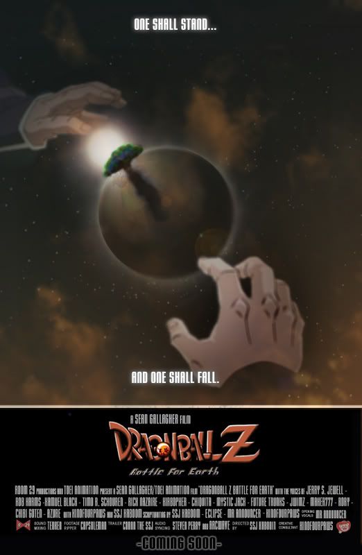
This poster says everything in the movies' title: 'Battle For Earth'. Tullece and Goku are both reaching for it, as a sort of metaphor for 'Who will take Earth? Good or evil?' That conveys a sort of battle/struggle. Then we've got the fiery background, which is a sort of message as to how fiery the battle will become (and the fire in the woods at the beginning of the movie). And obviously, you've got the Earth in the middle, so you can rightly say they're 'battling for Earth'. Oh yeah, and I like the slogan, 'One shall stand... and one shall fall.' I got it from Transformers, the 1989 animated movie (which is freakin' sweet, might I add). Is it better than the last one?
This poster says everything in the movies' title: 'Battle For Earth'. Tullece and Goku are both reaching for it, as a sort of metaphor for 'Who will take Earth? Good or evil?' That conveys a sort of battle/struggle. Then we've got the fiery background, which is a sort of message as to how fiery the battle will become (and the fire in the woods at the beginning of the movie). And obviously, you've got the Earth in the middle, so you can rightly say they're 'battling for Earth'. Oh yeah, and I like the slogan, 'One shall stand... and one shall fall.' I got it from Transformers, the 1989 animated movie (which is freakin' sweet, might I add).
-
Conan the SSJ

- I Live Here
- Posts: 2814
- Joined: Sun Apr 17, 2005 8:40 am
- Location: Ohio
Steven, you are an absolute friggin' genius. For this talnted poster, you deserve the cosplaying Chichi.Steven Perry wrote:This poster says everything in the movies' title: 'Battle For Earth'. Tullece and Goku are both reaching for it, as a sort of metaphor for 'Who will take Earth? Good or evil?' That conveys a sort of battle/struggle. Then we've got the fiery background, which is a sort of message as to how fiery the battle will become (and the fire in the woods at the beginning of the movie). And obviously, you've got the Earth in the middle, so you can rightly say they're 'battling for Earth'. Oh yeah, and I like the slogan, 'One shall stand... and one shall fall.' I got it from Transformers, the 1989 animated movie (which is freakin' sweet, might I add).
14 years later

Then what do I get for directing?Conan the SSJ wrote:Steven, you are an absolute friggin' genius. For this talnted poster, you deserve the cosplaying Chichi.
I agree, though. VERY nice, Stevey. Reminds me, however, that we're going to need to make some changes to the credits on the posters, what with VAing and other roles being switched around somewhat.
I'm trying to work out some kinks with the KEVRG's video. But I've got all weekend free; I should be able to get this done and a Tullece picked over the weekend.
[ BlueSky | Bsky: DBS Plots | DeviantArt | Twitter (Depreciated) ]
[PSN/Steam: KaboomKrusader | Switch FC: SW-4304-7361-2824 | ACNH Dream Address: DA-1637-4046-7415 ("SlamZone") ]
Powar Levuls! — DBZ | Movies & Specials | GT
[PSN/Steam: KaboomKrusader | Switch FC: SW-4304-7361-2824 | ACNH Dream Address: DA-1637-4046-7415 ("SlamZone") ]
Powar Levuls! — DBZ | Movies & Specials | GT

-
Conan the SSJ
- I Live Here
- Posts: 2814
- Joined: Sun Apr 17, 2005 8:40 am
- Location: Ohio
::Gouges out eyes::
I'm sure I deserve a prettier cosplayer than that? Well, maybe I don't quite deserve that one...
Last edited by Kaboom on Fri Aug 10, 2007 9:46 pm, edited 2 times in total.
[ BlueSky | Bsky: DBS Plots | DeviantArt | Twitter (Depreciated) ]
[PSN/Steam: KaboomKrusader | Switch FC: SW-4304-7361-2824 | ACNH Dream Address: DA-1637-4046-7415 ("SlamZone") ]
Powar Levuls! — DBZ | Movies & Specials | GT
[PSN/Steam: KaboomKrusader | Switch FC: SW-4304-7361-2824 | ACNH Dream Address: DA-1637-4046-7415 ("SlamZone") ]
Powar Levuls! — DBZ | Movies & Specials | GT
-
Eclipse

- OMG CRAZY REGEN
- Posts: 957
- Joined: Sat Aug 27, 2005 9:40 pm
- Location: Edmonton, Alberta, Canada
XDSSj Kaboom wrote:
::Gouges out eyes::
I'm sure I deserve a prettier cosplayer than that? Well, maybe I don't quite deserve that one...
Nice poster, Steve. Love the idea behind it.
Now...I feel talentless..I need to do something productive >.>
-
Steven Perry
- Advanced Regular
- Posts: 1186
- Joined: Mon Mar 27, 2006 10:27 am
- Location: Hertfordshire, UK

-
Captain Awesome

- Patreon Supporter
- Posts: 2653
- Joined: Wed Jul 25, 2007 1:31 am
- Location: Australia, Planet Earth
Overall, I like it.
I just think you should lay off the cloud overlay as it detracts from the great artwork, and drop shadows don't really work well on that kind of background.
I like the layout, I just think all the little flourishes you've added kind of make it look incongruous with the film itself.
Sorry if I'm nitpicky but two years studying graphic design will do that to you
-
Steven Perry
- Advanced Regular
- Posts: 1186
- Joined: Mon Mar 27, 2006 10:27 am
- Location: Hertfordshire, UK
You are talking about the one above you (Saiyan's), not my one (at the top of the page), right?Captain Awesome wrote:Overall, I like it.
I just think you should lay off the cloud overlay as it detracts from the great artwork, and drop shadows don't really work well on that kind of background.
I like the layout, I just think all the little flourishes you've added kind of make it look incongruous with the film itself.
Sorry if I'm nitpicky but two years studying graphic design will do that to you
-
Supa Saiya-Jin Tullece

- OMG CRAZY REGEN
- Posts: 800
- Joined: Sat May 19, 2007 5:18 pm
- Location: Helena, Alabama
-
desirecampbell

- Moderator
- Posts: 4296
- Joined: Sat Oct 22, 2005 9:55 pm
- Location: Ontario, Canada
- Contact:
I disagree, I think the cloud overlays are necessary to blend the two styles (the characters and the planet/bg). The characters need to be 'softened' so they don't look so strange against the rest of the image. True, this may give the impression that the film is of a different style than it actually is - which is why I've pushed to use this poster instead of the others that use less of the traditional style (like the previous poster on the page).Captain Awesome wrote:Overall, I like it.
I just think you should lay off the cloud overlay as it detracts from the great artwork, and drop shadows don't really work well on that kind of background.
I like the layout, I just think all the little flourishes you've added kind of make it look incongruous with the film itself.
Beyond that, I like the little touches, like the red/blue glow for Goku/Telluce (especially how each glow seems to radiate fro the sun/space). The only part I don't like is the 'Dragonball Z Battle for Earth' logo at the bottom (the DBZ logo has that awful drop shadow and lens flare combo, and the 'BFE' byline, well, I just don't like the font I guess).
(é) Yeah, I'm famous. Super famous. I start things.
Toyble's DBAF | DBZ Side Stories |Jump Super Anime Tour manga | Chou Kochikame
Toyble's DBAF | DBZ Side Stories |Jump Super Anime Tour manga | Chou Kochikame
-
Ex-Dubbie369
- OMG CRAZY REGEN
- Posts: 898
- Joined: Mon Nov 27, 2006 2:14 am
- Location: Anaheim, CA
-
Steven Perry
- Advanced Regular
- Posts: 1186
- Joined: Mon Mar 27, 2006 10:27 am
- Location: Hertfordshire, UK
You're totally right, Desiré. Can you help me with my poster (as in review it like you've done for Saiyan's, and possibly even work on it)? I'd appreciate it.desirecampbell wrote:I disagree, I think the cloud overlays are necessary to blend the two styles (the characters and the planet/bg). The characters need to be 'softened' so they don't look so strange against the rest of the image. True, this may give the impression that the film is of a different style than it actually is - which is why I've pushed to use this poster instead of the others that use less of the traditional style (like the previous poster on the page).Captain Awesome wrote:Overall, I like it.
I just think you should lay off the cloud overlay as it detracts from the great artwork, and drop shadows don't really work well on that kind of background.
I like the layout, I just think all the little flourishes you've added kind of make it look incongruous with the film itself.
Beyond that, I like the little touches, like the red/blue glow for Goku/Telluce (especially how each glow seems to radiate fro the sun/space). The only part I don't like is the 'Dragonball Z Battle for Earth' logo at the bottom (the DBZ logo has that awful drop shadow and lens flare combo, and the 'BFE' byline, well, I just don't like the font I guess).
-
Captain Awesome
- Patreon Supporter
- Posts: 2653
- Joined: Wed Jul 25, 2007 1:31 am
- Location: Australia, Planet Earth
The characters and background should contrast (just as they do in the show), if you "soften" the characters all you're going to do is lose detail and depth, the problem with the overlays that are stock photoshop cloud effects is that they will always look horrible no matter what you do to them, you can spot them a mile away.desirecampbell wrote: I disagree, I think the cloud overlays are necessary to blend the two styles (the characters and the planet/bg). The characters need to be 'softened' so they don't look so strange against the rest of the image. True, this may give the impression that the film is of a different style than it actually is - which is why I've pushed to use this poster instead of the others that use less of the traditional style (like the previous poster on the page).
I think perhaps some Aura brush strokes or smoke/dust overlay would look great, reproducing an effect from the show is preferable to just clicking a filter button.
The current effects stick out like a sore thumb.
-
desirecampbell
- Moderator
- Posts: 4296
- Joined: Sat Oct 22, 2005 9:55 pm
- Location: Ontario, Canada
- Contact:
The 'hands' poster...Steven Perry wrote:You're totally right, Desiré. Can you help me with my poster (as in review it like you've done for Saiyan's, and possibly even work on it)? I'd appreciate it.
1. It doesn' show what the film is about as well as the 'face to face' one. It's a great secondary poster (like that 'Oozaru' poster) but shouldn't be the main/lead poster.
2. artistically, the composition is off-center (the hands are coming in at different angles, and Goku';s hand seems too far left) and it's a bit sparse.
Beyond that, just the regular: stock clouds look bad, the DBZ logo looks awful. Also, the "one shall stand... one shall fall" could stand to be a bit larger, I think.
I'd love to take a stab at changing the posters, but I don't have the time this week. I swear, if Toyble releases another page before Friday I'm going to fucking die.
That's true, they do smack of amateurism. Even just using the same clouds on a larger scale, changing the opacity (maybe a blend, or two) would improve it.Captain Awesome wrote:The characters and background should contrast (just as they do in the show), if you "soften" the characters all you're going to do is lose detail and depth, the problem with the overlays that are stock photoshop cloud effects is that they will always look horrible no matter what you do to them, you can spot them a mile away.
I think perhaps some Aura brush strokes or smoke/dust overlay would look great, reproducing an effect from the show is preferable to just clicking a filter button.
The current effects stick out like a sore thumb.
(é) Yeah, I'm famous. Super famous. I start things.
Toyble's DBAF | DBZ Side Stories |Jump Super Anime Tour manga | Chou Kochikame
Toyble's DBAF | DBZ Side Stories |Jump Super Anime Tour manga | Chou Kochikame
-
Acid_Reign

- Advanced Regular
- Posts: 1056
- Joined: Wed Jan 24, 2007 5:59 am
- Location: Massachusetts, USA
- Contact:
Also, people seem to think that blending effects + text = the coolest thing ever.
It doesn't.
Get rid of all of the embossing, bevels, and shadows (KEEP the white text white, however, because you're dealing with a dark background). Believe me, you'll thank me for this. I don't discourage blending effects altogether, but default settings really give you away as a newbie, or someone who just slapped on whatever and called it "done" (See: FUNi).
Also, is that two DBZ logos? Delete that second layer, son.
And get rid of the blue-streak lens flares; replace them with another variant or at least Gaussian them out a bit.
But honestly, I don't see this as the most important thing right now. Something to tide us over until we get Tullece/KEVRG, sure, but it needn't be an exhaustive process. Our potential audience likely won't be a panel of graphics experts.
-
KinoFourpaws

- Regular
- Posts: 645
- Joined: Thu Sep 07, 2006 1:33 am
- Location: Somewhere in the back of my mind...
- Contact:
... D'OH! I'm assuming you mean the logo on Steven's poster. Oh, well... I've never been particularly adept at drawing letters... >_<;desirecampbell wrote:Beyond that, just the regular: stock clouds look bad, the DBZ logo looks awful. Also, the "one shall stand... one shall fall" could stand to be a bit larger, I think.
Since you've been kind enough to dispense crit for the posters, do you mind telling me what I need to work on regarding the logo? I'm not sure if I'll be able to go back and change it (really, though, it's already served its purpose for Conan's trailer), but it'd be nice to know what to do/avoid next time I try to attempt making one of those things. >_>;
Art, etc. links taken down for now. Will be updated at some point. I dunno.
I NEED A NEW SIGNATURE D:
Steam handle: KinoFourpaws. Want to shoot up some zambees?
I NEED A NEW SIGNATURE D:
Steam handle: KinoFourpaws. Want to shoot up some zambees?